
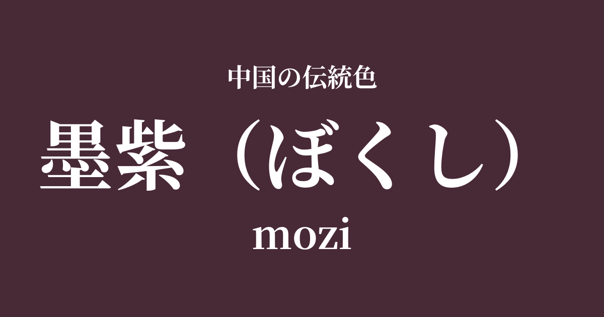
| Color name | ink purple |
|---|---|
| reading | Bokushi |
| pinyin | mozi |
| HEX | #482936 |
| RGB | 72, 41, 54 |
What is Sumi-murasaki? Origin and etymology
The word "bokushi" literally means "purple like ink." It is a color that blends the deep, quiet, yet rich black of ink, which is used in calligraphy and ink painting, which are fundamental to Chinese culture, with purple, which has been considered a symbol of nobility and mystery since ancient times.
It's not simply a dark purple; it incorporates the unique graininess of ink and the subtle sheen that it displays depending on the light. This creates a complex and profound hue that is both weighty and somehow refined.
Historical background of the color "ink purple"
Purple has long held special significance in China. Because the roots of the gromwell plant, used as a dye, were precious, purple clothing was a forbidden color, permitted only to emperors and high-ranking nobles, and was a symbol of authority and nobility. In particular, purple was associated with the heavens and the center of the universe, as evidenced by the fact that the heavenly palace where the Emperor of Heaven resided was called the "Purple Palace."
Ink purple is a color that combines the authority of traditional purple with the element of "ink," which symbolizes the spirituality of literati and intellectuals. During the Tang and Song dynasties, as culture matured and a more delicate and complex aesthetic sense was demanded, these deep, intermediate colors became popular. It is said that ink purple was used in the magnificent robes used in court ceremonies and in the furnishings that adorned the residences of nobles, creating an atmosphere of quiet dignity and refined elegance.
Ink purple in Chinese art and crafts
The deep and elegant shade of ink purple is deeply intertwined with Chinese clothing culture, particularly silk weaving. When this color was dyed onto lustrous silk, it changed its appearance from black to deep purple depending on how the light hit it, giving the viewer an elegant and mysterious impression. It was used in Hanfu and ceremonial robes worn by emperors, royalty, and high-ranking officials, silently signifying their high status.
Furthermore, a color similar to ink purple can be found in the world of ceramics. For example, the purplish-red glaze seen in Jun ware from the Song dynasty is appealing because of the unpredictable colors created by chemical changes (kiln transformations) inside the kiln, and sometimes a deep, subdued purple reminiscent of ink purple appears within it. These works of art can be said to embody the serenity and refined elegance that ink purple possesses.
Color scheme preview
This is to check the readability of the text when this color is used as the background.
Suggested color scheme: ink purple
Moon White (#D9E4E8)
The deep, richness of the ink purple is enhanced by the pure, light-like hue of the moon. This color scheme evokes a tranquil moonlit scene, full of calmness and elegance.
Akika (#D9B612)
The deep purple and muted yellow complement each other, creating a traditional yet modern impression. It's a noble, elegant, and intellectual color scheme.
Ginko (#F0A0A9)
The deep, calm impression of ink purple is complemented by the soft, gentle red of silver crimson, creating an elegant and lustrous atmosphere. This is a sophisticated color scheme for adults.
Practical Scenes
In interior design, incorporating charcoal purple into accent walls, sofas, curtains, etc., brings a sense of refined calmness and depth to the space. Combining it with moon white, off-white, and gold accessories creates a modern and luxurious atmosphere.
In fashion, using this color in larger items such as coats, dresses, and suits can express elegance and individuality. It pairs particularly well with glossy materials like silk and velvet. Using it as an accent color in accessories such as scarves and bags also creates a sophisticated impression.
In web design and graphic design, using gold as a background color can convey a sense of luxury and trustworthiness. It is suitable for luxury brands, traditional culture, and art-related websites, and looks particularly beautiful when used with white or gold text.