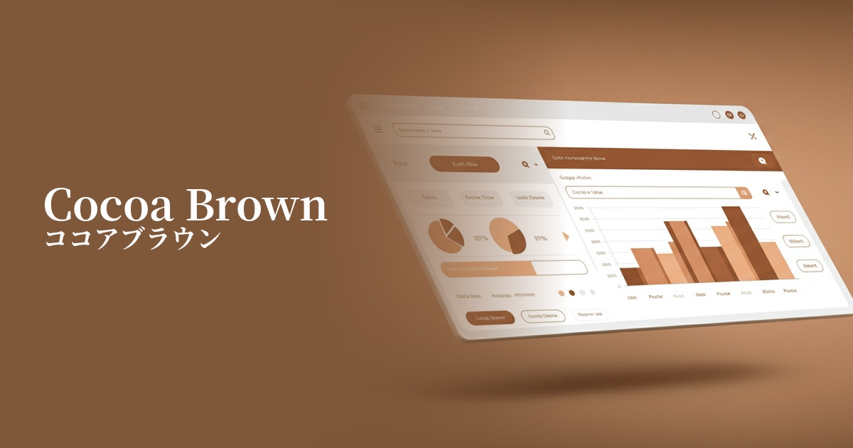
| English name | Cocoa Brown |
|---|---|
| Katakana | Cocoa Brown |
| HEX | #8E7164 |
| RGB | 142, 113, 100 |
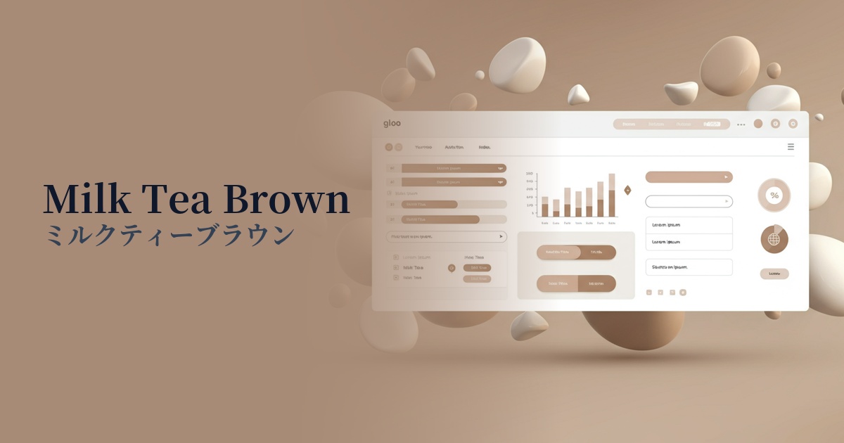
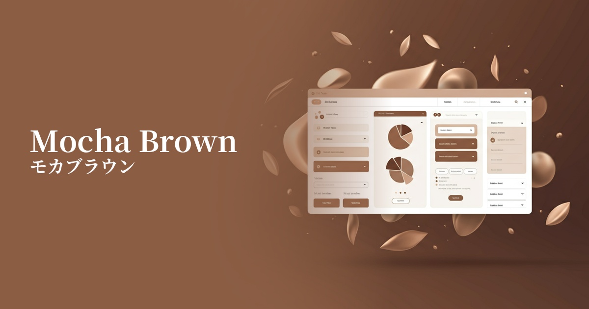
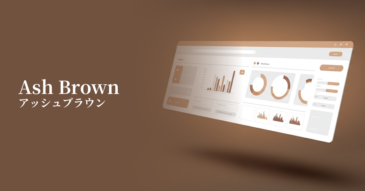
| Design Theme | Muted colors & earth tones |
Why is it a trend? (Background and reasons)
In recent years, there has been a growing trend towards seeking natural and organic elements as a reaction against digital fatigue and increased screen time. Earth tones like cocoa brown provide users with a comforting sense of peace and warmth, allowing them to feel a gentle and human connection even through a screen.
The trend towards "muted colors" with their minimalist and nostalgic feel is one reason why cocoa brown is gaining attention. Its subdued, muted tone harmonizes easily with other colors, giving a sophisticated and elegant impression. Because it's not overly assertive, it's also an excellent background color for highlighting content.
Furthermore, its importance is increasing from a UX perspective. Cocoa brown, a neutral color that avoids extreme contrasts, is easy on the eyes and less tiring to use even during prolonged viewing. The fact that it's easy to maintain design consistency in both dark and light modes is another reason why it's highly valued in modern web design.
The psychological effects of design and UX
Cocoa brown is a quintessential earth tone, evoking images of the land and trees, and evokes psychological effects such as a sense of stability, reliability, and security in users. It helps build trust on websites where reliability is paramount, such as financial services and B2B platforms.
Warm color tones are also suitable for expressing a handmade feel and craftsmanship. For e-commerce sites selling organic foods, lifestyle brands, and handmade products, they can intuitively convey the story and warmth behind the products.
The subdued, elegant hues create a refined, understated sense of luxury. Not as heavy as black, and deeper than beige, they are ideal for creating a sophisticated aesthetic on fashion, interior design, and cosmetic brand websites.
Visibility testing (UI component example)
Practical usage (best practices)
Using it as the background color for the entire site gently envelops the content, creating a calm atmosphere. In particular, it enhances the appeal of the works without detracting from them, especially in portfolio sites and brand sites that heavily utilize photographs and illustrations.
Instead of pure black (#000000), using this color for headings and body text can also be effective. It maintains sufficient contrast against white or cream-colored backgrounds while reducing the feeling of pressure on the user, resulting in a more readable and eye-friendly design.
Using cocoa brown for important buttons and CTAs (calls to action) can add a sense of reliability and security to actions such as "buy" or "inquire," rather than making them seem pushy. This is especially suitable for high-priced products or services that you want customers to consider carefully.
Using it as an accent on small elements such as borders, icons, and dividers in a card-type UI adds a sense of unity and rhythm to the overall design. It also plays a role in tightening the overall tone when combined with other colors.
Recommended color scheme suggestions
Alice Blue (#F0F8FF)
The warmth of cocoa brown and the clean, open feel of Alice blue complement each other beautifully. This combination creates a clean yet approachable impression, making it ideal for corporate websites and SaaS UIs.
Pistachio (#93C572)
The earthy cocoa brown and the plant-inspired pistachio are a classic combination that evokes a sense of nature itself. They effectively create a natural and healthy image on websites focusing on organic products and sustainability.
Rosy Brown (#BC8F8F)
Cocoa brown and rosy brown share the commonality of being brown, but the addition of a reddish nuance creates an elegant, slightly sweet, and feminine atmosphere. They are recommended for cosmetics, fashion, and lifestyle brand websites.