| English name | Mocha Brown |
|---|---|
| Katakana | Mocha Brown |
| HEX | #9C8679 |
| RGB | 156, 134, 121 |
| Design Theme | Muted colors & earth tones |
Why is it a trend? (Background and reasons)
In recent years, natural and organic aesthetics that provide users with a sense of security and comfort have become mainstream in the world of web design. Mocha brown is a prime example of earth tones that evoke images of the earth and trees, and is attracting attention as a color that symbolizes this trend.
As we spend more time interacting with digital devices, many users unconsciously seek calming colors that promote peace of mind, rather than stimulating ones. The warmth and stability of mocha brown are deeply connected to this growing interest in "digital wellness."
Furthermore, the growing emphasis on values such as sustainability and craftsmanship has also boosted the popularity of mocha brown. It is an ideal color for expressing the warmth of handcrafted work and the integrity of natural materials, and it serves as a powerful tool for conveying a brand's story.
The psychological effects of design and UX
Mocha brown evokes coffee and chocolate, inspiring users with positive emotions such as warmth, comfort, and relaxation. In UI/UX design, it can help alleviate user tension and create a comfortable environment.
Brown tones symbolize reliability and trustworthiness. Therefore, incorporating them into websites in fields where reliability is paramount, such as financial services, consulting, and B2B SaaS, can intuitively enhance brand confidence.
Low-saturation, subdued tones convey a sense of luxury and sophistication. While not flashy, this makes them less likely to become tiresome and more likely to form the basis of a long-lasting, beloved design. They are also an excellent choice for background colors when you want to focus on the content itself.
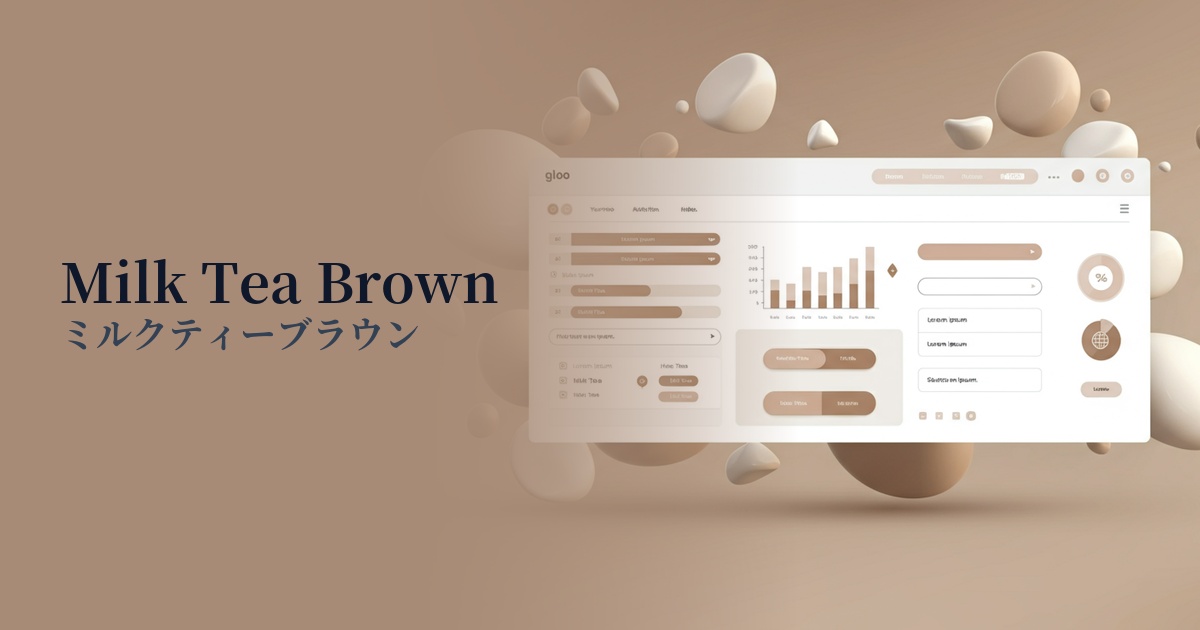
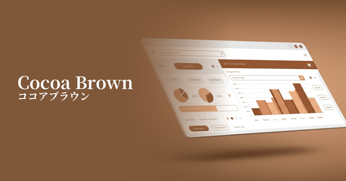
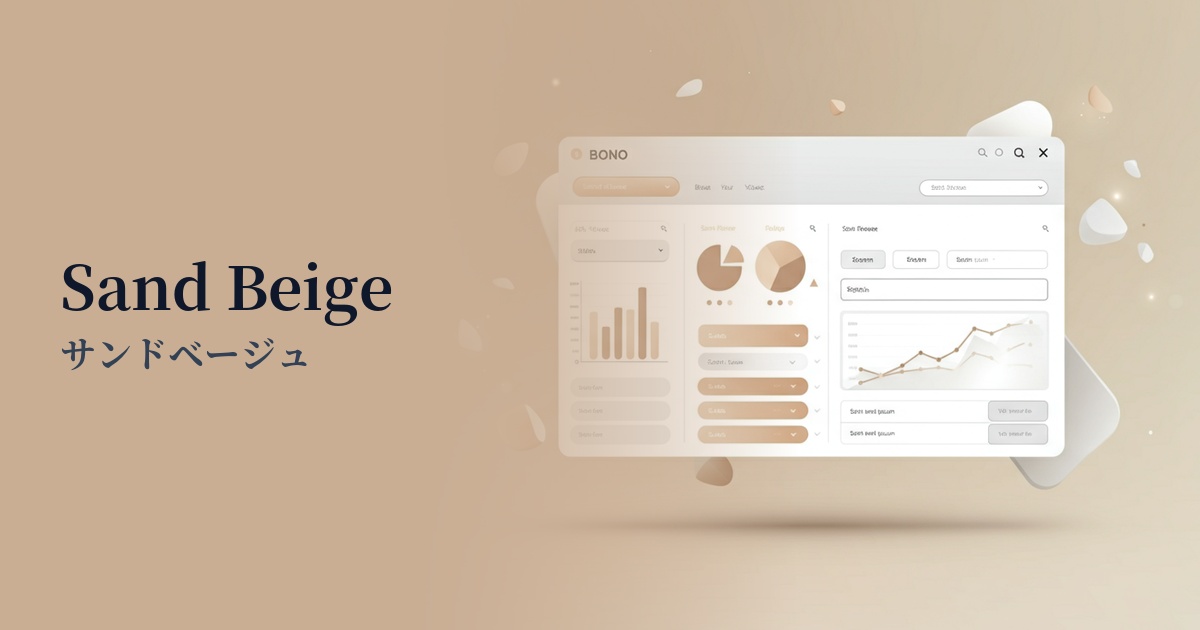
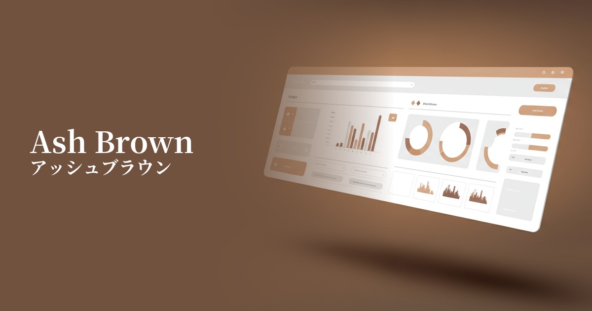
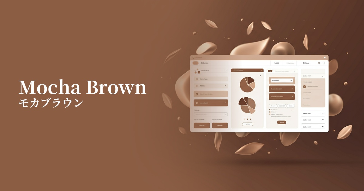
Visibility testing (UI component example)
Practical usage (best practices)
Using it as the background color for an entire website creates a calm and sophisticated atmosphere. In particular, combining it with off-white or cream creates a soft, eye-friendly contrast, resulting in a design that is less tiring to view for extended periods.
Using it for headings and subtitles, rather than as the main text color, can add depth and rhythm to your design. Because it creates a softer impression than black, it's effective when you want to convey a sense of approachability.
On e-commerce sites, this color can be used as a background color to highlight products or as the base color for card-style UIs. It's particularly effective at enhancing the appeal of products where quality and texture are important, such as organic cosmetics, handmade goods, and specialty coffee.
While using mocha brown for a CTA button isn't common, if the overall tone of the site is unified with natural colors, deliberately using it as a similar color rather than an accent color can create a subtle and elegant button design. In that case, it's important to clearly indicate the interaction, such as darkening the color on mouseover.
Recommended color scheme suggestions
Antique White (#FAEBD7)
The warm off-white color complements the gentleness of the mocha brown, creating an overall soft and elegant impression. It also offers high readability, making it ideal for background and text combinations.
Cadet Blue (#5F9EA0)
Combining the warm color mocha brown with the cool blue-gray enhances the beauty of both colors, resulting in a sophisticated and urban color scheme. It's a combination that conveys a sense of reliability and intelligence.
Sage Green (#9DC183)
The combination of earth tones creates a natural and comforting harmony. It brings a peaceful and vibrant atmosphere to websites themed around organic and wellness themes.