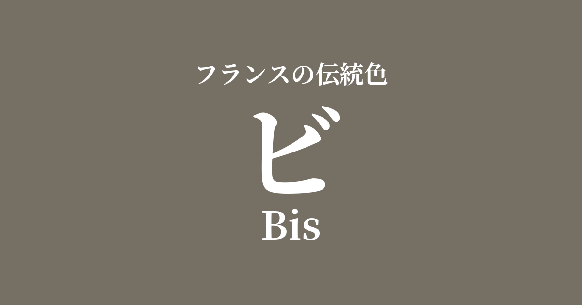
| French | Bis |
|---|---|
| Katakana | ビ |
| HEX | #766f64 |
| RGB | 118, 111, 100 |
What does "bi" mean? Origin and etymology
"Bis" is a French word meaning "second time" or "repeated." Its etymology traces back to the Latin word "bis" (twice).
As a color name, it has come to refer to the natural, undyed color of wool, or the muted, complex hues that result from dyeing wool once and then redyeing it. In contrast to vibrant colors, it is characterized by simple, subdued tones such as grayish-brown and flaxen.
These understated shades possess a quiet beauty distinct from ostentation, and over time, they have become deeply rooted in French color culture as refined, nuanced colors.
The historical background of Bi
In medieval Europe, vibrant colors required expensive dyes, making them a symbol of privileged classes such as royalty, nobility, and high-ranking clergy.
On the other hand, commoners and monks typically wore undyed fabrics or clothes dyed with readily available plant dyes. "Bi" represented the colors that were common in the daily lives of such people and was also considered a symbol of simplicity and humility. It is said to have been used particularly by religious orders that valued poverty.
As time progressed, from the 19th century onward, the Industrial Revolution led to the development of chemical dyes, allowing everyone to enjoy a wide range of colors. Conversely, natural, nuanced intermediate colors like "bi" began to be re-evaluated as chic and sophisticated. The profound depth hidden within their simplicity was discovered as a new aesthetic.
In the world of art and fashion
In the field of art, 19th-century Realist painters favored earth tones like "bi." For example, the simple yet powerful expression of this color can be seen in the peasant clothing depicted by Jean-François Millet, and in the landscapes and depictions of people's lives by Gustave Courbet. This color was indispensable for depicting reality as it is.
In the world of fashion, "beige" is a timeless classic color. It pairs exceptionally well with natural materials such as tweed, wool, and linen, bringing out the best in their textures. Incorporating it into autumn and winter coats, jackets, and knitwear creates an elegant and sophisticated look.
In recent years, with the rise of values such as minimalism and sustainability, this color has once again attracted attention as a symbol of natural and unadorned beauty.
Color scheme preview
This is to check the readability of the text when this color is used as the background.
Color scheme proposal for Bi
Blue Roi (#005998)
When combined with the noble royal blue, the simplicity of "Bi" is highlighted, and both colors gain depth. This color scheme gives a classic, intellectual, and highly refined impression.
Champagne (#f7e7ce)
The warmth of the "B" is emphasized when paired with a bright, soft champagne color. It creates a calm and comfortable space, giving off a natural and relaxed atmosphere.
Rose Pompadour (#ed82a1)
Adding the elegant and slightly sweet Rose Pompadour as an accent brings a touch of glamour to the subdued tones of "B". This color scheme gives a sophisticated yet feminine impression.
Practical Scenes
In interior design, using "B" on large areas such as walls, curtains, and sofas brings a sense of calm and warmth to a space. It pairs exceptionally well with wooden furniture and linen materials, harmonizing with a wide range of styles from natural and rustic to modern. It also functions as an excellent base color that enhances other colors.
In fashion, it possesses a timeless appeal that transcends trends, and it elegantly pulls together an entire outfit. It's recommended to incorporate it in high-quality materials such as wool coats and cashmere sweaters. Its versatility in pairing with various colors such as navy, burgundy, and off-white is also a major appeal.
In web design, using it as a background color allows you to create a site with a calm and soothing atmosphere that is easy on the eyes, while maintaining the readability of the content. It is particularly well-suited for brand websites that want to convey trustworthiness and authenticity, as well as shops that deal in natural materials.