| English name | Dusty Mint |
|---|---|
| Katakana | Dusty Mint |
| HEX | #B3D1C5 |
| RGB | 179, 209, 197 |
| Design Theme | Muted colors & earth tones |
Why is it a trend? (Background and reasons)
In recent years, natural color schemes that provide users with a sense of security and comfort have become popular in web design. In particular, muted colors and earth tones offer visual relief to modern people who experience digital fatigue. Dusty mint is one of the colors that perfectly symbolizes this trend.
Furthermore, the growing interest in sustainability and wellness is another reason why nature-inspired colors like dusty mint are becoming popular. These colors are being actively adopted to express the worldview of organic product e-commerce sites, environmental media, and healthcare-related services.
Alongside technological advancements, there's a growing demand for human warmth and analog textures. Dusty Mint is ideal for adding a touch of nostalgia and tactile feel to advanced UIs, achieving a design that strikes a perfect balance—modern yet not overly cold.
The psychological effects of design and UX
Dusty Mint combines the refreshing and clean feel of mint green with a grayish, muted tone, creating a calm and sophisticated impression. It provides users with a calm and reassuring psychological effect, delivering a pleasant user experience even in services where reliability is crucial or on screens with a large amount of information.
Because the colors are less saturated, they are less visually stimulating than vibrant colors, which can help users concentrate on the content. This helps reduce eye strain and create a stress-free operating environment in dashboards and web applications that are used for extended periods.
Because it's a color that evokes nature and plants, it can intuitively convey concepts such as organic, natural, and eco-friendly. It's also an effective choice when you want to express your brand's integrity and transparency.
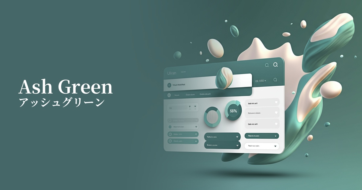
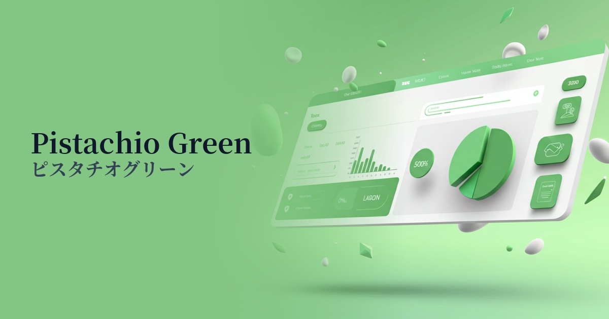
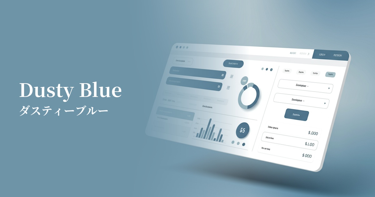
Visibility testing (UI component example)
Practical usage (best practices)
When used as the main background color, it brings a calm and sophisticated atmosphere to the entire site. In particular, when combined with a minimalist design that uses plenty of white space, it can accentuate an elegant and clean impression.
When used as a CTA (Call to Action) button, ensuring sufficient contrast against a white or off-white background can subtly encourage user action. However, care must be taken to ensure that the text color meets WCAG contrast ratio standards, such as choosing dark gray or black.
It's also effective to use it as an accent color for the background of a card-type UI, as a section divider, or as an icon color. Combining it with other neutral colors adds rhythm and depth to the design, making it easier to organize information.
In SaaS dashboards and management screens, colors can be used to highlight specific items in graphs or indicate active menus. This helps users intuitively grasp information and improves usability.
Recommended color scheme suggestions
Antique White (#FAEBD7)
By combining it with antique white, a warm off-white, you can create a very natural and gentle atmosphere. It's ideal for organic cosmetics and lifestyle websites, and the color scheme gives users a sense of security and comfort.
Slate Gray (#708090)
Combining it with the intelligent and calming slate gray creates a modern and trustworthy design. The addition of the softness of dusty mint gives it a refined feel without being too rigid. It is suitable for the UI of SaaS and business tools.
Rosy Brown (#BC8F8F)
Adding rosy brown, a reddish-brown color, as an accent creates an elegant and slightly feminine impression. This color scheme is recommended for fashion and beauty-related e-commerce sites where you want to express a sophisticated yet cute adult style.