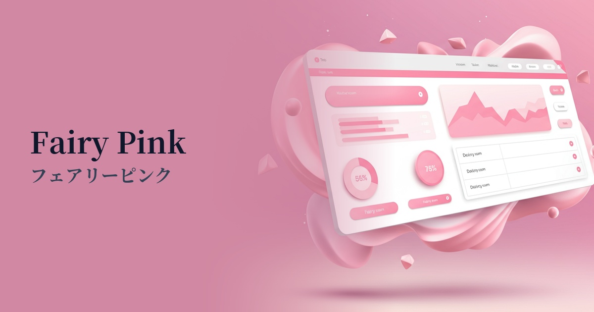
| English name | Fairy Pink |
|---|---|
| Katakana | Fairy Pink |
| HEX | #FFE4EB |
| RGB | 255, 228, 235 |
| Design Theme | Pastel & Macaron Colors |
Why is it a trend? (Background and reasons)
In recent years, web design has seen a shift from cold corporate colors to more humane, gentle, and positive color schemes. Fairy pink is one of the colors that symbolizes this trend of "soft UI" and "gentle design." Combined with its visually appealing appearance that looks great on social media, it is gaining popularity as a color that gives users a sense of familiarity and comfort.
While pink was once strongly associated with designs for women and children, the lightness and sophisticated hue of fairy pink have made it suitable for a wide range of fields, regardless of gender or age. In particular, it has been adopted in wellness, beauty, and creative startups and SaaS UIs, becoming a key color for creating a modern and comfortable user experience.
The psychological effects of design and UX
Fairy Pink psychologically evokes positive emotions such as "gentleness," "happiness," "compassion," and "romance." It also possesses a dreamy and fantastical atmosphere, which is expected to soothe the user's mind and create a positive first impression.
In UI/UX design, this color has the effect of alleviating user tension and anxiety. For example, using this color as an accent in complex settings screens or long input forms can reduce the psychological burden on the user and make the operation feel smoother.
Furthermore, because it also encompasses nuances such as self-affirmation and healing, it is highly suitable for designing services that want to demonstrate a supportive approach to users, such as mental health and wellness apps and charity websites. It helps visually convey the brand's spirit of "care" and "support."
Visibility testing (UI component example)
Practical usage (best practices)
Using it boldly as the main background color creates a soft and immersive atmosphere throughout the entire site. It's particularly effective for landing pages that want to convey a brand's worldview, or for creator portfolio sites. Using dark gray text over white text improves readability.
It's also recommended to use it as an accent color for highlighting CTA buttons, tags, and icons. Because it's not too overpowering, it gently guides the user's eye and encourages clicks. It's especially suitable for positive actions such as "add to favorites" or "watch later."
By combining it with delicate illustrations and bright photographs that capture plenty of light, you can bring out the gentle and sophisticated image of fairy pink to its fullest potential. Combining it with minimalist typography and a layout that makes good use of white space will give it an even more modern and clean impression.
Recommended color scheme suggestions
Slate Gray (#708090)
The sweetness of the fairy pink is balanced by the calming slate gray. This color scheme gives a sophisticated and modern impression while ensuring readability, making it ideal for content-driven websites and minimalist designs.
Mint Green (#98FF98)
When combined with mint green, it creates a fresh and vibrant impression reminiscent of spring. It's perfect for conveying a natural and healthy image, such as for organic products or wellness services.
Buttercup (#F3AD19)
Adding a bright buttercup yellow accent creates a playful and energetic pop design. It's perfect for children's services or creative brands that want to emphasize fun.