| English name | Morning Dew |
|---|---|
| Katakana | Morning Dew |
| HEX | #E3F3F1 |
| RGB | 227, 243, 241 |
| Design Theme | Neutral & Minimal Background Colors |
Why is it a trend? (Background and reasons)
In today's information-saturated digital environment, users are increasingly seeking calming designs with minimal visual noise. Morningdew functions as a quiet background to allow users to focus on the content itself, perfectly aligning with contemporary design trends that pursue minimalism and clean aesthetics.
The growing interest in digital well-being is a major reason for this color's popularity. Evoking the fresh morning air and misty landscapes, this color provides users with a sense of psychological tranquility and relaxation. For brands focusing on sustainability and harmony with nature, it's an ideal color to express their worldview.
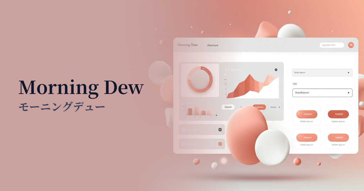
Morningdew is a perfectly balanced neutral color that combines technological advancement with human warmth. Unlike white or gray, which can often give a cold impression, its subtle blue-green hue evokes a sense of familiarity. For this reason, it is particularly favored for use in SaaS dashboards and healthcare-related services where functionality and reliability are paramount.
The psychological effects of design and UX
Calmness and Focus: Morning Dew's calming hues have a soothing effect on the user, making it easier to concentrate on the information on the screen. It reduces visual fatigue even during prolonged use, providing a comfortable user experience.
Cleanliness and Trustworthiness: This color conveys a clean and sophisticated impression, fostering trust in products and services. It is particularly effective in UI design for fields where accuracy and reliability are essential, such as healthcare, finance, and technology.
Sense of openness and lightness: It has the effect of bringing spaciousness and brightness to the space, and when combined with a minimalist layout, it creates an open and light interface. It does not create a sense of confinement and guides the user comfortably.
Novelty and sophistication: It has a modern and refined feel that sets it apart from ordinary white and gray. It gives the brand an image of being progressive and thoughtful, helping to differentiate it from the competition.
Visibility testing (UI component example)
Practical usage (best practices)
Using this as the background color for your entire website creates a consistent and clean aesthetic. It's especially ideal for minimalist portfolio sites where you want to highlight content, or brand sites where you want to subtly convey the appeal of your products.
By using it as the dashboard background for SaaS applications and analytics tools, you can improve the visibility of data and graphs while also reducing eye strain for users during long work sessions.
It's also effective to set this color as the background color for card-style UI elements such as blog post lists or e-commerce site product lists. It gently distinguishes information blocks and intuitively conveys the hierarchy of content. It also pairs perfectly with soft drop shadows.
By using it as the background for your main content and combining it with more saturated or darker colors as accents, you can make CTA buttons and important links stand out. Morningdew acts as a canvas that brings out the best in other elements.
Recommended color scheme suggestions
Charcoal (#36454F)
The bright, soft feel of Morningdew contrasts beautifully with the weighty feel of Charcoal. Using Charcoal for text and important UI elements allows you to achieve both excellent readability and a modern, trustworthy impression.
Terracotta (#E2725B)
The cool impression of Morning Dew, combined with the warm red of Terracotta, creates a natural and humane color scheme. It's perfect for expressing approachability and sophistication on websites for lifestyle brands and handcrafted products.
Cornflower Blue (#6495ED)
Adding a refreshing cornflower blue accent in a similar color scheme further enhances the clean and cutting-edge impression. This combination is effective for technology startups and healthcare apps that want to convey both trustworthiness and innovation.