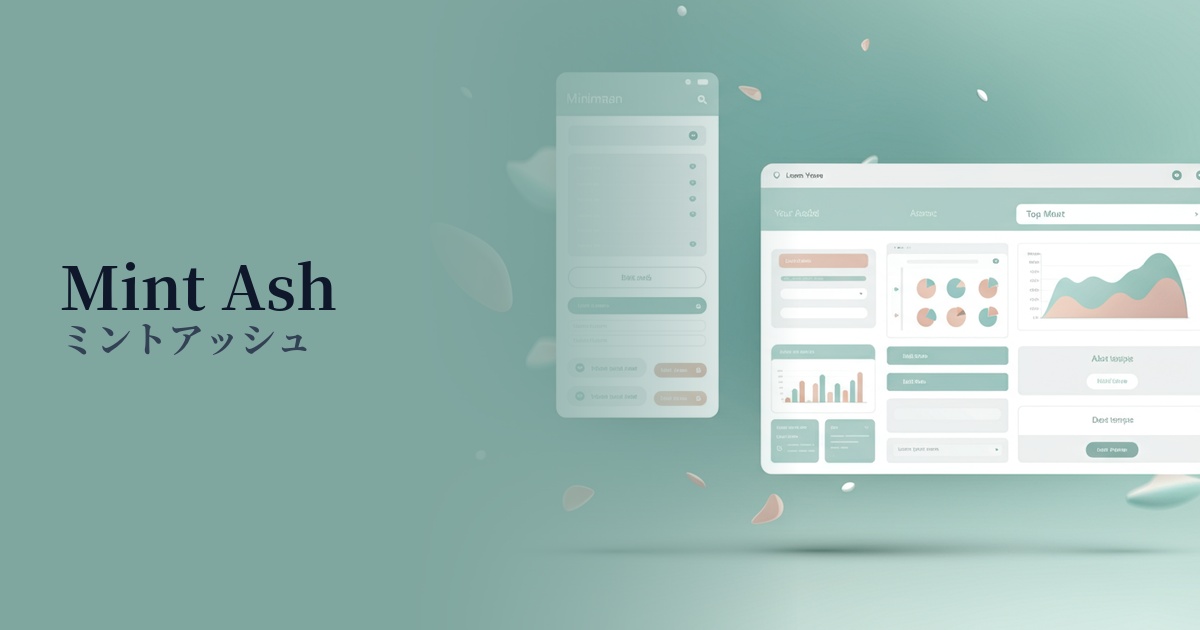
| English name | Mint Ash |
|---|---|
| Katakana | Mint Ash |
| HEX | #E2EAE6 |
| RGB | 226, 234, 230 |
| Design Theme | Neutral & Minimal Background Colors |
Why is it a trend? (Background and reasons)
In recent years, there has been a significant increase in interest in minimalism and sustainability in web design. Neutral colors like mint ash, which are not overly assertive, are a perfect match for minimalist layouts because they allow the content to take center stage while still giving a sophisticated impression. Furthermore, their nature-inspired hues are well-suited to expressing modern values such as the environment and wellness.
Another contributing factor is the growing awareness of digital well-being. We spend a significant amount of time each day in front of screens, and there is a demand for designs that are easy on the eyes and reduce visual strain. Bright, low-saturation colors like mint ash reduce glare compared to pure white, helping users comfortably view information for extended periods.
Furthermore, the theme of integrating technology and nature is also a trend. Even in cutting-edge SaaS and apps, there is a growing tendency to avoid a cold, impersonal impression and instead incorporate a more human and approachable atmosphere. Mint ash is being chosen by many designers as an exquisite color that balances a clean, modern impression with an organic and calm atmosphere.
The psychological effects of design and UX
Mint Ash combines the refreshing scent of mint with the calming effect of ash (gray), providing users with a sense of tranquility and security. In today's information-saturated digital environment, it is expected to have a calming and relaxing psychological effect.
This color gives a very clean and "clean" impression. Therefore, it can effectively convey brand image on websites and apps in fields where hygiene and reliability are important, such as healthcare, medicine, organic cosmetics, and food.
Mint ash is characterized by its understated yet sophisticated and elegant atmosphere. When used in minimalist portfolio websites, e-commerce sites handling high-quality products, or lifestyle brands, it creates a modern and intellectual worldview.
The colors, reminiscent of plants and morning mist, are strongly associated with images of "nature" and "organic." By incorporating them into the corporate websites of companies that prioritize sustainability or into the designs of brands that use natural materials, these values can be visually expressed.
Visibility testing (UI component example)
Practical usage (best practices)
The most effective use of this color is as the background color for the entire website. It doesn't interfere with the content, maintains text readability, and brings a sense of unity and a clean feel to the entire site. This is especially effective for blogs and news sites with a large amount of information.
Mint ash excels at enhancing other colors. Combining it with vibrant coral pink or yellow as accent colors makes those colors stand out more, effectively guiding the user's attention. It's a good choice for CTA buttons and important notifications.
In UI design, it's recommended to use mint ash as the background color for card-type layouts or as a color to separate sections. By creating areas of mint ash within a white background, information is organized and a visual rhythm is created. Users can more easily intuitively understand the structure of the information.
It's ideal for interfaces that users spend long periods of time using, such as SaaS dashboards and management screens. By reducing eye strain and making it easier to concentrate on important data, graphs, and notifications, it contributes to improved usability.
Recommended color scheme suggestions
Slate Gray (#708090)
The soft impression of mint ash is given a sophisticated and calming edge by slate gray. It creates a trustworthy and professional atmosphere, making it ideal for designs where you want to convey a solid impression, such as business websites and SaaS UIs.
Rosy Brown (#BC8F8F)
Combining it with skin-friendly rosy brown adds warmth and gentleness. This color scheme is recommended for expressing a friendly and comfortable worldview on organic cosmetics and lifestyle brand websites.
Coral (#FF7F50)
By adding vibrant coral accents to a calming mint ash, the overall design gains a lively and modern feel. It's effective when used for CTA buttons and important links to capture the user's attention.