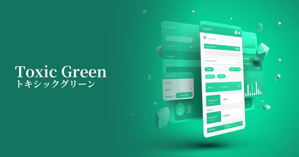
| English name | Toxic Green |
|---|---|
| Katakana | Toxic Green |
| HEX | #7FFF00 |
| RGB | 127, 255, 0 |
| Design Theme | Neon & Cyberpunk Colors |
Why is it a trend? (Background and reasons)
Recent design trends show a growing interest in the digital world and cyberpunk culture. Toxic green has attracted attention as a symbolic color of this trend. As advanced technologies such as virtual reality (VR) and AI become more commonplace, surreal and stimulating colors are stimulating users' senses.
Another contributing factor is the resurgence of appreciation for the retro-futuristic aesthetic that was popular from the 80s to the 90s. The neon colors frequently used in video games and science fiction films of that era are a fresh source of inspiration for contemporary creators. Toxic green, as a unique color that can express both nostalgia and a sense of the future at the same time, gives websites and apps a distinctive worldview.
The psychological effects of design and UX
Toxic green, as its name suggests, is a provocative color that evokes the image of "poison," but in design, it conveys positive impressions such as "innovation," "energy," and "a sense of the extraordinary." It has the psychological effect of strongly attracting the user's attention and being easily remembered.
From a UI/UX perspective, this color offers very high visibility. However, due to its high saturation, using it extensively can strain the eyes and tire users. Therefore, it is most effective when used as an accent color to highlight important actions or information.
It has a strong affinity with brand images in fields such as technology, entertainment, games, or street fashion, making it an ideal choice when you want to express an innovative and bold stance.
Visibility testing (UI component example)
Practical usage (best practices)
It's most effective when used in call-to-action (CTA) buttons. Placing a toxic green button on a dark background naturally guides the user's gaze and encourages clicks.
You can use it as an accent color throughout your website, applying it to hover effects for link text, active navigation menus, or specific icons. This allows users to intuitively understand what they can interact with.
In SaaS dashboards, you can highlight important data by using this color to highlight parts of graphs and charts. However, avoid using it extensively as a background color; the key to sophisticated design is to use it only as a "spice" to grab the user's attention.
Using it as part of a tagline or as an accent color in an illustration in the first view of a landing page (LP) can instantly capture the visitor's attention and instill an image of the brand's cutting edge.
Recommended color scheme suggestions
Charcoal (#36454F)
By using toxic green against a dark charcoal gray background, you can most effectively express a cyberpunk or futuristic worldview. The high contrast ensures visibility, and the vibrancy of the green stands out, creating a modern and powerful color scheme.
Deep Pink (#FF1493)
The combination with deep pink, which is close to its complementary color, is a very bold and energetic color scheme reminiscent of 80s synthwave. It's perfect for highly entertaining content or when you want to project a strong personality.
Dove Gray (#6D6F6E)
By combining it with a slightly lighter dove gray, the intensity of toxic green is softened, creating a sophisticated impression. This well-balanced color scheme is suitable when you want to create a clean, calm atmosphere while still maintaining a technological feel.