| English name | Apricot Beige |
|---|---|
| Katakana | Apricot Beige |
| HEX | #E6C5B3 |
| RGB | 230, 197, 179 |
| Design Theme | Muted colors & earth tones |
Why is it a trend? (Background and reasons)
In recent years, web design has seen a demand for colors that reduce visual fatigue from prolonged use of digital devices and provide a sense of comfort. Apricot beige is a type of earth tone reminiscent of the earth and human skin, giving users an unconscious sense of security and tranquility. This growing interest in a return to nature and wellness is a major factor driving this trend.
While minimalism is becoming mainstream, there is also a growing need to avoid monotony and coldness, and to add a human warmth. Apricot beige brings a subtle hint of color and brightness to basic beige, achieving both a sophisticated impression and approachability. This gives emotional depth to minimalist designs and allows for a rich expression of the brand's story.
This color is neither as sweet as pink nor as assertive as orange, making it easily accepted by a wide range of users regardless of gender. In today's world, where inclusive design is highly valued, it is increasingly being adopted in many services and products as a color that enables neutral expression without bias towards any particular gender.
The psychological effects of design and UX
Apricot Beige, with its hue close to human skin tone, evokes an instinctive sense of familiarity and comfort in users. This psychological effect is particularly effective in fields such as wellness, healthcare, and counseling, where building trust with users is crucial.
Low-saturation, muted tones create an elegant and sophisticated impression. When used by luxury lifestyle brands, cosmetics companies, or minimalist portfolio websites, they help enhance the texture of products and works, and build a premium brand image.
The non-aggressive and calming color scheme is expected to alleviate users' psychological tension and allow them to concentrate on the content in a relaxed state. This reduces stress and provides a comfortable experience in UIs where users spend long periods of time, such as information-heavy websites and learning platforms.
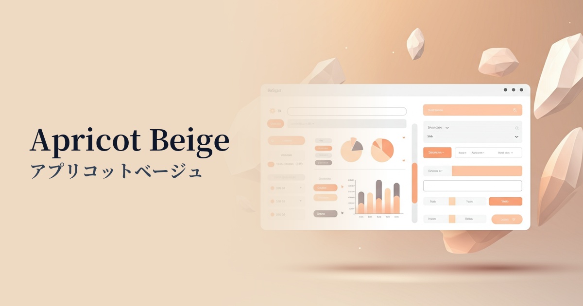
Visibility testing (UI component example)
Practical usage (best practices)
Using this as the background color for your entire site brings a warm and calming atmosphere to the space. Compared to a pure white background, it is less tiring on the eyes, resulting in a user interface that is less tiring even during long periods of browsing. It is especially recommended for text-heavy blogs and media sites.
When used as the background for the main content area or card-type components, it beautifully enhances accent colors such as dark green, terracotta, and navy. This creates color contrast, making important elements stand out.
Because it's not too assertive, it's suitable for intermediate CTA (Call to Action) buttons that don't put too much pressure on the user, such as "Learn More" or "Request Information." Using this color for a second option while making the main purchase button a more prominent color creates a rhythm in the UI.
It is effective when used as a key color on landing pages (LPs) for cosmetics, wellness products, food products, etc. It visually conveys the organic worldview and the story of a mindful lifestyle associated with the product, and it blends very well with photos and illustrations.
Recommended color scheme suggestions
Slate Gray (#708090)
The warmth of apricot beige and the sophisticated, cool impression of slate gray create a perfect balance. This color scheme creates a modern and refined atmosphere, making it ideal for B2B services and portfolio websites where trustworthiness is essential.
Terra Cotta (#E2725B)
Adding terracotta accents, which are also in the earth tones, creates a warmer and more energetic impression. It emphasizes a natural and organic feel, adding depth and vibrancy to lifestyle brands and craft product websites.
Avocado (#568203)
The soft, warm tones of apricot beige and the fresh hues of avocado green complement each other beautifully. This creates a natural and healthy image, bringing vitality and tranquility to wellness and organic food websites.