| English name | Neutral Blue |
|---|---|
| Katakana | Neutral Blue |
| HEX | #BFDBFE |
| RGB | 191, 219, 254 |
| Design Theme | UI System & Alert Colors |
Why is it a trend? (Background and reasons)
The popularity of neutral blue stems from the recent trend towards minimalism and clean aesthetics in web design. In today's information-saturated digital environment, users increasingly seek visual tranquility and a sense of security. This color, which conveys a calm and soothing impression that meets these needs, is being adopted in many interfaces.
This color has become increasingly popular, especially on the websites of SaaS products and technology companies. Neutral blue is highly effective in conveying reliability, intelligence, and professionalism. While not flashy, it helps build a solid brand image that promises consistent service delivery.
Furthermore, growing interest in user experience (UX) and accessibility is also driving this trend. Neutral blue is easy on the eyes and less tiring to use for extended periods. In addition, it has the practical advantage of making it easier to adjust the contrast with other colors, thus facilitating the creation of highly visible designs.
The psychological effects of design and UX
Neutral blue psychologically evokes feelings of calmness, composure, and trust. It is expected to give users a sense of security and allow them to calmly receive information. Therefore, it is suitable for dashboards that handle complex information and UIs for services where accuracy is essential.
This color also conveys an intelligent and clean impression. Because it evokes images of the sky and clear water, it can create a sense of openness and transparency. Using it on B2B service, financial, or medical websites effectively communicates a clean and professional image, making it easier to gain user trust.
From a UI/UX perspective, this color serves as a "non-intrusive color." Because it's not overly assertive, it's ideal as a background color to highlight content and important data. It contributes to creating a clean, uncluttered interface that allows users to focus on their tasks.
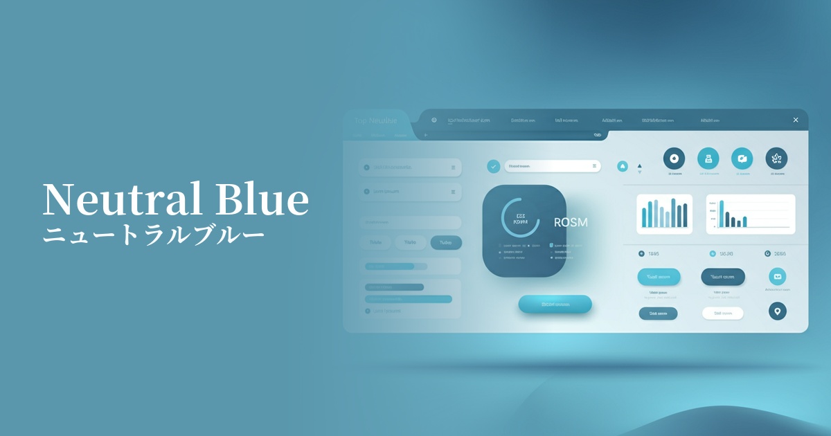
Visibility testing (UI component example)
Practical usage (best practices)
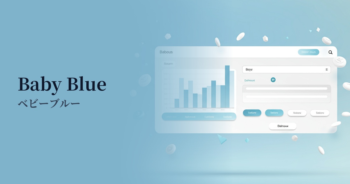
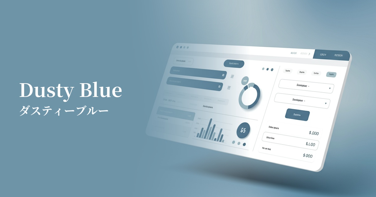
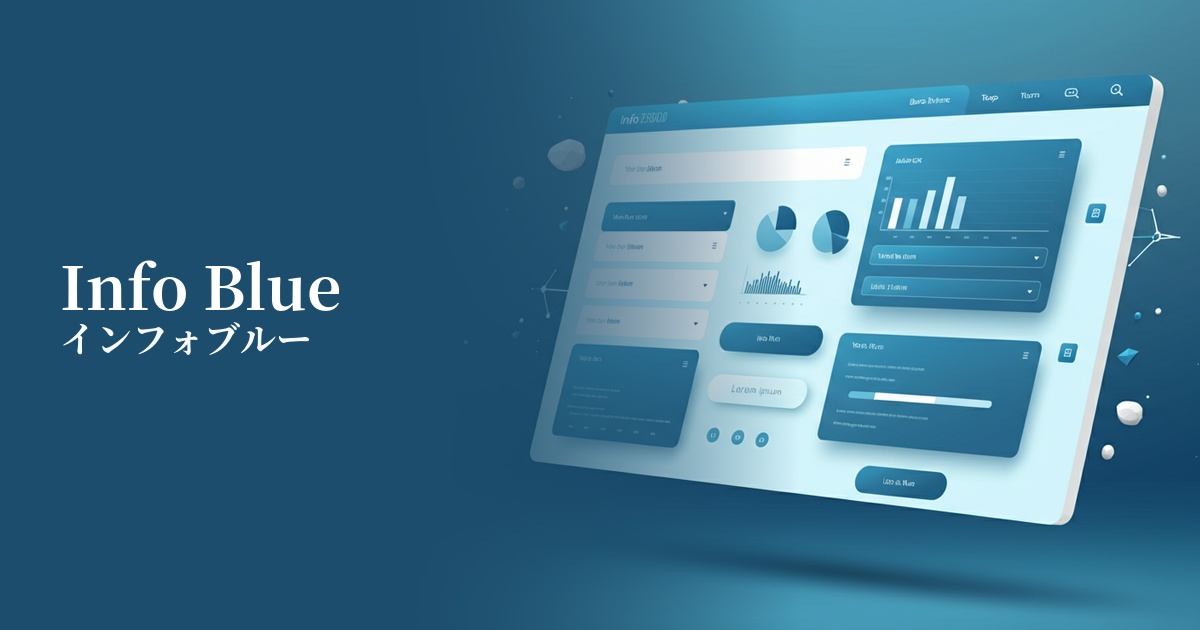
One of the most effective use cases is the background color of dashboards and admin screens in SaaS applications. For users who stare at the screen for extended periods, it reduces eye strain and allows for clearer display of data elements such as graphs and tables.
It's also ideal for alerts and notification banners that convey "Information" in UI systems. It plays a role in gently communicating information that isn't as urgent as "Success" green or "Warning" yellow, but that you want users to know.
In minimalist designs based on white or light gray, this color is also recommended as an accent color. For example, using this color for primary buttons or link text can subtly guide user actions effectively.
Another way to use it is to boldly incorporate it as a background color in the hero area of your corporate website or landing page. When combined with high-quality photographs and sophisticated typography, it can create a fresh and modern first impression and visually convey the company's credibility.
Recommended color scheme suggestions
Charcoal (#36454F)
When combined with dark charcoal gray, it improves text readability and creates an intelligent and sophisticated impression. It helps build a trustworthy and modern design, ideal for SaaS UIs and corporate websites.
Sandy Brown (#F4A460)
Adding a warm, sandy brown accent gives the overall design a friendly and natural feel. The calmness of the blue is complemented by a human warmth, creating a pleasant impression.
Dove Grey (#6A6A69)
When combined with soft dove gray, it creates a very delicate and elegant tone. Because the colors are not overpowering, it's ideal when you want the content to be the focus. Recommended for creating a minimalist and elegant atmosphere.