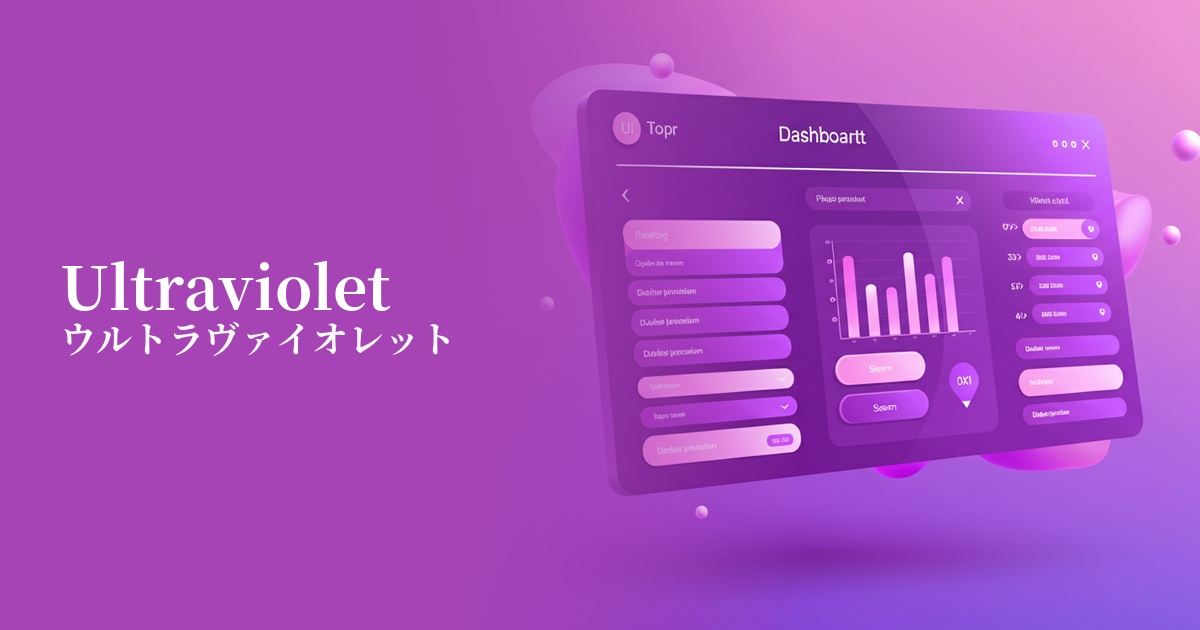
| English name | Ultraviolet |
|---|---|
| Katakana | Ultraviolet |
| HEX | #9400D3 |
| RGB | 148, 0, 211 |
| Design Theme | Neon & Cyberpunk Colors |
Why is it a trend? (Background and reasons)
Ultraviolet gained global attention in 2018 when it was named PANTONE's "Color of the Year." Its influence continues to this day, and it has a particularly strong presence in the digital realm.
In recent years, the science fiction aesthetics of the 80s and 90s, such as cyberpunk, retrofuturism, and vaporwave, have been re-evaluated. Ultraviolet is being adopted by many creators as the perfect color to express this surreal and nostalgic worldview.
Furthermore, the widespread adoption of dark mode UI is a major contributing factor. This color, which stands out vividly against a dark background, is highly effective as an accent color. It plays a vital role in branding services and products themed around advanced technologies such as the metaverse, VR, and AI, symbolizing a sense of the future and innovation.
The psychological effects of design and UX
Ultraviolet evokes an impression of mystery, originality, and futurism. With a long history of being treated as a noble and spiritual color, it possesses a mysterious depth and a sense of luxury.
In UI/UX design, it has the effect of stimulating user curiosity and increasing anticipation for unknown experiences. When used on creative tools, entertainment services, or websites dealing with cutting-edge technology, it can strongly leave a lasting impression of the brand's uniqueness and worldview.
However, because it is a highly saturated and striking color, overuse can cause visual fatigue in users. From an accessibility standpoint, careful consideration is required when using it as a text color, such as ensuring sufficient contrast with the background color.
Visibility testing (UI component example)
Practical usage (best practices)
The most effective use is as an accent color. By limiting its use to a range of approximately 5-101 TP3T across the entire site, and focusing on elements such as CTA buttons, important icons, and hover effects, you can naturally guide the user's gaze and encourage action.
In designs that utilize dark mode, using ultraviolet as a key color can be a good idea. By placing ultraviolet against a black or dark blue background, the light will stand out, creating an immersive, cybernetic space.
A classic technique for bringing out the appeal of this color is to create gradients that combine it with pink or blue tones. By incorporating it into the background of the hero area or decorating the card-type UI, you can easily create trendy and dynamic visuals.
In creator portfolio websites and art and music event sites, this color is sometimes used as the main color to express the brand's individuality. In such cases, the key is to maintain a sophisticated impression by using ample white space and keeping other elements simple.
Recommended color scheme suggestions
Gold (#FFD700)
This color scheme uses colors that are close to complementary, strongly enhancing each other. The mystique of ultraviolet is combined with the luxurious feel of gold, giving the impression of a premium technology brand that is both cutting-edge and dignified.
Deep Pink (#FF1493)
This is a classic combination that perfectly captures the cyberpunk aesthetic. Against a dark background, these two colors glow like neon lights, evoking the nighttime cityscape of a futuristic city. It's ideal for entertainment and music event promotional websites.
Slate Gray (#708090)
This color scheme features a vibrant ultraviolet, firmly supported by a calming slate gray. It's effective when you want to maintain a cutting-edge feel while also conveying reliability and stability, and it gives a sophisticated impression in SaaS dashboards and other applications.