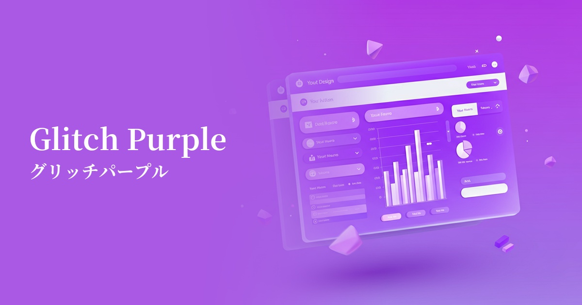
| English name | Glitch Purple |
|---|---|
| Katakana | Glitch Purple |
| HEX | #A020F0 |
| RGB | 160, 32, 240 |
| Design Theme | Neon & Cyberpunk Colors |
Why is it a trend? (Background and reasons)
The rise of glitch purple stems from the resurgence of cyberpunk culture and the growing interest in digital spaces such as the metaverse and VR. This color embodies the concept of "glitch," reminiscent of digital errors and bugs, and is being embraced as a somewhat unstable, human-like digital expression that isn't perfect. It's characterized by a futuristic yet somewhat nostalgic retro-futuristic atmosphere.
In recent years, design trends have been dominated by minimalism and neutral colors, but there is a growing need to create a distinctive and memorable brand image. Vibrant, surreal hues like glitch purple instantly capture the user's attention and have the power to strongly convey innovation and cutting edge. They are being adopted particularly in the technology and entertainment sectors as a strategic move to differentiate oneself from competitors.
The psychological effects of design and UX
Glitch Purple is a color that symbolizes mystery, creativity, and futuristic energy. The noble color purple, combined with the instability of digital technology, creates an innovative image that breaks down conventional norms. It evokes a sense of anticipation and excitement in users, as if something new is about to begin.
From a UI/UX perspective, this color has a very strong attention-grabbing effect. It is extremely effective when you want to draw the user's attention to a specific element (for example, an important call-to-action button). However, because of its strong stimulus, overuse can potentially tire the user. Also, due to its vibrancy, care must be taken with the contrast ratio with the background color, and it is a color that requires careful consideration of accessibility.
Visibility testing (UI component example)
Practical usage (best practices)
The most effective use of this color is as an accent color. On a dark-themed website, using it selectively on buttons, icons, links, and active menu items makes those elements stand out and intuitively guides the user. Because it naturally draws the user's eye, it can also lead to improved conversion rates.
When using it as a background, it's recommended to use a gradient with black or dark blue rather than filling it in with a single color. This softens the impact of the color while creating depth and immersion in the space. When used as a background for hero areas or cards, it dramatically enhances the content.
Glitch Purple truly shines in technology and creative fields such as SaaS dashboards, music and video event websites, and digital artist portfolios. However, avoid using it as a text color for long passages where readability is crucial.
Recommended color scheme suggestions
Cyan (#00FFFF)
The combination of Glitch Purple and Cyan is a classic color scheme that symbolizes the cyberpunk aesthetic. The intense contrast creates a futuristic atmosphere and strongly attracts the user's attention. When used as an accent in a dark theme, it completes an immersive design.
Charcoal (#36454F)
Placing glitch purple against a deep charcoal gray background makes the vibrancy of the purple stand out, creating a sophisticated impression. This is recommended for SaaS UIs and portfolio sites where you want to balance visibility with a sense of luxury and technology.
Silver (#C0C0C0)
Combining it with silver softens the intense impression of glitch purple, adding a clean and modern feel. It's perfect for when you want a futuristic yet slightly more subdued tone, making it more appealing to a wide range of users.