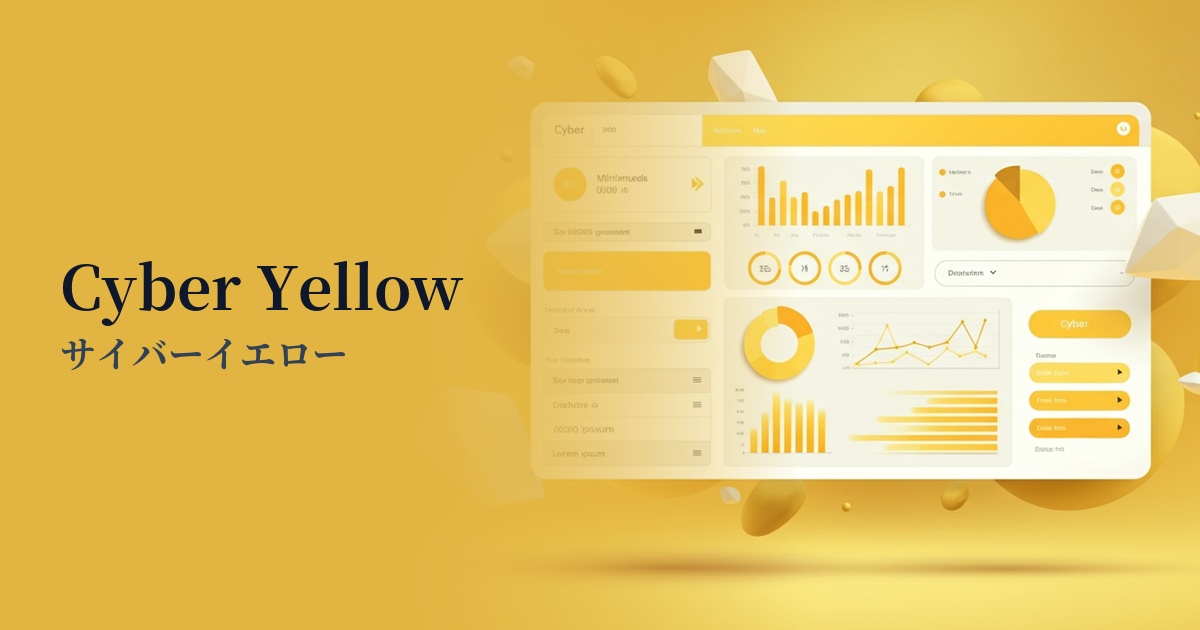
| English name | Cyber Yellow |
|---|---|
| Katakana | Cyber Yellow |
| HEX | #FFFF00 |
| RGB | 255, 255, 0 |
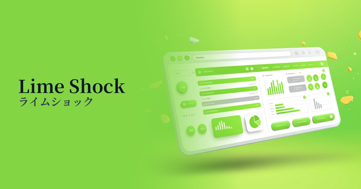
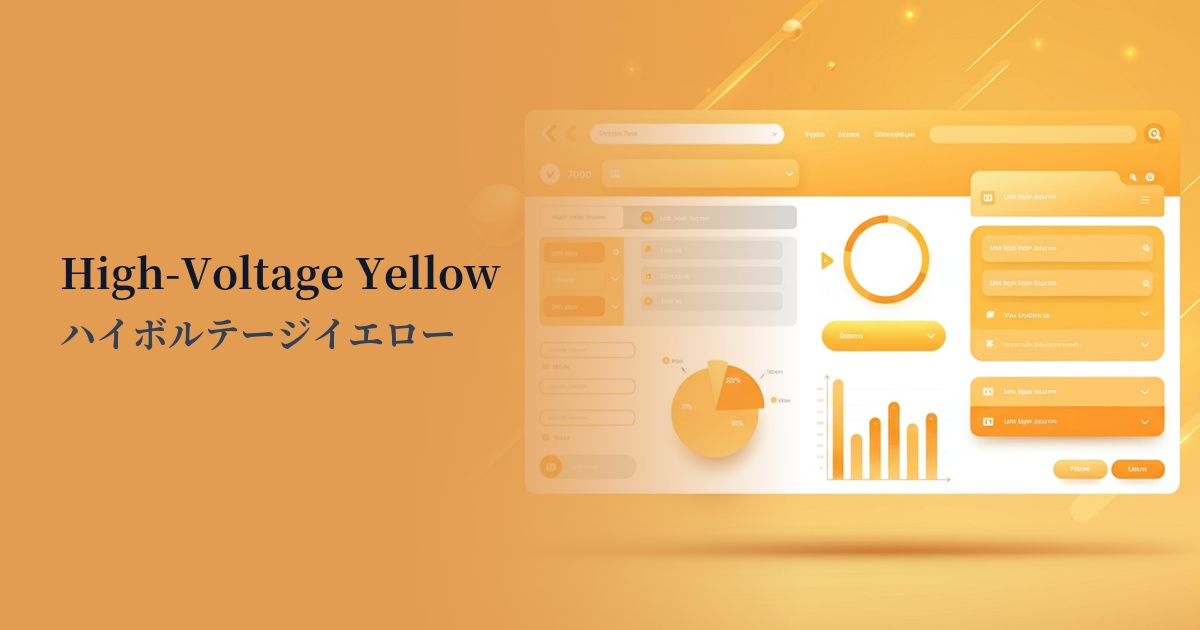
| Design Theme | Neon & Cyberpunk Colors |
Why is it a trend? (Background and reasons)
The rise of cyber yellow stems from the revival of cyberpunk culture and Y2K fashion from the 80s and 90s. The retro-futuristic worldview is being embraced as something fresh, particularly by Generation Z, the digital natives, and cyber yellow is being incorporated into web design as a symbolic color of this trend.
Furthermore, advancements in technologies such as AI and the metaverse are also driving this trend. It is the perfect color to represent surreal, digital spaces, and its intense visual impact makes it a powerful tool for brands looking to grab users' attention and differentiate themselves from other services in today's information-saturated world.
The psychological effects of design and UX
Cyber Yellow conveys a sense of energy, innovation, and speed. Using it for technology-based services or creative portfolios helps build a cutting-edge and dynamic brand image.
This color is one of the brightest colors perceived by the human eye and has a very powerful attention-grabbing effect. In UI design, using it exclusively for CTA buttons, important notifications, and sales information naturally guides the user's gaze and contributes to improving conversion rates.
On the other hand, its high saturation and brightness also present accessibility challenges. Using it extensively as a background color can cause eye strain and significantly impair readability. In particular, it is almost impossible to maintain a contrast ratio with white or light-colored text, so it is essential to always combine it with dark colors such as black or dark blue.
Visibility testing (UI component example)
Practical usage (best practices)
The most effective way to use it is as an accent color. Limiting its area to approximately 1-51 TP3T across the entire site will maximize its impact. It's recommended for use in CTA buttons, icons, link hover effects, and highlighting important keywords.
It works especially well with dark mode UI designs. Placing cyber yellow against a black, charcoal gray, or dark blue background creates a futuristic, sci-fi movie-like atmosphere while ensuring excellent visibility.
It would also be good to incorporate it as part of a gradient in the background of a hero area or as a divider for a specific section. Combining it with other cyberpunk-style neon colors (such as magenta or cyan) will create a richer, more three-dimensional visual.
Recommended color scheme suggestions
Charcoal (#36454F)
The vibrant cyber yellow stands out beautifully against the dark background, dramatically improving visibility. This classic cyberpunk color scheme emphasizes a futuristic and sophisticated feel, making it ideal for technology websites and dark mode UIs.
Royal Blue (#4169E1)
Combining yellow with blue tones, which are close to its complementary color, enhances the contrast between the two colors, creating an energetic and dynamic impression. This color scheme, while cutting-edge, also conveys a sense of trustworthiness, making it ideal for startup websites.
Deep Pink (#FF1493)
The combination of neon colors creates a retro-futuristic atmosphere reminiscent of the 80s or synthwave. The result is a pop and playful impression, perfect for making entertainment and fashion-related websites stand out.