| English name | High-Voltage Yellow |
|---|---|
| Katakana | High Voltage Yellow |
| HEX | #FFD700 |
| RGB | 255, 215, 0 |
| Design Theme | Neon & Cyberpunk Colors |
Why is it a trend? (Background and reasons)
Moving away from the subdued tones of minimalism, the world of web design now demands bolder and more expressive colors. The trend of using vibrant colors to uplift moods, much like "dopamine dressing," has spread to the digital space. Among these, high-voltage yellow is particularly noteworthy for its ability to attract user attention and convey positive energy.
The resurgence of retro-futuristic aesthetics, such as Y2K fashion and cyberpunk, is a major reason for this color's popularity. It has a strong affinity with themes like digital, technology, and the future, and possesses the power to instantly convey the worldview of innovative services and creative brands. In today's information-saturated websites, it becomes a powerful tool for standing out.
The psychological effects of design and UX
High Voltage Yellow, as its name suggests, is a color that symbolizes "energy," "vitality," and "optimism." It instantly captures the user's attention and encourages action. It evokes positive emotions such as fun and excitement, bringing a lively atmosphere to the entire site.
In UI/UX design, it also functions as a warning or attention sign. Just like in traffic lights and signs, it can intuitively convey the message, "Pay attention here." By leveraging this psychological effect and applying it to important notifications and conversion points, you can effectively guide user actions.
Furthermore, this color is associated with concepts such as "innovation," "creativity," and "ideas." Like the image of a light bulb illuminating a moment of inspiration, it is often adopted by cutting-edge technology companies and creative agencies to showcase their modern and forward-thinking approach.
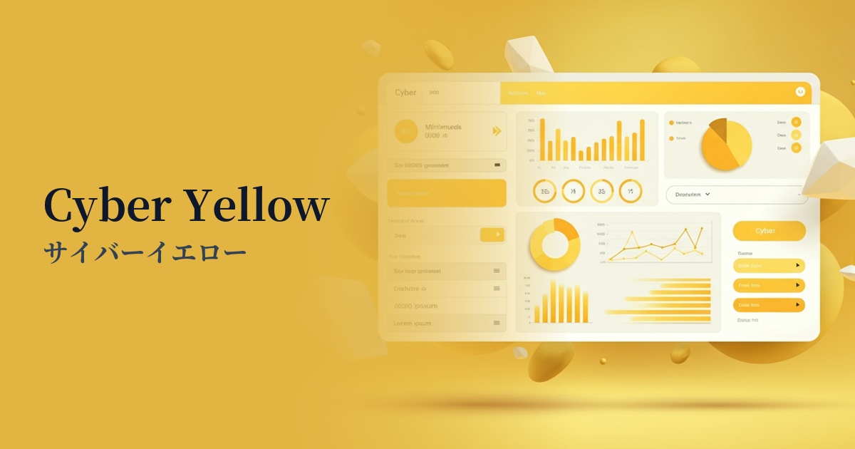
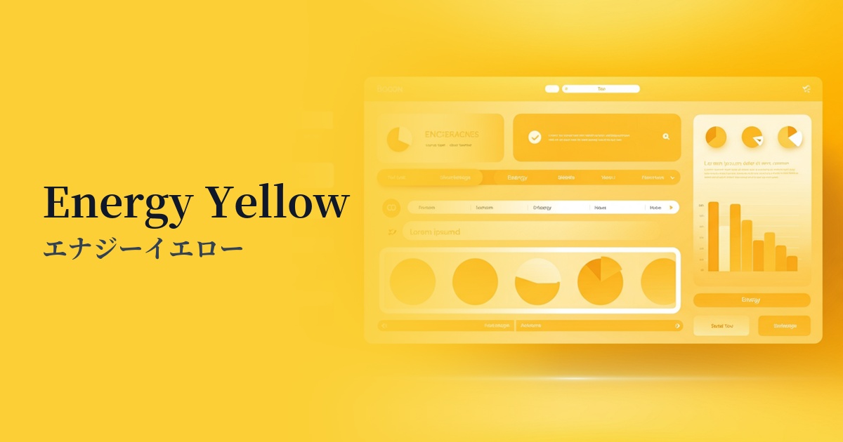
Visibility testing (UI component example)
Practical usage (best practices)
The most effective use case is as a CTA (Call To Action) button. Especially when placed against a dark mode UI or a dark background, its high saturation and brightness make it stand out, contributing to an increased click-through rate. It clearly indicates the next action the user should take.
It's recommended to use it as an accent color of around 5-10% throughout the entire site. By limiting its use to icons, active navigation links, heading highlights, and form focus states, a visual hierarchy is created, allowing users to efficiently follow information.
If you want to make a bold impression, it's effective to apply it to the hero section or key visual background of your landing page, or to large typography. It can express your brand's confidence and energy, leaving a strong first impression on visitors. However, when using it extensively, you need to carefully consider the balance with other elements.
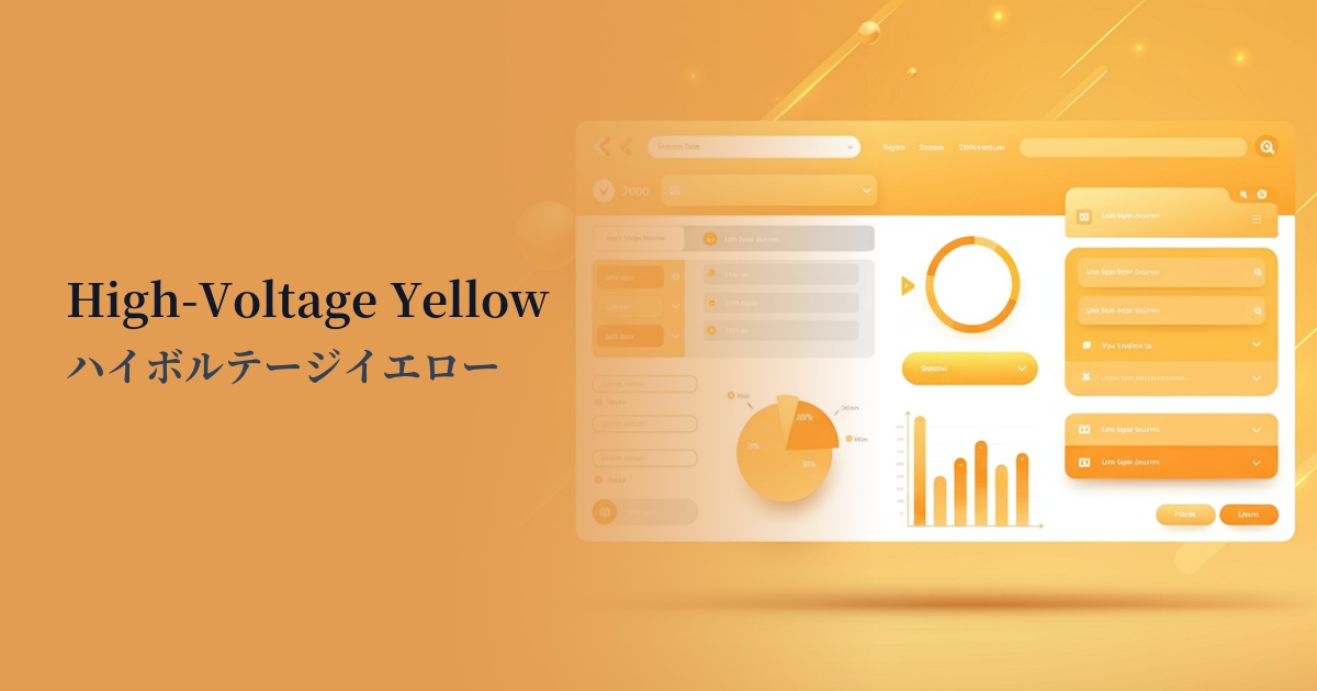
In data visualization, this color is useful for highlighting specific important data. Using this color in graphs and charts guides the user's gaze to specific insights, aiding in information comprehension. However, when overlaying text, it is essential to ensure a sufficient contrast ratio.
Recommended color scheme suggestions
Charcoal (#36454F)
Using charcoal gray as a background and high-voltage yellow as an accent dramatically improves visibility. This creates a sophisticated and refined impression, making it a trustworthy color scheme ideal for SaaS UIs and technology-related websites.
Fuchsia (#FF00FF)
The combination with fuchsia strongly evokes cyberpunk and Y2K aesthetics. Its bold and energetic impression leaves a lasting and powerful impact on users in event websites and creative portfolios.
Gainsboro (#DCDCDC)
The bright Gainsboro base color, accented with high-voltage yellow, creates a clean and modern space. It's recommended for e-commerce sites and content-driven blogs that want to add vibrancy and playfulness to a minimalist design.