| English name | Muted Mauve |
|---|---|
| Katakana | Mute Mauve |
| HEX | #B2A1B1 |
| RGB | 178, 161, 177 |
| Design Theme | Muted colors & earth tones |
Why is it a trend? (Background and reasons)
In recent years, natural and calming tones that provide users with a sense of security and comfort have become mainstream in the world of web design. Mute mauve is one of the colors that symbolizes this trend. The main reason this color is attracting attention is the growing demand for a more human and warm digital experience, moving away from overly saturated colors and impersonal monochromes.
In particular, as values such as wellness, sustainability, and mindfulness permeate society as a whole, there is a growing demand for a calm and thoughtful impression in website and app designs. Mute mauve combines the calmness of lavender with the sophistication of gray, and while not flashy, it exudes a quiet yet certain presence, perfectly matching contemporary aesthetics.
The psychological effects of design and UX
Muted mauve conveys a sense of tranquility, sophistication, and elegance to the user. This color, a fusion of the mystery and creativity of purple with the neutrality and calmness of gray, has the effect of bringing psychological peace to the viewer.
In UI/UX design, using this color for backgrounds and key components can reduce the user's visual burden and create an environment where they can easily focus on the content. This is especially useful in blogs, portfolios, and wellness-related apps where users may spend a long time, helping to alleviate user stress and build trust.
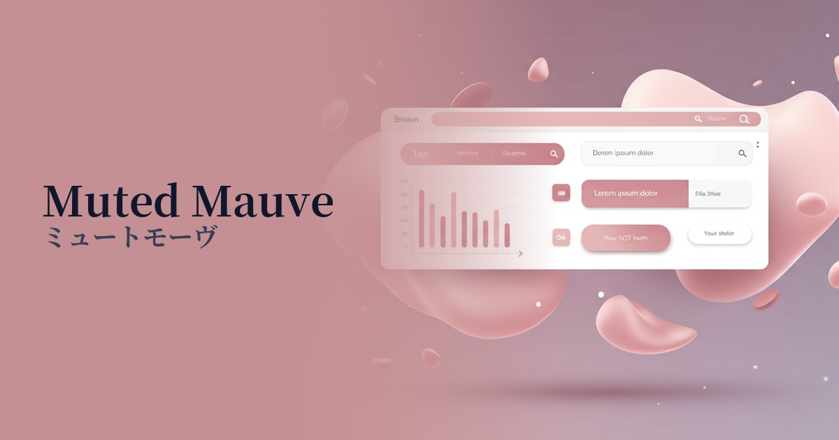
Visibility testing (UI component example)
Practical usage (best practices)
Mute Mauve is highly versatile and can be used in a variety of situations. When used as the background color for an entire site, it softly envelops the entire content, creating an elegant and calming atmosphere.
It can also be effective to use it as an accent color rather than as the main color. For example, using muted mauve for buttons, icons, or specific card components in a minimalist design with a white background can gently guide the viewer's eye while adding depth and sophistication to the design.
When used in information-heavy interfaces such as SaaS dashboards and settings screens, it reduces visual clutter and allows users to concentrate on their tasks. Furthermore, it's ideal as an elegant background color to enhance the appeal of products on lifestyle e-commerce sites such as fashion, cosmetics, and interior design websites.
Recommended color scheme suggestions
Charcoal (#36454F)
Using a deep charcoal for text and key elements ensures excellent readability against the soft muted mauve background, creating a modern and refined impression.
Antique White (#FAEBD7)
When combined with warm antique white, it creates an overall bright, airy, and clean atmosphere. It's ideal for minimalist designs that make good use of negative space.
Sage Green (#B2AC88)
Adding earthy, natural colors like sage green as accents creates an organic and comforting harmony. It's perfect for wellness and sustainability themes.