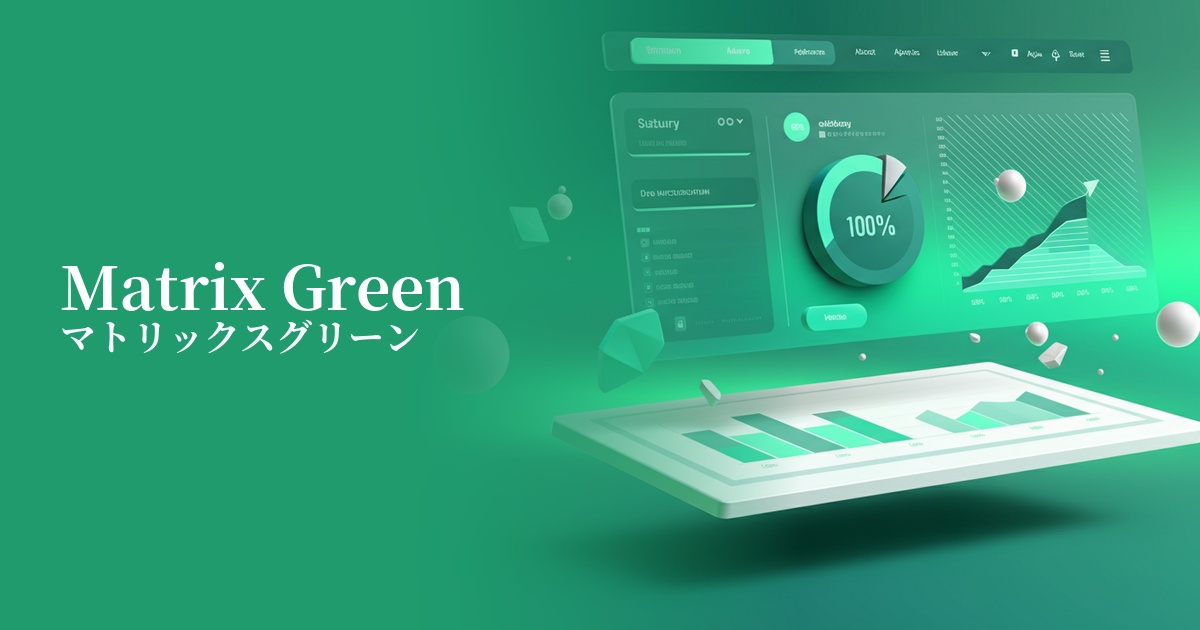
| English name | Matrix Green |
|---|---|
| Katakana | Matrix Green |
| HEX | #00FF00 |
| RGB | 0, 255, 0 |
| Design Theme | Neon & Cyberpunk Colors |
Why is it a trend? (Background and reasons)
The trend of Matrix Green is largely due to nostalgia for the cyberculture of the late 90s and early 2000s, and the influence of the recent Y2K fashion revival. The digital, slightly retro futuristic feel that symbolized that era is being re-evaluated as something fresh in today's creative scene.
Furthermore, in today's world, where advanced technologies such as AI, the metaverse, and blockchain are permeating our lives, this vibrant green is attracting attention as a color that symbolizes a digital worldview and a sense of the future. Technology-related services and brands are increasingly adopting it to visually convey their cutting edge and innovation.
From a UI design perspective, the widespread adoption of dark mode is a major contributing factor. High-saturation neon colors like Matrix Green stand out remarkably against a dark background, effectively drawing attention. This has increased the demand for accent colors to effectively highlight important information and actions to users.
The psychological effects of design and UX
Matrix Green, as its name suggests, strongly evokes keywords such as "future," "digital," "cyberspace," and "artifacts." Its surreal and energetic impression instantly captures the viewer's attention, leaving a strong impact.
In UI/UX design, this strong visual appeal can be used to effectively prompt users to take specific actions or to display important notifications. However, because of its extremely high saturation, using it extensively can cause visual fatigue. Also, using it with text can significantly reduce readability, so caution is needed when using it.
By effectively using this color, you can give your brand or service a positive image of being "progressive," "innovative," and "exciting." On the other hand, excessive use can give off a cheap impression or an air of danger, so careful design that considers the overall balance is required.
Visibility testing (UI component example)
Practical usage (best practices)
Its most effective use is as an accent color. When used in hover effects for CTA buttons or link text on websites and apps that use dark mode, it can powerfully encourage user action.
It's also recommended to incorporate it into dynamic UI elements such as loading animations, progress bars, and specific items in graphs. This allows users to intuitively understand the system's operation and data flow, providing a futuristic and enjoyable user experience.
On websites for technology services, games, music events, and other similar businesses, incorporating Matrix Green into key visuals, icons, and illustrations can effectively convey the brand's world and enhance user immersion.
When using it as a background, the general rule is to combine it with gradients, glow effects, or grid patterns rather than filling the entire surface with a solid color. This allows you to soften the overwhelming impact while expressing depth and a cyberpunk atmosphere.
Recommended color scheme suggestions
Charcoal (#36454F)
Matrix Green stands out vividly against dark charcoal gray or black backgrounds, most effectively expressing a cyberpunk or futuristic worldview. It's a classic combination that offers high visibility, encourages focus on content, and delivers a strong impact.
Deep Pink (#FF1493)
The combination of neon colors evokes the atmosphere of 80s synthwave and vaporwave. It creates a very energetic and playful impression, making it ideal for making your entertainment or event website stand out.
Slate Gray (#708090)
By pairing it with a calming slate gray, you can soften the intense impression of matrix green and add a sophisticated, modern feel. This is ideal for technology-based SaaS companies and other businesses that want to convey both cutting-edge technology and reliability.