| English name | System Teal |
|---|---|
| Katakana | System Teal |
| HEX | #14B8A6 |
| RGB | 20, 184, 166 |
| Design Theme | UI System & Alert Colors |
Why is it a trend? (Background and reasons)
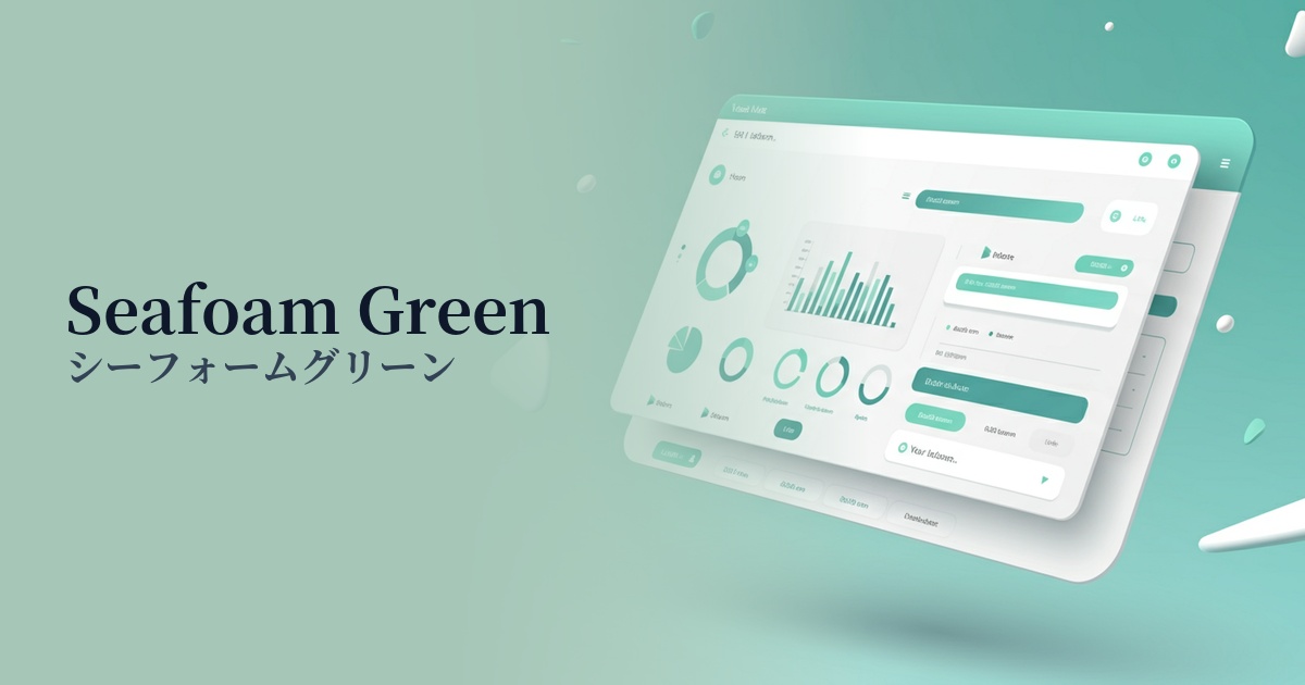
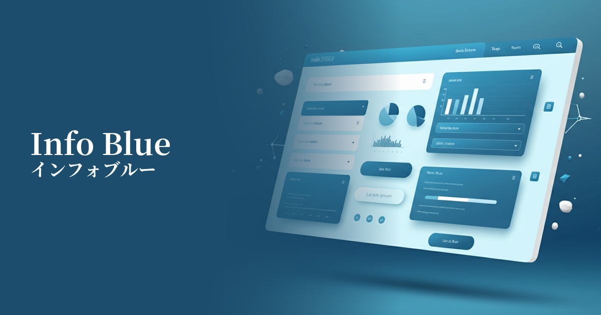
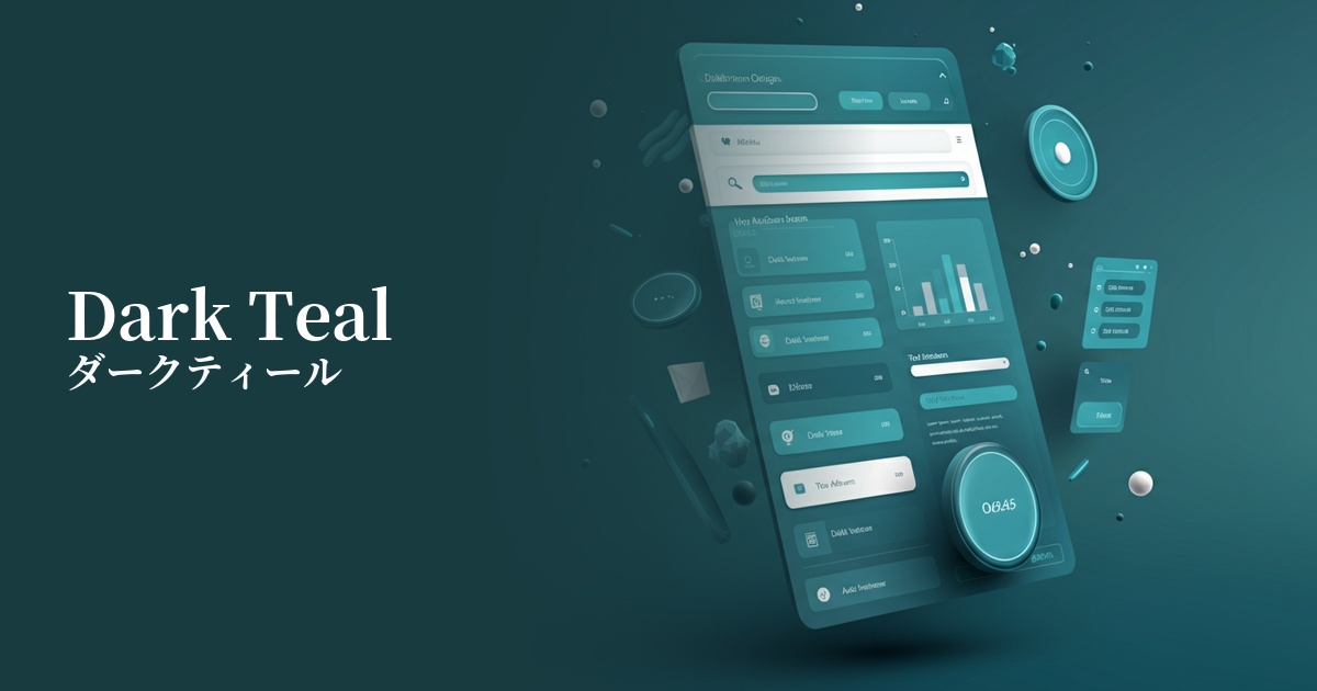
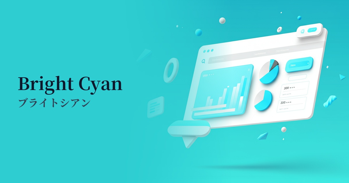
In recent years, web design has seen a strong demand for clean and user-friendly UIs that users can intuitively navigate. System Teal perfectly aligns with this trend, as it combines the reliability of the traditional system color blue with the positive impression of green.
This color tends to be frequently used, especially in SaaS products and technology-related services. It's effective in conveying an impression of being cutting-edge without being overly superficial, giving users the impression of a "reliable new tool." It plays a role in organizing complex information and guiding users smoothly.
Furthermore, as interest in accessibility grows, system teal plays an important role. Because it easily maintains a certain level of visibility not only against a white background but also against a black background in dark mode, it has the advantage of being easy to use for important UI elements such as icons indicating active status and notifications.
The psychological effects of design and UX
System Teal combines the impressions of "trust," "calmness," and "intelligence" associated with blue with the images of "growth," "safety," and "harmony" associated with green. This gives users a sense of security and positive expectations, and is particularly useful in building trust in financial, healthcare, and education-related services.
This color is vibrant yet easy on the eyes, possessing the "clarity" to highlight important information on the UI. Using it for success messages after form submission or task completion notifications clearly communicates that the user's actions were performed correctly, enhancing a positive experience.
System Teal's appeal lies in its modern and sophisticated atmosphere, which sets it apart from traditional, solid blues. When adopted by startups and services dealing with new technologies, it helps build an advanced and fresh brand image.
Visibility testing (UI component example)
Practical usage (best practices)
When used in a SaaS application dashboard for active menu items, selected filters, or toggle switches in the ON state, it allows users to intuitively understand the current status.
When used in success notifications such as "Registration complete" after form submission, or in progress bars indicating processing completion, it functions as positive feedback that gives users a sense of security and accomplishment.
Applying System Teal to the most important CTA buttons, such as "Try for free" or "Download materials," on landing pages and service websites can attract attention and improve conversion rates.
By using a monochrome or neutral color scheme for the entire website and using it as an accent for link text, icons, and headings in specific sections, you can create a clean and sophisticated impression while effectively highlighting important elements.
Recommended color scheme suggestions
Slate Gray (#708090)
When combined with a calming slate gray, the vibrancy of System Teal stands out, creating a modern and trustworthy impression. It is ideal for designs where cleanliness is required, such as SaaS UIs and corporate websites.
Coral (#FF7F50)
Adding coral, a color close to its complementary color, as an accent creates a vibrant and energetic design. This color scheme is recommended for areas where you want to attract user attention or for playful and creative websites.
Antique White (#FAEBD7)
Using a warm antique white as the background color softens the coolness of system teal, creating an overall softer and more visually pleasing impression. This is suitable for blogs and media sites with a lot of content.