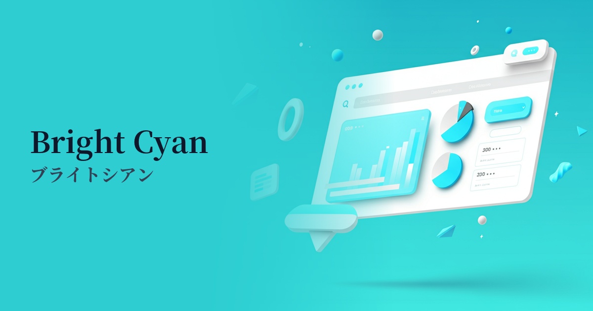
| English name | Bright Cyan |
|---|---|
| Katakana | Bright Cyan |
| HEX | #22D3EE |
| RGB | 34, 211, 238 |
| Design Theme | UI System & Alert Colors |
Why is it a trend? (Background and reasons)
Bright cyan is gaining attention because of its appeal to the digital native generation. This vibrant and energetic color easily resonates with the sensibilities of younger generations who are familiar with digital content such as social media and games, giving them a modern and active impression.
Furthermore, with the advancement of technology, interest in colors that evoke a futuristic and cutting-edge image is growing. In particular, the revival of retro-futuristic trends such as cyberpunk and Y2K is boosting the popularity of digitally-inspired colors like bright cyan.
From a UI/UX perspective, this color is extremely effective. Its high visibility on digital screens instantly captures the user's attention. With the widespread adoption of dark mode, its value as an accent color that stands out vividly against dark backgrounds is increasing even further.
The psychological effects of design and UX
Bright cyan conveys impressions of "advancement," "technology," "vitality," and "speed." It combines the "trust" and "calmness" of blue with the "growth" and "vitality" of green, creating a positive and future-oriented image.
In UI/UX, visuals can effectively capture the user's attention and encourage specific actions. Their vibrancy can evoke feelings of novelty and enjoyment in users, leading to increased engagement with the service.
However, because of its high saturation, overuse may cause visual fatigue in users. Its psychological effect can be maximized by using it only as an accent to highlight important elements.
Visibility testing (UI component example)
Practical usage (best practices)
The most effective application is to CTA (Call To Action) buttons. By using them on buttons such as "Register" or "Purchase" on landing pages or e-commerce sites, you can naturally guide the user's gaze and expect an increase in click-through rates.
It's also recommended to use it as an accent color throughout the entire site. By limiting its use to active items in the navigation menu, icons, and link text, you can create rhythm and visual hierarchy in your design.
In SaaS dashboards and analytics tools, color highlighting is useful for highlighting specific data in graphs and charts. It makes important numbers stand out and helps users quickly understand the information.
It is also suitable for notifications and alerts intended to provide information. By using it for positive feedback such as "success" or "completion," you can give users a sense of security and accomplishment.
Recommended color scheme suggestions
Charcoal (#36454F)
Against a dark charcoal gray background, the vibrancy of bright cyan is maximized. This creates a futuristic and sophisticated impression, making it an ideal combination, especially for technology websites and dark mode UI designs.
Deep Pink (#FF1493)
Combining it with deep pink, which is close to its complementary color, creates a very energetic and bold color scheme where each color emphasizes the others. It is effective when you want to create a Y2K or cyberpunk atmosphere.
Gainsboro (#DCDCDC)
This design features a clean, light gray and white base with bright cyan accents. The minimalist composition highlights only the essential elements, creating a modern and trustworthy impression.