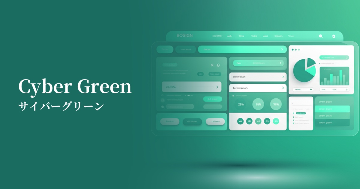
| English name | Cyber Green |
|---|---|
| Katakana | Cyber Green |
| HEX | #50FF50 |
| RGB | 80, 255, 80 |
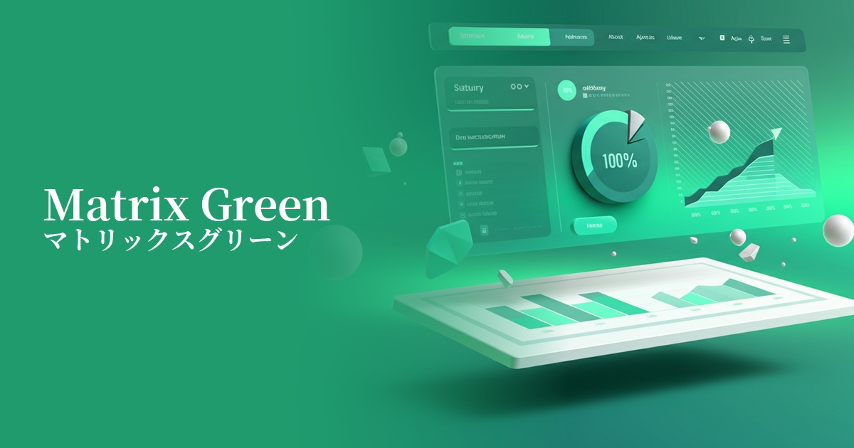
| Design Theme | Neon & Cyberpunk Colors |
Why is it a trend? (Background and reasons)
The rise of cyber green stems from the revival of cyberpunk culture, which began in the 1980s. As a color symbolizing the "near-future digital society" depicted in movies, games, and anime, it's being reinterpreted and incorporated into modern web design. In particular, it's gaining popularity as an ideal color for visually expressing the excitement and anticipation surrounding new technologies such as the metaverse, AI, and blockchain.
Another major reason is the growing demand for bolder and more expressive visuals as a reaction against the long-dominated minimalism and clean design trends. Cyber Green, with its strong individuality and visual impact, creates a unique brand experience that is easily remembered by users. It is highly effective when you want to differentiate your site from others and cultivate a cutting-edge image.
From a UI/UX perspective, the widespread adoption of dark mode is fueling the cyber green trend. By creating extremely high contrast against dark backgrounds, it's possible to make elements stand out like neon signs while maintaining visibility. This enables immersive, futuristic, and sophisticated interface designs.
The psychological effects of design and UX
Cyber green strongly evokes keywords such as "future," "technology," "digital," and "artificial" in users. This color has a psychological effect of making viewers anticipate advanced services and extraordinary experiences, and stimulating their curiosity for new things. It is especially well-suited for companies dealing with cutting-edge technology and for creating highly entertaining content.
This highly saturated color, radiating strong energy, has the power to instantly capture a user's attention. Therefore, in UI/UX design, using it for CTA (Call To Action) buttons that prompt users to take a specific action can be expected to increase click-through rates. However, due to its intense visual impact, overuse can cause visual fatigue in users, so its placement must be carefully considered.
The positive images that green inherently evokes, such as "safety" and "growth," also influence its interpretation. However, because it is an artificial hue that does not exist in nature, it is seen not in the context of organic or natural, but rather as a symbol of "evolution" and "development" through technology. It is a color that can also be applied to indicators that show a system is functioning correctly.
Visibility testing (UI component example)
Practical usage (best practices)
The most effective and easiest way to incorporate it is to use it as an accent color. Maintain a monochrome or dark color scheme throughout the site, and limit its use to elements such as CTA buttons, important icons, link text, and active navigation menus. This naturally guides the user's eye and improves usability.
Using it boldly in hero areas and key visuals can determine the first impression of your site. It's particularly effective on landing pages for technology startups, games, and online events. Combining it with gradients, glow effects, and glitch effects can create a more dynamic and immersive cyberpunk world.
This is also effective in designing SaaS dashboards and data visualizations. By highlighting particularly noteworthy numbers and alerts in cyber green from a vast amount of information, users can intuitively grasp important information. However, to be mindful of color vision diversity, be sure to design the system to use icons and text labels in conjunction with color, rather than relying solely on color to convey information.
It's also recommended to incorporate it into micro-interactions. For example, adding an effect where the border or background changes to cyber green when the mouse cursor hovers over a button or card can provide fun feedback to the user. These kinds of subtle touches enhance the overall user experience of the site.
Recommended color scheme suggestions
Charcoal (#36454F)
Against a dark charcoal gray background, the cyber green stands out vividly, effectively expressing a futuristic worldview. This classic combination offers excellent visibility and is perfect for highlighting key elements.
Deep Pink (#FF1493)
The combination with vibrant pink evokes the synthwave and vaporwave culture of the 80s. It gives off an energetic and playful impression, making it a perfect color scheme for music and entertainment-related designs.
Gainsboro (#DCDCDC)
By using a bright light gray as the base color, the striking impression of cyber green is softened, resulting in a clean and technical atmosphere. This is effective when you want to achieve a more refined and understated design while maintaining a cutting-edge feel.