| English name | Smoky Blue |
|---|---|
| Katakana | Smoky Blue |
| HEX | #8FA6B8 |
| RGB | 143, 166, 184 |
| Design Theme | Muted colors & earth tones |
Why is it a trend? (Background and reasons)
In recent years, web design has seen a growing interest in digital detox and wellness, leading to a preference for colors that are easy on the eyes. Muted colors, such as smoky blue, are less visually stressful for users and less tiring to look at screens for extended periods. This shift away from overly vibrant colors towards designs that provide comfort is fueling the popularity of these colors.
Furthermore, the emphasis on sustainability and harmony with nature is another reason why smoky blue is gaining attention. This color, a calm blue reminiscent of the sky and sea, with a veil of gray, is a type of earth tone and has a very high affinity with the concepts of organic products and ethical brands.
In the technology sector, smoky blue is highly valued as a color that combines reliability and innovation. Its modern yet not overly cold hue, and its somewhat human warmth, makes it particularly effective in SaaS dashboards and B2B service UIs, conveying a sense of security and intelligence to users.
The psychological effects of design and UX
Smoky blue, while based on the psychological effects of blue such as "trust," "calmness," and "intelligence," gains nuances of "sophistication," "elegance," and "gentleness" when mixed with gray. Because it is not overly assertive, it does not intimidate the recipient and gives the impression of encouraging calm conversation.
From a UI/UX perspective, this color does not distract users and effectively directs their attention to the content itself. Because it is less likely to evoke excessive emotional fluctuations, it is ideal for interfaces where users need to calmly process information, such as analytical tools and administrative screens. It instills a sense of security in users and builds a psychological foundation that enhances the reliability of the service.
Visibility testing (UI component example)
Practical usage (best practices)
Using this color as the background color for the entire site, or as the main color for a large area, can create a unified and calming aesthetic. It is particularly effective for blogs that are primarily text-based, or for portfolio sites with a minimalist design.
In designs based on white or light gray, using this color as an accent for buttons, links, and headings can elegantly guide the user's eye. It's not flashy, but it can subtly highlight important elements.
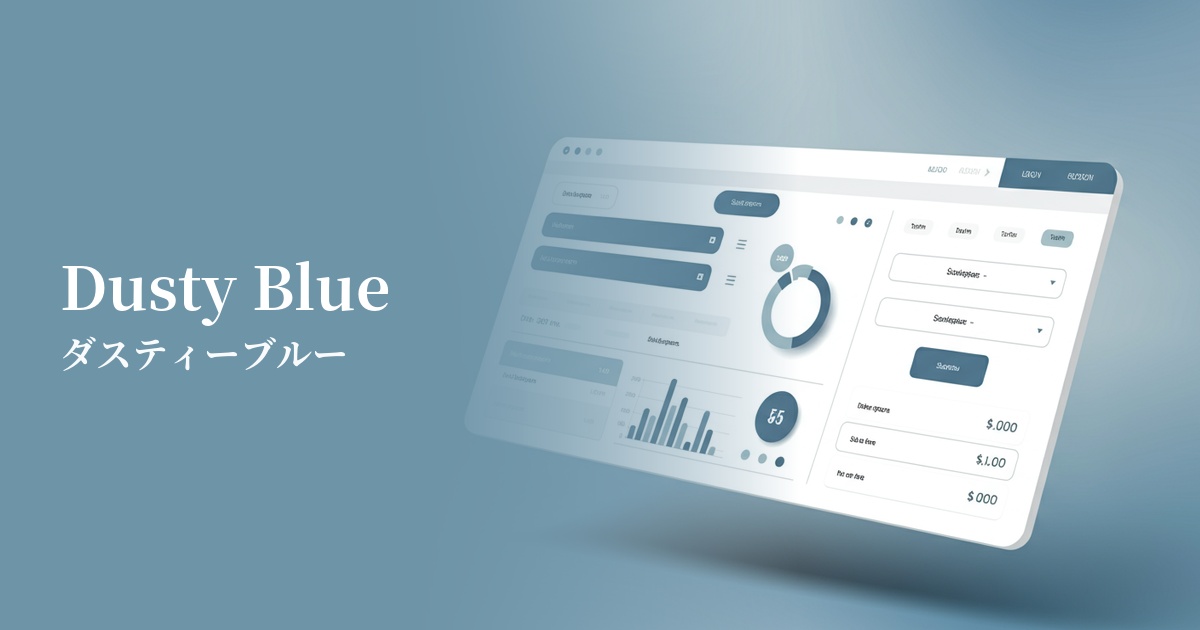
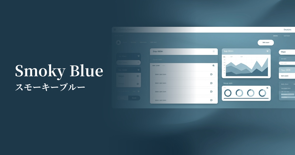
It's ideal for SaaS dashboards and management screens, which tend to contain a lot of information. It's easy on the eyes even during prolonged use, and doesn't compromise the visibility of data and graphs, allowing users to focus on their tasks without stress.
Corporate websites that require trustworthiness and expertise are particularly effective in the consulting, legal, and financial sectors. They help visually convey a company's integrity and sophisticated brand image.
Recommended color scheme suggestions
Navajo White (#FFDEAD)
The calmness of smoky blue, combined with the natural warmth of Navajo white, creates a friendly and comfortable space. This color scheme is recommended for websites with a natural and organic atmosphere, as well as lifestyle media.
Charcoal (#36454F)
Combining it with a deep, dark gray like charcoal creates an intelligent, sophisticated, and modern impression. This color scheme is ideal for technology companies and minimalist, high-end portfolio websites.
Rosy Brown (#BC8F8F)
Adding a warm, complementary color like rosy brown as an accent creates depth and warmth in the design. The subtle yet striking contrast effectively captures the user's attention.