| English name | Dusty Silver |
|---|---|
| Katakana | Dusty Blue |
| HEX | #9AADC2 |
| RGB | 154, 173, 194 |
| Design Theme | Muted colors & earth tones |
Why is it a trend? (Background and reasons)
In recent years, minimalism and a natural aesthetic have become major trends in the world of web design. There is a growing preference for designs that are comfortable and don't tire the user even after prolonged use, rather than flashy and eye-catching designs. Dusty blue is gaining popularity as a color that perfectly matches the modern user psychology of seeking "tranquility" and "comfort."
As we spend more time interacting with digital devices, many people unconsciously seek "digital detox" or "wellness." Low-saturation, eye-friendly colors like dusty blue provide users with mental peace and serve as a refuge in the information-overloaded digital space where they can take a breather.
This trend isn't limited to the web. The wave of earth tones and muted colors, which had already gained popularity in fashion and interior design, has naturally flowed into web design. The movement to recreate the comfort of the real world in the digital world is boosting the popularity of dusty blue.
The psychological effects of design and UX
The strongest impression that Dusty Blue conveys is "calmness," "tranquility," and "stability." The calm and intellectual image of blue, combined with the gentleness created by the mixing of gray, gives the viewer a sense of security.
Because the saturation is subdued, it creates a sophisticated impression without being overly assertive. It strikes a perfect balance between conveying a sense of luxury and expertise without being intimidating.
From a UI/UX perspective, this color is effective in keeping users focused on the content without distracting them. In particular, using it as a background color in SaaS dashboards that handle complex information or in blog posts with long texts reduces the cognitive load on users and helps them complete tasks and understand information.
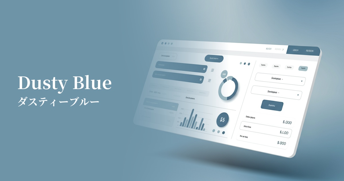
Visibility testing (UI component example)
Practical usage (best practices)
Using this as the main background color for your entire site will elegantly enhance your content while creating a unified and calming aesthetic. It is especially recommended for portfolio sites and gallery sites where you want to beautifully showcase photographs and illustrations.
In designs based on white or cream tones, using this color as an accent color for buttons, links, and headings functions as an elegant pop of color. It encourages user action without disrupting the overall tone of the design.
Using dusty blue as the background for a card-style UI or as a divider between sections makes the grouping of information visually clear. Combined with whitespace, it creates a rhythmic and organized layout.
This is ideal for corporate websites, B2B services, and financial websites where trustworthiness and integrity are essential. It is expected to instill a sense of security in users and enhance brand credibility.
Recommended color scheme suggestions
Antique White (#FAEBD7)
It gives a clean and open impression. The calming feel of dusty blue combined with the warmth of antique white results in a minimalist and sophisticated design that is both trustworthy and approachable.
Sandy Brown (#F4A460)
It creates a warm and natural atmosphere. The cool impression of dusty blue is combined with the natural warmth of sandy brown, reminiscent of earth and sand, to create a comfortable and relaxing space.
Rosy Brown (#BC8F8F)
This color scheme adds a touch of elegance and femininity. The intellectual feel of dusty blue is complemented by the soft, rosy hue of rosy brown, resulting in an elegant and sophisticated design.