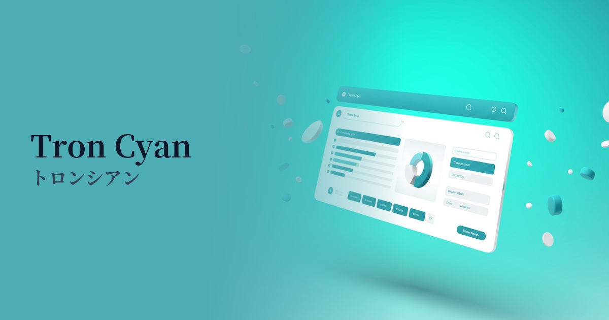
| English name | Tron Cyan |
|---|---|
| Katakana | Troncian |
| HEX | #22FCFF |
| RGB | 34, 252, 255 |
| Design Theme | Neon & Cyberpunk Colors |
Why is it a trend? (Background and reasons)
The rise of Tronsian stems from the revival of 1980s cyberpunk and retrofuturism. This aesthetic has regained popularity in entertainment fields such as movies, games, and music, and this trend is now spreading to web design.
Furthermore, as concepts such as AI, VR, and the metaverse become more familiar, there is a growing demand for color palettes that express a futuristic and digital worldview. Troncyan is chosen by many creators as a color that symbolizes this advanced and surreal nature.
From a technical standpoint, the widespread adoption of dark mode has been a major boost. This color, which appears to glow brightly against a dark background, is highly effective as an accent color to enhance the visibility of the UI. It has the power to attract the user's eye and make important elements stand out.
The psychological effects of design and UX
Advanced and futuristic: This color strongly evokes technology, virtual space, and the cyber world, intuitively conveying the image of cutting-edge services and products.
Energy and vitality: Vibrant and stimulating colors instantly capture the user's attention, creating a dynamic and lively impression. This is effective when you want to add movement and energy to a static page.
An extraordinary experience: The unique, surreal atmosphere is particularly well-suited to games and entertainment content, and is expected to enhance immersion, drawing users into its world.
Strong attention-grabbing: Because it's a very noticeable color, using it for CTA buttons, important notifications, and alerts can effectively encourage user action. However, be careful not to overuse it, as it can easily become visual noise.
Visibility testing (UI component example)
Practical usage (best practices)
It's most effective when used as an accent color in dark mode. Placing Troncyan against a black or dark blue background makes it appear to glow like a neon sign, highlighting important UI elements (active menus, notifications, icons, etc.).
Using this color in the typography and graphics of the LP's hero area or key visuals can create a strong first impression on visitors and showcase the brand's cutting edge.
By limiting its use to interactive elements such as buttons and links, you can guide users intuitively. Adding a glow effect on hover provides a richer user experience.
In addition to using it as a single color, you can create more complex and captivating synthwave-style visuals by using it in gradients with other neon colors such as laser magenta and cyber yellow.
Recommended color scheme suggestions
Charcoal (#36454F)
The dark charcoal gray background maximizes the luminous appeal of Troncyan. This highly visible, classic combination most effectively expresses a futuristic and sophisticated cyberpunk aesthetic.
Deep Pink (#FF1493)
Cyan and magenta-based pinks are almost complementary colors that enhance each other. They are perfect for creating an energetic, playful, retro-futuristic atmosphere reminiscent of 80s synthwave and vaporwave.
Slate Gray (#708090)
By combining it with a slightly lighter, more sophisticated gray, the harshness of neon is softened, creating a modern and clean impression. This color scheme is recommended for designs that want to convey both trustworthiness and innovation, such as technology-related corporate websites.