| English name | Blossom Meaning |
|---|---|
| Katakana | Blossom Pink |
| HEX | #FFD3DA |
| RGB | 255, 211, 218 |
| Design Theme | Pastel & Macaron Colors |
Why is it a trend? (Background and reasons)
In recent years, while minimalism and clean design have become mainstream, there has been a growing interest in warm and humane designs that soothe users' digital fatigue. Soft pastel colors like blossom pink bring a gentle and calming atmosphere to the screen, providing a pleasant user experience.
Particularly among Generation Z and Millennials, there is a growing emphasis on self-expression and individuality. Blossom pink conveys not only cuteness but also a sophisticated and positive impression, making it a color that resonates with target audiences and is actively adopted by cosmetics, fashion, and lifestyle brand websites and apps.
As technology becomes increasingly integrated into our lives, UI design now demands emotional connection. This color adds emotional richness to functional designs, deepening user engagement. It is particularly effective for services that require friendliness and for platforms with community features.
The psychological effects of design and UX
Blossom pink is a color reminiscent of cherry blossom petals, giving viewers a feeling of happiness and exhilaration, like the arrival of spring. Incorporating it into the UI can be expected to create a positive mood for users and foster a sense of familiarity with the service.
This color instinctively evokes feelings of "gentleness" and "care." Therefore, using it in situations where you want to emphasize wellness, childcare, mental health-related services, or user support can intuitively convey your brand's stance.
Blossom pink, with its moderate saturation and high brightness, is less visually stimulating and reduces eye strain. Using it as a background color in applications intended for long-term use, or in blogs where you want users to relax while reading content, can help alleviate user stress.
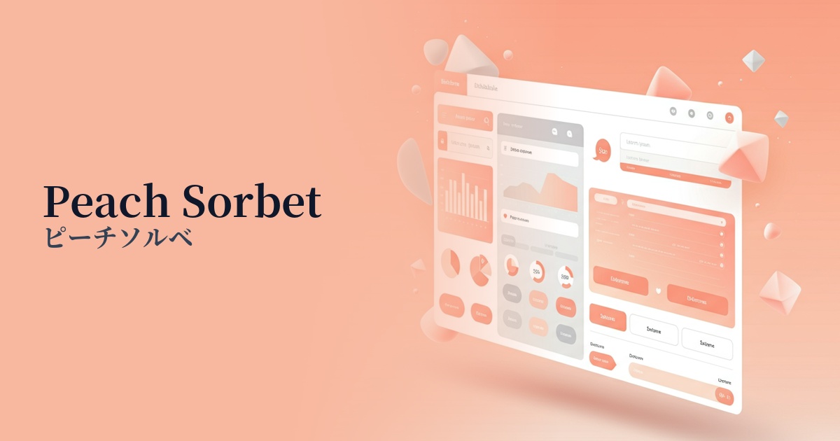
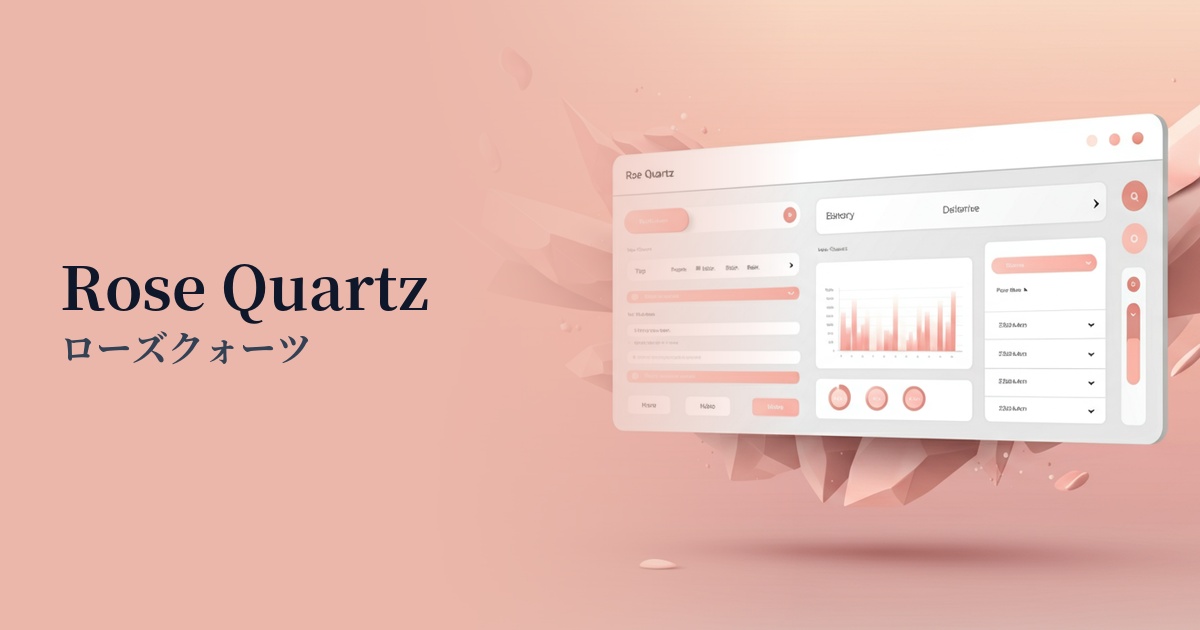
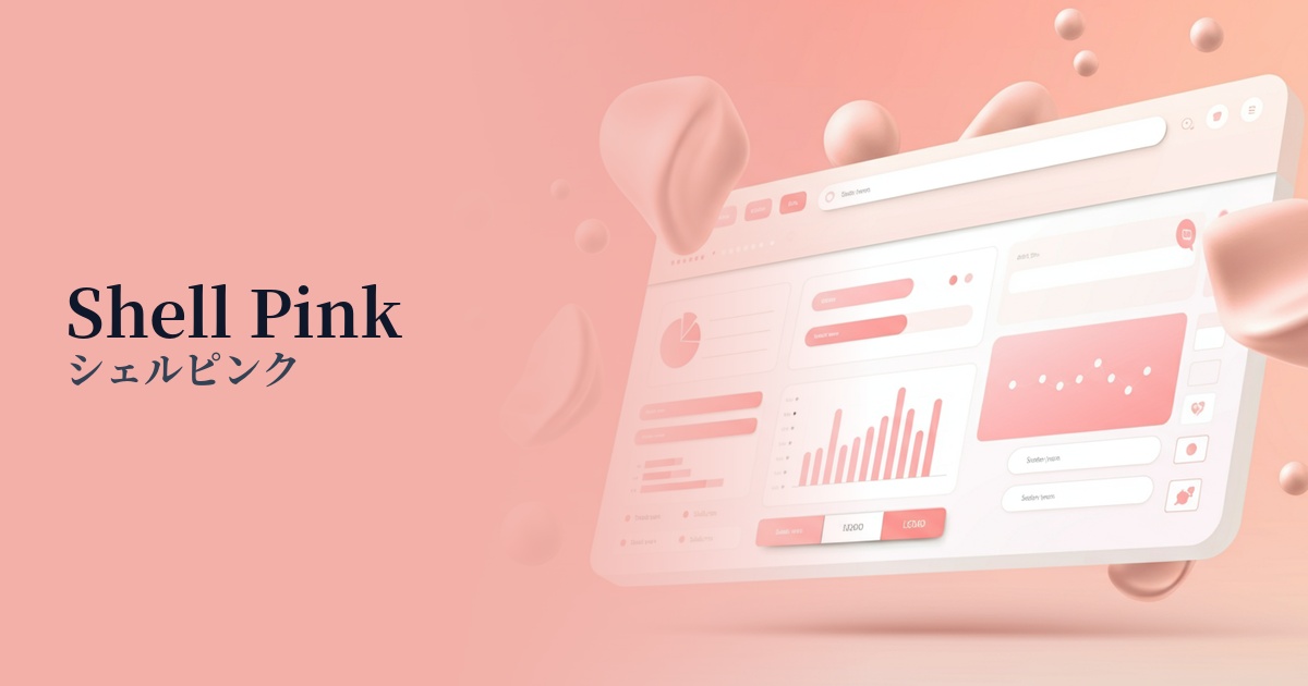
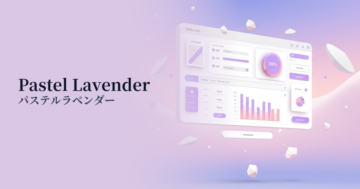
Visibility testing (UI component example)
Practical usage (best practices)
This color is ideal as the main color for brand websites targeting women and young people, such as those selling cosmetics, sweets, or baby products. Using it boldly in headers, footers, and key visuals will strongly impress the brand's worldview.
In minimalist designs, using these elements as accents for CTA buttons, important links, and icons gently draws the user's attention. They are particularly effective in clean layouts based on white or light gray, highlighting key elements while maintaining a sophisticated feel.
Using this color subtly as a background color for content areas or information cards creates a soft atmosphere and visual rhythm throughout the page. However, care must be taken with the contrast ratio with text. To meet WCAG standards, choose dark gray or navy for the text color to ensure sufficient readability.
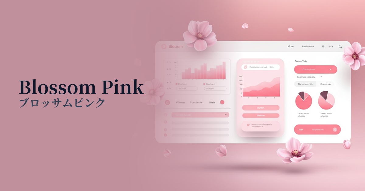
It may seem surprising at first glance, but using positive feedback (e.g., "Task Completed," "Goal Achieved") in notifications and graphs on a SaaS dashboard allows for a gentle way of celebrating the user's sense of accomplishment. In contrast to the red used to indicate errors or the yellow used for warnings, it is suitable for conveying information in a reassuring way.
Recommended color scheme suggestions
Slate Gray (#708090)
The sweetness of blossom pink is balanced by the sophisticated and calming slate gray. This color scheme is ideal for technology and lifestyle media that want to project a modern and refined image. It successfully conveys both trustworthiness and gentleness.
Pistachio (#93C572)
This organic and soothing color scheme evokes the flowers and leaves of nature. The gentleness of blossom pink harmonizes with the freshness of pistachio, bringing a sense of peace and health to wellness, natural cosmetics, and food-related websites.
Buttercup (#F3AD2A)
When combined with bright buttercup yellow, it creates a warm, energetic impression reminiscent of spring sunshine. This color scheme is perfect for expressing fun and playfulness in children's services and creative portfolio websites.