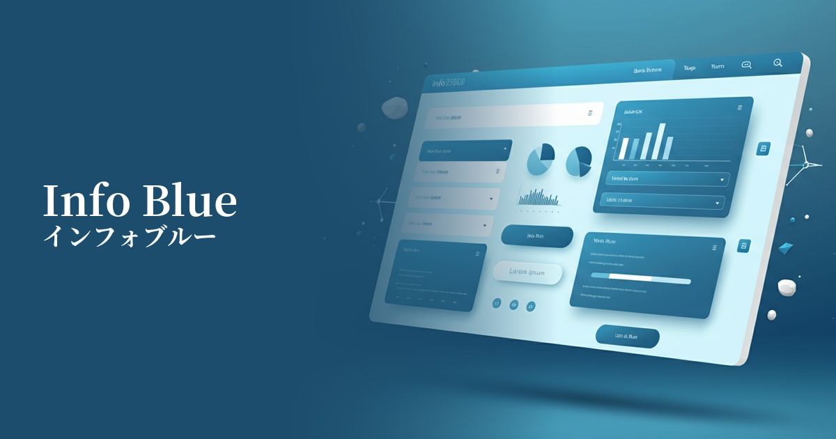
| English name | Information Blue |
|---|---|
| Katakana | Infoblue |
| HEX | #3B82F6 |
| RGB | 59, 130, 246 |
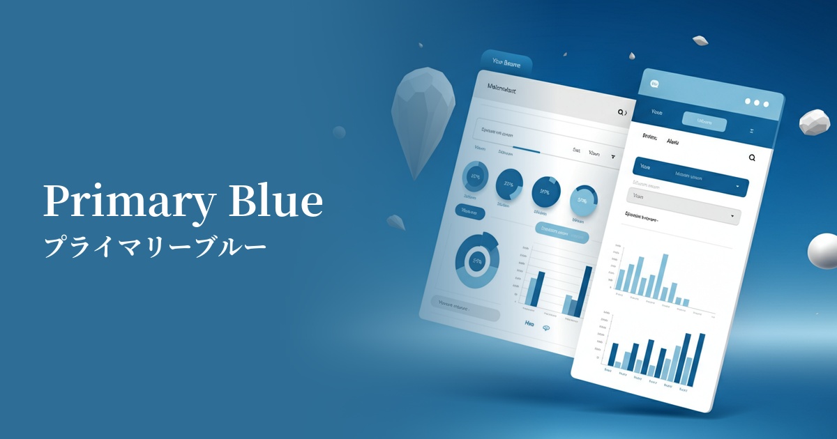
| Design Theme | UI System & Alert Colors |
Why is it a trend? (Background and reasons)
The frequent use of infoblue in modern web design stems from the proliferation of digital products, particularly SaaS and information services. As the need to clearly and positively communicate useful information to users, such as "new feature announcements" or "tips," increases, this color, while rooted in the traditional "trust blue" tradition, offers a brighter, more modern impression, making it a perfect match for contemporary UIs.
Another major reason is the growing concern for accessibility. As evidenced by its adoption in many design systems, Infoblue has practical advantages, such as its ability to easily achieve sufficient contrast ratio against a white background and meet WCAG standards. Its exquisite color scheme, which is functional yet not boring and gives users a sense of security, has earned it the support of many designers.
The psychological effects of design and UX
InfoBlue is based on the psychological effects inherent in the color blue, such as "trust," "integrity," and "calmness." This gives users a sense of security and intuitively conveys that the information displayed is reliable.
The most distinctive feature of this color, as its name suggests, is its ability to smoothly convey "information." Unlike green, which signifies success, or red, which warns of danger, it plays the role of a neutral or positive "notification" or "guidance." It can gently guide users to the next step without over-exciting or causing anxiety.
The slightly brighter tone conveys a sense of technological advancement and intelligence while softening any stiffness and creating a friendly atmosphere. This also contributes to building a user-friendly and positive brand image.
Visibility testing (UI component example)
Practical usage (best practices)
It is most effective when used in UI notification components. For example, it can be used in informational banners such as "You have a new message" or tooltips such as "Hint: You can reset your settings with this button" to appropriately attract the user's attention and indicate that the information is useful.
It's also ideal for CTA buttons related to information dissemination and confirmation. Using InfoBlue for actions like "Learn More" and "Save Settings" helps users proceed with confidence. However, it's important to clearly define the roles of each color, for example, by using a more prominent primary color for the site's most important actions (e.g., purchase, registration).
It's also effective for navigation links, icons, and clickable text colors that indicate an active state. It creates a visual hierarchy within the page, helping users intuitively understand what they can interact with.
It's also recommended to use InfoBlue as a key color for graphs and charts that visualize data in SaaS dashboards. By highlighting specific metrics with InfoBlue, users can quickly recognize important information.
Recommended color scheme suggestions
Dove Gray (#6D6D6D)
By combining it with a calming gray, the reliability and intellectual impression of info blue are further enhanced. This solid color scheme brings a sense of stability to the entire UI and is designed to naturally draw the user's eye to important information (info blue).
Alice Blue (#F0F8FF)
When paired with a clean, bluish background color, the vibrancy of Info Blue stands out, creating an open and modern impression. This combination is ideal for minimalist designs and when you want to provide users with a light and clean user experience.
Sandy Brown (#F4A460)
Adding a small amount of warm brown, a color close to its complementary shade, as an accent creates a pleasing contrast with the info blue. This generates visual vibrancy and energy, and is effective in areas where you want to strongly attract the user's attention.