| English name | Dark Teal |
|---|---|
| Katakana | Dark Teal |
| HEX | #0F766E |
| RGB | 15, 118, 110 |
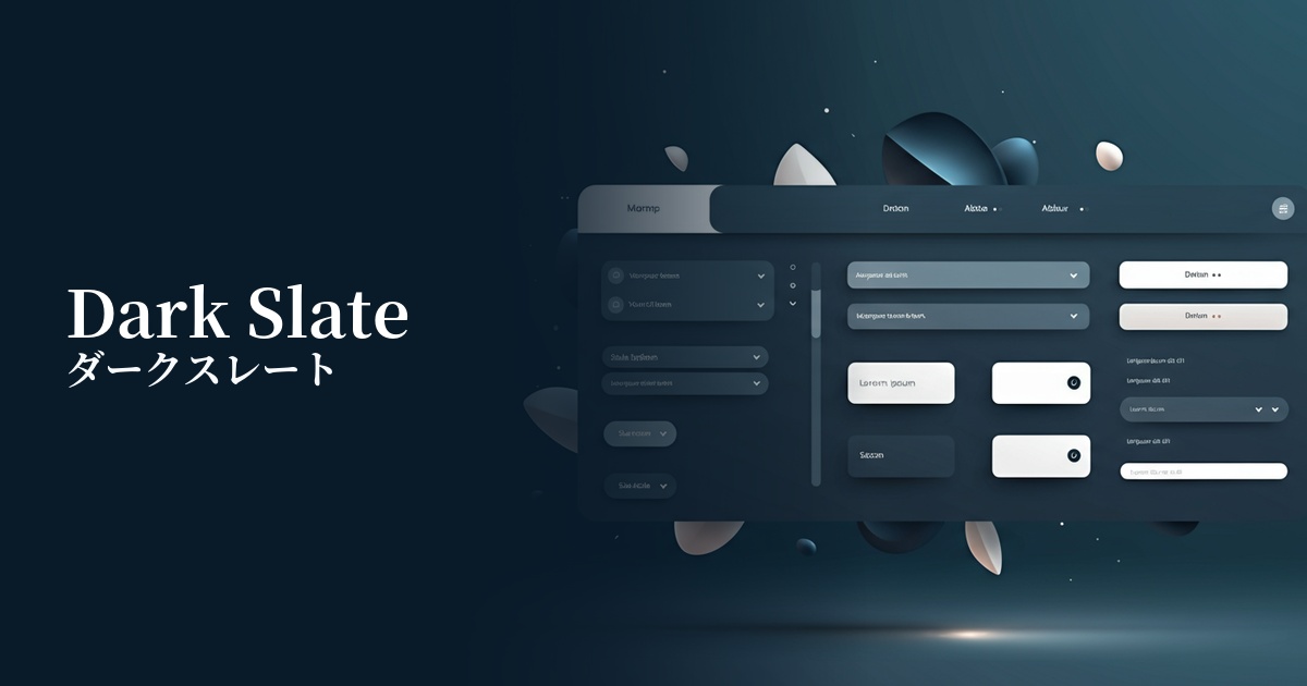
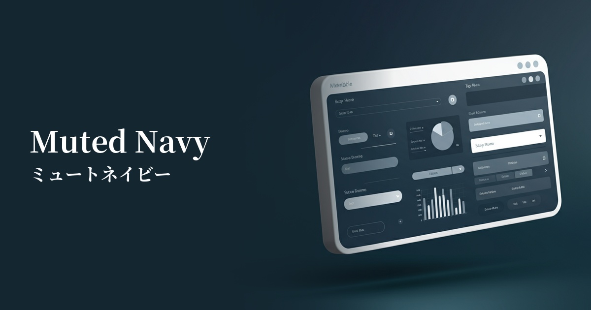
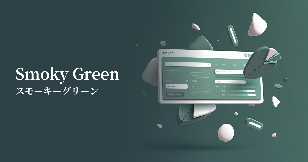
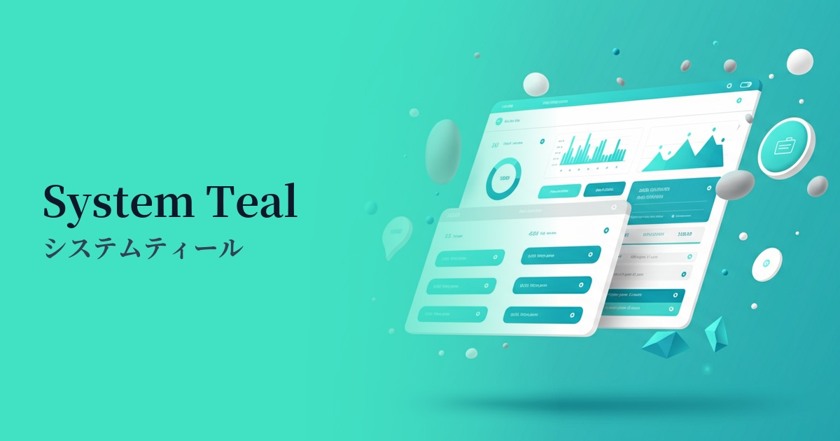
| Design Theme | UI System & Alert Colors |
Why is it a trend? (Background and reasons)
In recent years, web design has seen a trend towards calming tones that are easy on the eyes, reflecting users' digital fatigue. Deep colors like dark teal are not too vibrant and are less likely to stress users even during prolonged viewing, so they are being adopted in many interfaces.
In particular, for B2B SaaS, finance, and technology services, visually conveying "reliability," "expertise," and "security" is extremely important. Dark teal gives an intelligent and calm impression, making it a color that accurately represents the brand image of such companies.
Another major factor is the widespread adoption of dark mode. Dark teal, which is softer and more sophisticated than pure black, is a perfect match for dark mode backgrounds and accent colors, and has become a key color for achieving modern UI designs.
The psychological effects of design and UX
Dark teal evokes psychological effects such as "trust," "security," and "calmness" in users. Because it combines the intelligence of blue with the tranquility of green, it is effective when used on screens displaying important information or in situations where you want users to concentrate.
From a UI/UX perspective, this color helps users focus on the content itself without overly attracting their attention. Unlike flashy colors, it helps organize the information hierarchy and build a refined user experience.
Because it effectively conveys a sense of luxury and expertise, it is also effective when you want to enhance the value of your brand. Users unconsciously perceive this color as conveying impressions such as "high quality" and "reliable service."
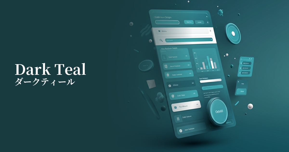
Visibility testing (UI component example)
Practical usage (best practices)
By using it in the sidebars and headers of SaaS application dashboards and management screens, you can provide a calm and intelligent work environment. It is expected to reduce eye strain for users who use it for long periods of time and help them maintain their concentration.
When used as the main color on the corporate websites of technology companies and consulting firms, it powerfully conveys the company's expertise and trustworthiness. When combined with a white or light gray background, it creates a clean and modern impression.
It's also ideal for CTA (Call To Action) buttons on landing pages. It ensures high visibility against a bright background while encouraging users to make calm decisions and click without creating a sense of urgency or anxiety.
Using it as an accent color is also effective. By using a minimalist white or gray as the base color for the entire site, and then using dark teal for headings, icons, and link text, the overall design becomes more refined and sophisticated.
Recommended color scheme suggestions
Antique White (#FAEBD7)
The professional impression of dark teal is complemented by the softness and warmth of antique white. It also functions as a highly readable text color, creating a sincere design that instills confidence in users.
Coral (#FF7F50)
By using coral, a color that is close to its complementary color, as an accent, you add vibrancy and attention to the calm atmosphere of dark teal. It is ideal for areas where you want to encourage user action, such as CTA buttons and important notifications.
Gainsboro (#DCDCDC)
The combination of dark teal and achromatic light gray creates a very sophisticated and modern impression. It is effective in minimalist designs and for expressing an intelligent and cool worldview in technology-related service websites.