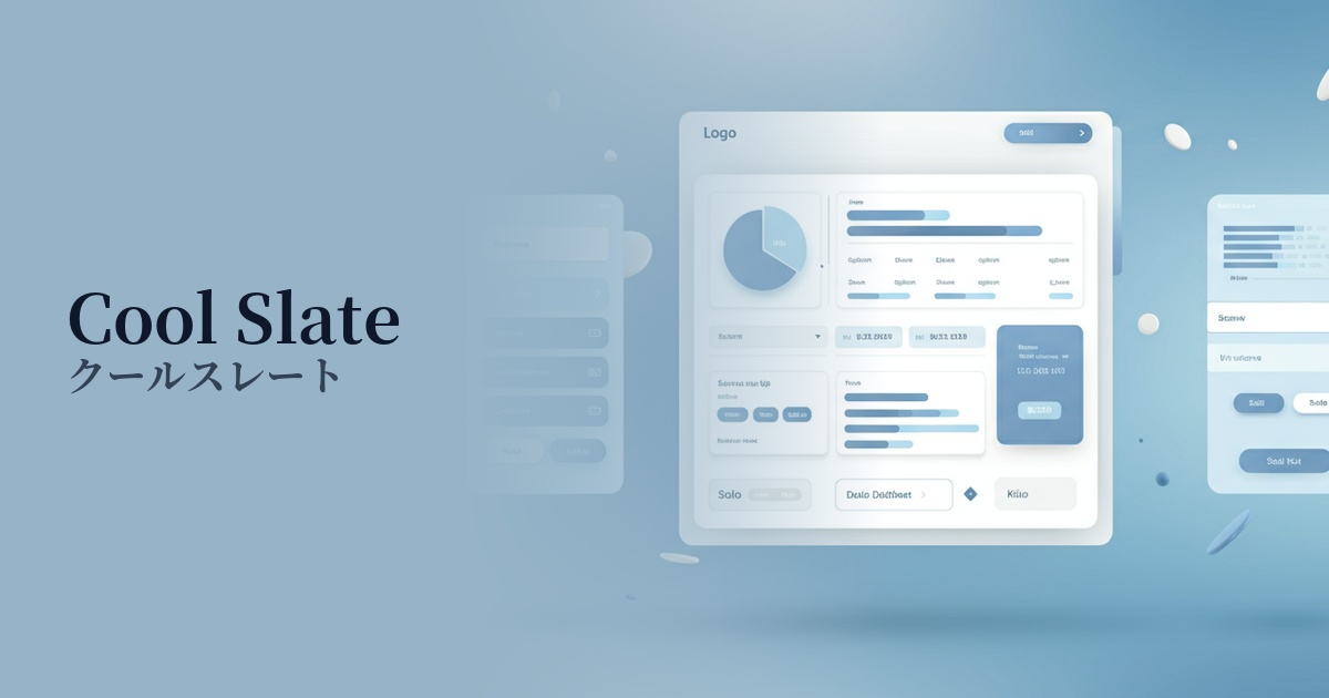
| English name | Cool Slate |
|---|---|
| Katakana | Cool Slate |
| HEX | #D2D9E1 |
| RGB | 210, 217, 225 |
| Design Theme | Neutral & Minimal Background Colors |
Why is it a trend? (Background and reasons)
In recent years, minimalism and clean aesthetics have become mainstream in web design. Cool Slate is gaining attention as a neutral color that follows this trend. It is a color that perfectly matches the modern design trend of eliminating excessive ornamentation and focusing on the content itself.
In today's information-saturated digital environment, users tend to seek visual tranquility and calmness. A gentle, cool gray like Cool Slate is easy on the eyes and less tiring to look at for extended periods. This allows for a more focused environment on tasks in SaaS dashboards and content-heavy websites.
Furthermore, Cool Slate, with its understated elegance, functions as an excellent background color that complements other colors. Its versatility—easily creating sophisticated and well-defined designs by combining it with vibrant accent colors or deep, dark colors—is why it's favored by so many designers.
The psychological effects of design and UX
Cool Slate is a bluish, calm gray that conveys a sense of "trust," "intelligence," and "stability" to users. It is particularly effective when you want to convey a professional and honest image, such as on websites for financial services, B2B SaaS companies, and technology companies.
From a UI/UX perspective, this color has a psychological effect of calming users by suppressing emotional fluctuations. Unlike flashy colors, it does not hinder content readability and helps users focus on the information. This can improve the overall quality of the user experience.
It also possesses a modern and sophisticated atmosphere. When combined with a minimalist layout, it helps to create a brand image that is advanced yet somehow calm and refined.
Visibility testing (UI component example)
Practical usage (best practices)
The most common use is as the background color for an entire website. It's easier on the eyes than pure white (#FFFFFF) and creates a sophisticated look. In particular, it creates a refined atmosphere without compromising readability on blogs and news sites with a lot of text content.
Cool Slate is ideal for use as the background color for sidebars and card components in SaaS application dashboards and admin panels. When highlighting active elements or important information with other colors, Cool Slate provides an effective base, clarifying the information hierarchy.
On landing pages (LPs), using a vibrant color as the background for the main content area and placing a bright color (for example, a bright blue or coral pink) for the CTA button can naturally guide the user's attention. Color contrast contributes to improved conversion rates.
Using it in UI elements such as headers, footers, and separators brings a sense of unity and stability to the entire page. Combining it with other neutral colors (for example, lighter grays or off-whites) creates subtle gradients, resulting in a design with depth.
Recommended color scheme suggestions
Dodger Blue (#1E90FF)
This combination features a calm, sophisticated background of Cool Slate accented with the vibrant and intellectual impression of Dodger Blue. It's ideal for SaaS and technology websites that want to convey both reliability and cutting-edgeness, and using it for CTA buttons and link colors clearly guides user actions.
Misty Rose (#FFE4E1)
This color scheme combines the calm cool slate with the warm and soft atmosphere of Misty Rose. It gives a modern yet human and approachable impression, allowing you to express sophisticated gentleness in lifestyle brands and creative portfolio websites.
Forest Green (#228B22)
The inorganic feel of Cool Slate is complemented by the natural and profound calmness of Forest Green. Because it simultaneously conveys a sense of stability and luxury, it creates a dignified design suitable for environmental services, wellness-related brands, and e-commerce sites handling high-quality products.