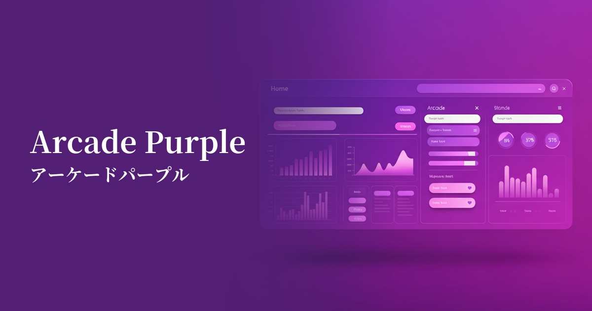
| English name | Arcade Purple |
|---|---|
| Katakana | Arcade Purple |
| HEX | #D400FF |
| RGB | 212, 0, 255 |
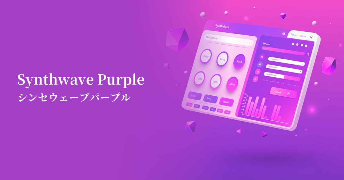
| Design Theme | Neon & Cyberpunk Colors |
Why is it a trend? (Background and reasons)
The reason arcade purple is gaining attention is the nostalgia for 80s and 90s culture, particularly the revival of the aesthetics of retro arcade games and synthwave music. This color, which is digital and surreal yet somehow nostalgic, strongly stimulates the sensibilities of contemporary creators.
Furthermore, the growing interest in virtual spaces such as the metaverse and VR/AR is also driving this color trend. Arcade purple is ideal as a color to symbolize the "digital space" and "future," which are distinct from the physical world. Its advanced and slightly mysterious atmosphere visually conveys the appeal of new technologies and entertainment.
The psychological effects of design and UX
Arcade purple is a very energetic and stimulating color. It instantly captures the user's attention and evokes positive emotions such as excitement, fun, and creativity. In UI/UX design, it has the effect of making users feel that "something new is about to begin."
This color is clearly artificial and does not exist in nature. Therefore, it is a perfect match for themes such as technology, digital content, and futuristic services. It intuitively conveys the brand's or product's image of being "cutting-edge" and "innovative" to users.
On the other hand, its high saturation and brightness can easily cause visual fatigue in users if used excessively. In particular, using it as a background for long texts significantly reduces readability, so from a UX design perspective, it is recommended to use it only as an accent.
Visibility testing (UI component example)
Practical usage (best practices)
The most effective use is in Call to Action (CTA) buttons on landing pages and registration forms. Arcade Purple stands out particularly vividly against dark backgrounds or in dark modes, powerfully encouraging user clicks. It's ideal for prompting actions such as "Try for free" or "Join now."
It's also effective to use it as an accent color scattered throughout a website or application. Using it for active navigation links, selected icons, form focus states, dashboard graphs, etc., brings consistency and vibrancy to the entire user interface, naturally drawing the user's eye to important information.
If you want to use it boldly as a background, instead of filling it with a single color, we recommend using a gradient with black, dark blue, or cybernetic cyan. Applying it to the background of hero areas or card-type components will create depth and a futuristic feel, adding richness to your design.
This color is particularly suitable for branding in industries that demand entertainment value and innovation, such as gaming, music and video streaming services, creative SaaS, and event promotion. It can highlight the brand's individuality and strongly appeal to target users.
Recommended color scheme suggestions
Obsidian (#0D0208)
Combining it with a very dark background is a classic color scheme that maximizes the brilliance of arcade purple. The extremely high contrast makes it highly visible and most directly expresses a cyberpunk or sci-fi world.
Cyan (#00FFFF)
The combination of purple and cyan is a color scheme that symbolizes 80s synthwave and vaporwave. The colors vividly complement each other, creating a very energetic and retro-futuristic impression. It's perfect for playful designs.
Midnight Blue (#191970)
This color scheme tones down the flamboyance of arcade purple, creating a modern and sophisticated impression. Deep midnight blue provides a stable base, while purple acts as an intellectual accent. It can also be applied to SaaS dashboards and other applications.