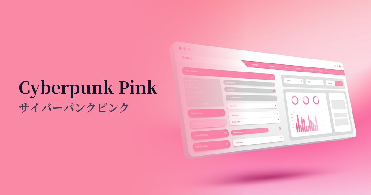
| English name | Cyberpunk Pink |
|---|---|
| Katakana | Cyberpunk Pink |
| HEX | #F50087 |
| RGB | 245, 0, 135 |
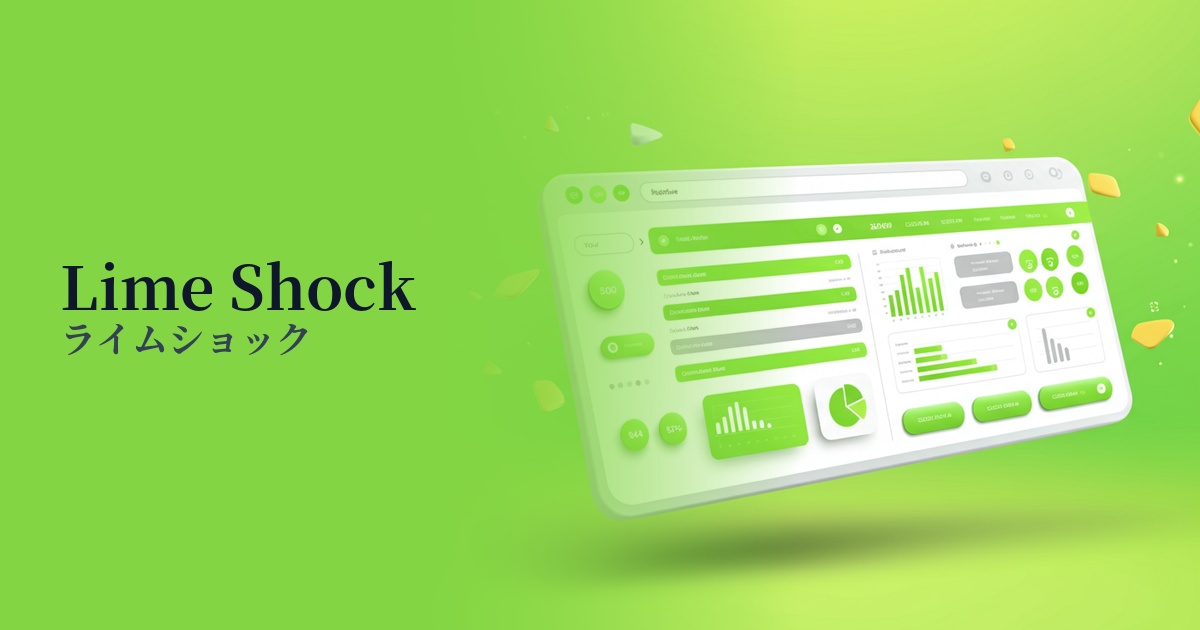
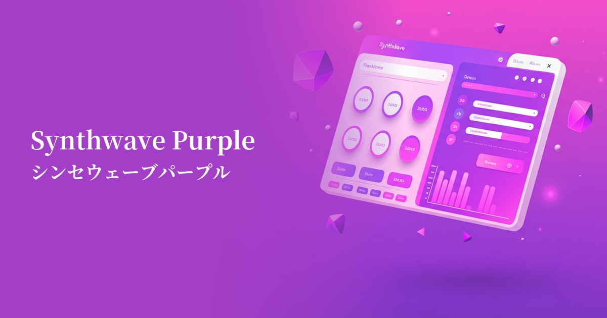
| Design Theme | Neon & Cyberpunk Colors |
Why is it a trend? (Background and reasons)
The popularity of cyberpunk pink is largely due to the revival of cyberpunk culture that has continued since the 1980s. The visuals of neon-lit, dystopian futuristic cities, exemplified by the film "Blade Runner" and the game "Cyberpunk 2077," are once again having a strong influence on the contemporary creative scene.
Furthermore, the increasing familiarity of concepts like VR/AR and the metaverse has also fueled this color trend. To enhance the sense of immersion in digital spaces, there is a growing demand for unrealistic and stimulating colors. Cyberpunk pink has been adopted precisely as a color that symbolizes this digital exhilaration.
Furthermore, we cannot ignore the trend of Y2K fashion and culture being re-evaluated, particularly among Generation Z. The vibrant and bold use of color that was popular back then evokes both nostalgia and a sense of novelty for today's youth. This pink, too, is attracting attention in this context as an innovative and playful color.
The psychological effects of design and UX
Cyberpunk pink is visually very strong, giving off an energetic and futuristic impression. This color, reminiscent of artificial light, is associated with keywords such as "advanced," "bold," "unconventional," and "playful."
In UI/UX design, it has an extremely powerful effect in instantly capturing the user's attention. Therefore, using it on elements that you want to encourage users to take a specific action, such as CTA buttons and important notifications, can be expected to improve conversion rates.
On the other hand, because it is a highly saturated and stimulating color, using it extensively may cause users to experience visual fatigue or a sense of pressure. While it has the effect of making the brand image look youthful and daring, using it strategically as an accent will lead to a better user experience.
Visibility testing (UI component example)
Practical usage (best practices)
The most effective use is in a Call to Action (CTA) button in a dark-themed UI. When this pink is placed against a deep navy or black background, it stands out like a neon sign, providing excellent visibility and powerfully encouraging user clicks.
It's also recommended to use it as an accent color throughout the entire site. By incorporating it partially into icons, link hover effects, separators, and loading animations, you can give the entire site a consistent, futuristic feel and a sense of dynamism.
One effective strategy is to boldly use this color in typography and abstract graphics in the hero area of your website, which determines the first impression. This can create a strong impact on users and instantly convey the brand's cutting-edge image.
In particular, it plays a key role as one of the main colors on landing pages (LPs) showcasing games, music events, and technology products. It's an ideal color for creating an extraordinary experience and a sense of excitement, and it effectively raises user expectations.
Recommended color scheme suggestions
Midnight Blue (#191970)
Placing cyberpunk pink against a deep blue or black background makes the color stand out, creating an impression reminiscent of a futuristic neon sign. Its high visibility makes it an ideal combination for science fiction and technology-themed websites.
Cyan (#00FFFF)
Combining it with vibrant cyan further enhances the cyberpunk aesthetic. The two colors complement each other, creating an energetic, digital atmosphere. It's particularly effective for game and music event websites.
Slate Gray (#708090)
Pairing it with cool slate gray tones down the vibrancy of the pink, creating a sophisticated and modern impression. This combination is easy to use as an accent to express cutting-edge technology in SaaS UIs and portfolio websites.