| English name | Sky Gray |
|---|---|
| Katakana | Sky Gray |
| HEX | #E4E9EC |
| RGB | 228, 233, 236 |
| Design Theme | Neutral & Minimal Background Colors |
Why is it a trend? (Background and reasons)
The recent trend towards minimalism and clean interfaces in web design has fueled the popularity of neutral colors like sky gray. Distinguishing itself from pure white (#FFFFFF) or typical light gray, this slightly bluish shade is understated yet sophisticated.
This color is highly compatible with the concepts of digital wellness and "calm technology." Its soft and light hue reduces visual noise and alleviates eye strain. In today's information-saturated world, it provides a calm user experience that allows users to focus on content in a relaxed manner.
The versatility of sky gray is a major reason for its trend. It demonstrates its value across a wide range of applications, from SaaS dashboards to corporate websites and creative portfolios. It functions as an ideal canvas, enhancing content and brand colors.
The psychological effects of design and UX
Sky Gray, as its name suggests, evokes the image of the sky, providing users with psychological effects such as calmness, tranquility, and a sense of openness. This color helps to alleviate user tension and create a less stressful digital environment.
While a pure white background can sometimes feel cold and impersonal, sky gray, with its subtle hue, conveys a more thoughtful and sophisticated impression. This unconsciously communicates reliability and expertise regarding the service or product to the user.
As a neutral background color, it enhances the readability of text and the visibility of other UI elements. It provides a clean foundation that naturally guides users' attention to important information and calls to action (CTAs), encouraging them to focus on the content.
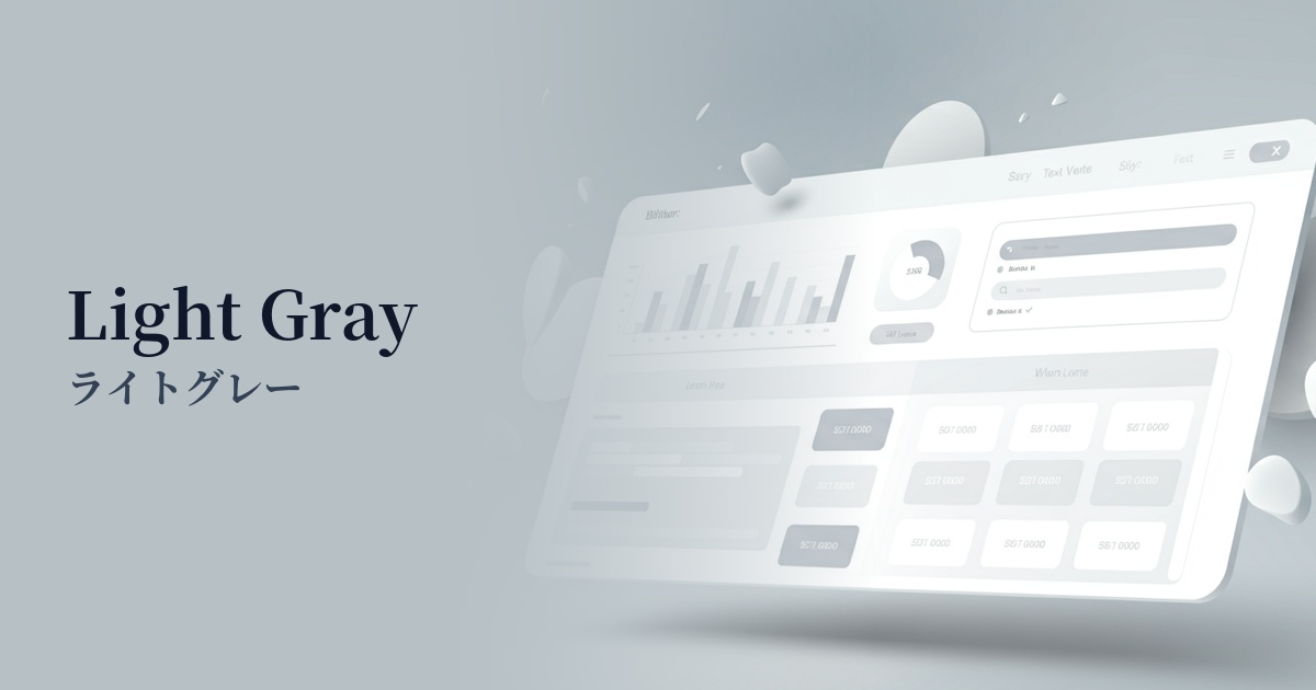
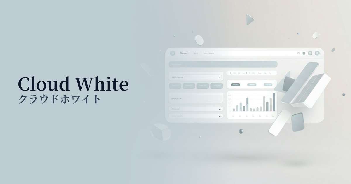
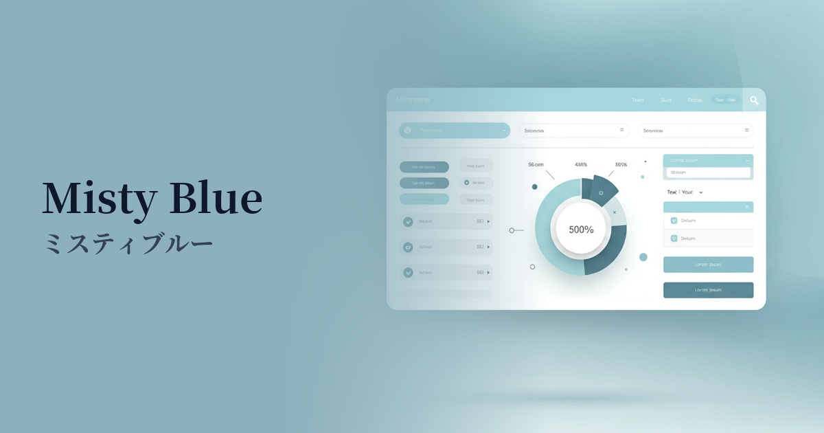
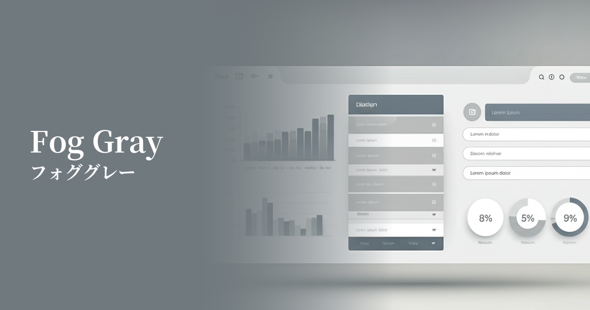
Visibility testing (UI component example)
Practical usage (best practices)
The most effective use of this color is as the background color for an entire website or application. It is less irritating to the eyes than pure white and provides a comfortable reading environment for users, even for long texts.
When used as the background color for components such as card-based UIs, modal windows, and sidebars, it can create a delicate and beautiful hierarchical structure between them and the main background (for example, a lighter white or off-white).
It's also ideal for inactive buttons and input forms. It clearly indicates that an element is unresponsive without disrupting the overall design harmony. Care should be taken with the contrast ratio with text, considering accessibility.
In minimalist designs based on a monochrome palette, using this color for secondary text or dividers can add structure and depth to a page without adding any new colors.
Recommended color scheme suggestions
Slate Blue (#708090)
Adding a touch of calming "slate blue" as an accent creates an intelligent and trustworthy atmosphere. It's ideal for designs that require a professional impression, such as SaaS administration panels and corporate websites.
Rosy Brown (#BC8F8F)
By combining it with the warm "Rosy Brown," you can add a touch of humanity and approachability to a minimalist design. It's recommended for lifestyle-oriented e-commerce sites and blogs, where you want to express a gentle world view that resonates with users.
Coral (#FF7F50)
Using the vibrant yet gentle color "coral" for CTA buttons and icons can effectively capture user attention. The contrast with a clean background makes the interface intuitive and encourages positive action.