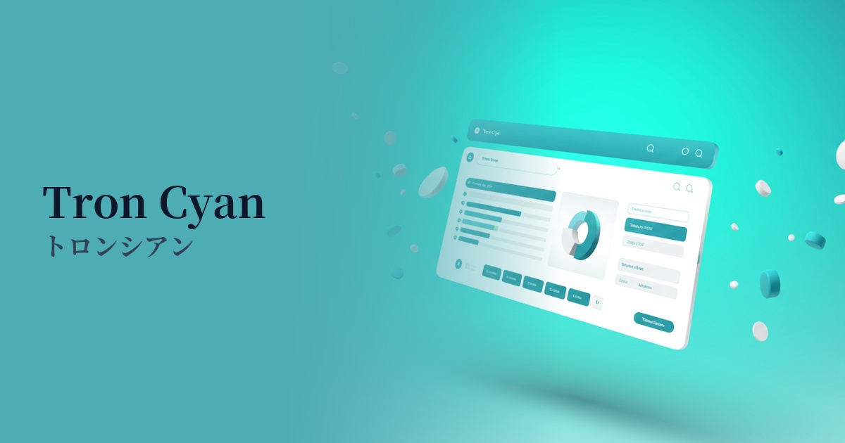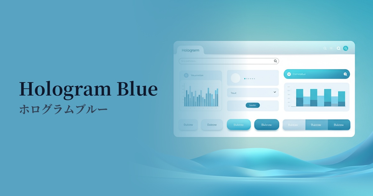
| English name | Hologram Blue |
|---|---|
| Katakana | Hologram Blue |
| HEX | #0AF8F8 |
| RGB | 10, 248, 248 |
| Design Theme | Neon & Cyberpunk Colors |
Why is it a trend? (Background and reasons)
The rise of holographic blue stems from a resurgence of aesthetics inspired by 80s and 90s science fiction movies and games, such as "cyberpunk" and "retro-futurism." As concepts like virtual reality (VR) and the metaverse become more commonplace, these surreal, digital hues are being embraced as the perfect color to express a futuristic worldview.
This color is being actively adopted, particularly in industries such as technology, SaaS, and fintech, as a symbol of innovation and digital energy. It stands apart from traditional corporate colors like muted blue, helping to build a dynamic and forward-thinking corporate image. It tends to be chosen by brands that want to convey a sense of speed and vitality towards the future, rather than static trust.
In today's information-saturated web environment, a visual impact that instantly captures a user's attention is crucial. High-saturation colors like hologram blue stand out especially against dark backgrounds and have the power to effectively guide users' eyes to important information and interactive elements (such as CTA buttons). As a result, they can potentially contribute to improved conversion rates.
The psychological effects of design and UX
Holographic blue strongly evokes keywords such as technology, data, and the future. Incorporating it into UI/UX design can give users the impression that your service or product is cutting-edge and innovative. It is particularly effective for branding startups and IT companies that deal with new technologies.
These vibrant colors evoke a strong sense of energy and vitality. In contrast to static and calm designs, they create a feeling of anticipation and excitement in users, making them think, "Something interesting is about to happen." They provide psychological support in highly entertaining content and in situations where you want to encourage user action.
The unrealistically vibrant colors create a sense of weightlessness and cyberpunk atmosphere unique to digital media. It effectively detaches users from everyday life and immerses them in the product's distinctive world. However, its intense visual stimulation can lead to eye strain if viewed for extended periods, so consideration should be given to the area and frequency of use.
Visibility testing (UI component example)
Practical usage (best practices)
The most effective and safest use is as an accent color. By limiting its use to key elements that you want to prompt user interaction with, such as CTA buttons, links, active status icons, and form focus colors, you can naturally guide the user's gaze and improve usability.
The holographic blue shimmer stands out best against dark backgrounds such as black or navy blue. This combination is a classic cyberpunk color scheme, creating a sophisticated and futuristic feel. It is particularly effective in SaaS dashboards, creator portfolio sites, and gaming-related UIs.
Beyond using it as a single color, you can create a more complex and captivating "hologram"-like texture by combining it with other neon colors such as laser magenta and synth wave purple in a gradient. Adding a subtle glow effect using CSS's `box-shadow` or `filter: blur()` further enhances the impression of digital illumination.
By using it in parts of the logotype, graphic elements overlaid on the hero image of a website, or as dividing lines, you can strongly convey the brand's individuality. Rather than using it throughout, focusing its application on key visual elements will result in a sophisticated design while maintaining an innovative image.
Recommended color scheme suggestions
Deep Pink (#FF1493)
The cool impression of holographic blue is contrasted with passionate deep pink, creating a dynamic contrast that highlights each color. This color scheme, reminiscent of 80s synthwave, is perfect for highly entertaining designs.
Navy Blue (#000080)
Placing holographic blue against a deep navy blue background creates a sophisticated, futuristic feel, as if light is emerging from the darkness. This combination is effective in professional settings, such as SaaS UIs and data visualizations, where a balance of reliability and cutting-edge design is desired.
Dove Grey (#B9BDBB)
Combining it with light gray softens the cyberpunk aggression, creating a clean and minimalist impression. Holographic blue acts as a sharp accent, making it suitable when you want to express a light, modern, and technological feel.