| English name | Mauve Pink |
|---|---|
| Katakana | Mauve pink |
| HEX | #E0B0FF |
| RGB | 224, 176, 255 |
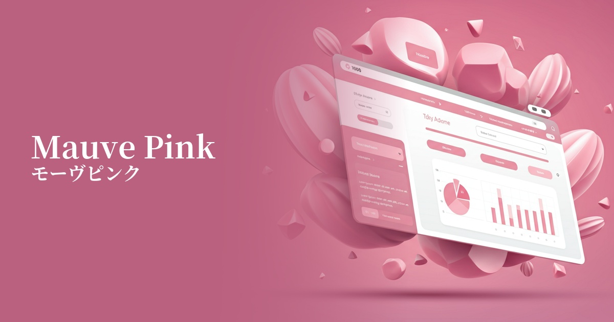
| Design Theme | Pastel & Macaron Colors |
Why is it a trend? (Background and reasons)
In recent years, web design has emphasized the concept of "digital wellness," which aims to provide users with comfort and tranquility. Mauve pink is characterized by its gentle and calming hue, a step away from overly vibrant colors. This gentle tone reduces stress on users even during long screen times, providing a comfortable browsing experience.
Mauve pink defies the conventional notion that "pink equals femininity," possessing a gender-neutral appeal. Its bluish-purple undertones prevent it from being overly sweet, giving it a sophisticated impression that appeals to a wide range of users, regardless of gender. It also aligns with modern values that respect diversity.
One reason mauve pink is so popular is its ability to combine a nostalgic, retro feel with modern sophistication. By incorporating elements of the Y2K trend while updating it to a more refined and subdued tone, it can give a modern website a nostalgic depth and individuality.
The psychological effects of design and UX
Mauve pink, with its hue similar to lavender and lilac, conveys elegance, sophistication, and deep tranquility to the viewer. Incorporating it into the UI can help calm the user's mind and allow them to focus on the content in a relaxed state.
Purple also possesses a mystical and creative side. This color is a perfect match for creative portfolio websites and services in fields such as art, spirituality, and wellness, helping to intuitively convey the brand's worldview.
With a lower saturation and a hint of blue compared to typical pinks, it creates a sophisticated, feminine look without being overly sweet. When used on e-commerce sites for beauty, fashion, and lifestyle products, it can add elegance and a sense of luxury, potentially increasing user purchasing intent.
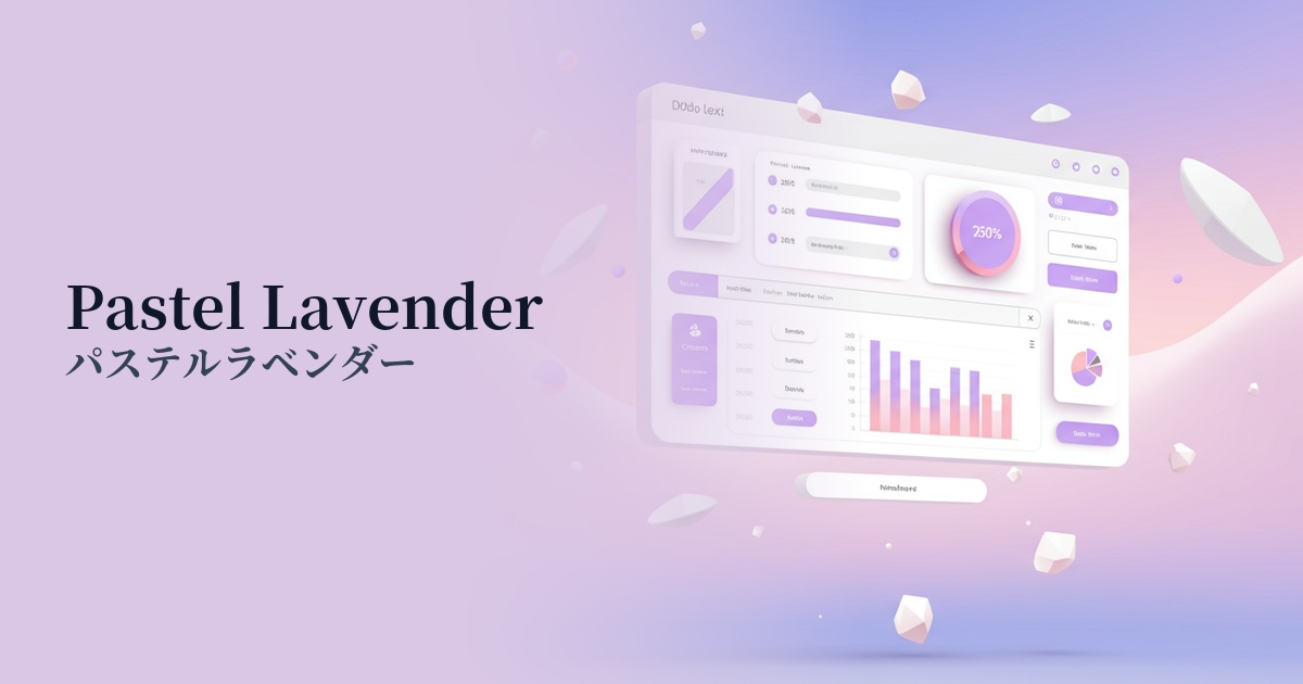
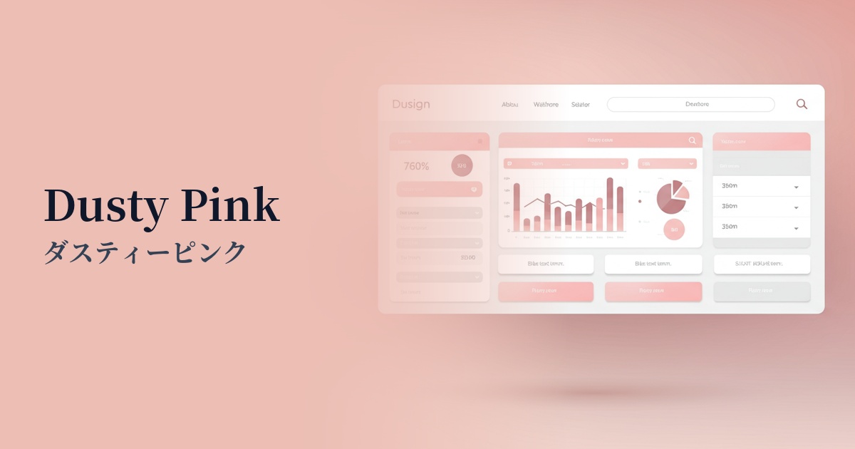
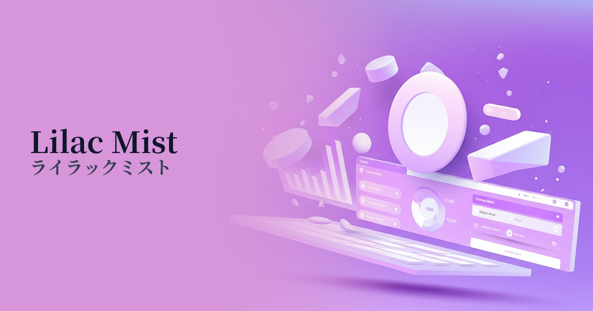
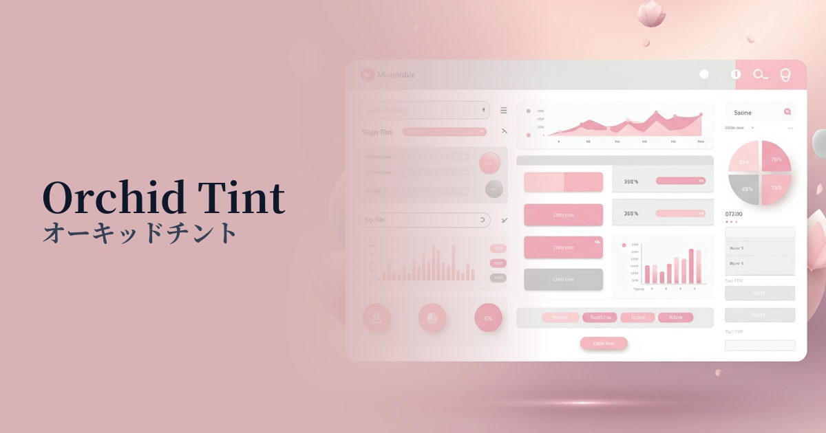
Visibility testing (UI component example)
Practical usage (best practices)
Using mauve pink as the background color and main color for the entire site creates an immersive world that gently envelops the user. In particular, when combined with a minimalist layout, the delicate beauty of the color stands out.
In clean designs based on white or light gray, it is effective to use it as an accent color for CTA buttons, icons, and link text. It gently attracts the user's attention without disrupting the overall harmony, and encourages action.
Gradient colors with other pastel shades such as baby blue, mint green, and cream yellow create a dreamy and ethereal visual. Incorporating them into the background of the first view or into the decoration of card-type UIs gives the site a modern and soft look.
It's also recommended to use it in UI components. For example, using mauve pink for active navigation menus, selected form elements, or progress bars can provide users with intuitive and gentle feedback on the current state.
Recommended color scheme suggestions
Slate Gray (#708090)
The elegance of mauve pink is complemented by the intellectual and calming atmosphere of slate gray. This combination is ideal for SaaS UIs and minimalist portfolio sites where you want to convey a modern and sophisticated impression.
Cream (#FFFDD0)
The warm, creamy off-white enhances the softness of the mauve pink. It creates a natural and comfortable atmosphere, making it ideal for lifestyle brands and wedding-related designs.
Sage Green (#B2AC88)
Combining it with sage green, which evokes nature, creates an organic and calming color scheme. It's perfect for wellness apps and websites showcasing sustainable products.