| English name | Orchid Tint |
|---|---|
| Katakana | Orchid Tint |
| HEX | #EBD7FF |
| RGB | 235, 215, 255 |
| Design Theme | Pastel & Macaron Colors |
Why is it a trend? (Background and reasons)
In recent years, "digital wellness" has become a key digital trend, and users are increasingly seeking comfort and tranquility in online spaces. Soft, gentle pastel colors like orchid tints are being adopted by many websites and apps because they reduce visual stress and evoke positive emotions.
This color is also attracting attention as a gender-neutral expression that is not bound by traditional gender stereotypes. Lavender tones give a neutral and modern impression, contributing to the creation of a contemporary brand image that respects diversity.
Furthermore, by fusing the natural motif of the orchid with a digital worldview, the brand brings warmth and sophistication to its technology. It is cutting-edge yet somehow approachable. This exquisite balance resonates with today's users.
The psychological effects of design and UX
As the name suggests, orchid tint evokes the color of an orchid, conveying an impression of elegance, sophistication, and refinement. It can create a sense of luxury and exclusivity, and is expected to enhance the brand's value.
Purple has long been associated with artistry and creativity. Using this color can stimulate users' creative sensibilities and provide an inspiring experience.
The soft, gentle tones evoke a sense of calm and tranquility in the viewer. When used as a background color for UI, it offers a UX benefit by reducing eye strain even when users look at the screen for extended periods, allowing them to use the service in a relaxed state.
It possesses a somewhat dreamy and fantastical atmosphere, making it suitable for expressing youthfulness and innovation. It is particularly effective for services and content targeting younger generations, such as Generation Z.
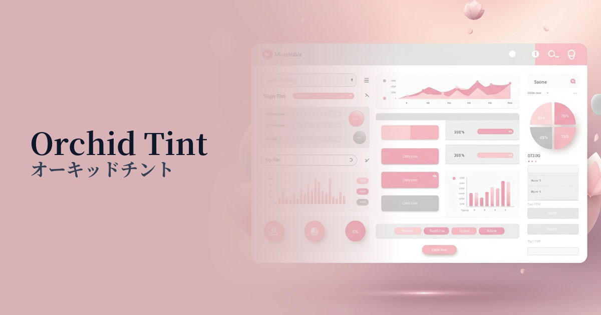
Visibility testing (UI component example)
Practical usage (best practices)
It can be boldly used as the main color or background color for websites that prioritize a specific brand image, such as wellness apps, beauty brands, and creator portfolio sites. Even when used over a large area, it doesn't feel overwhelming, allowing you to create an immersive design.
It is effective as an accent color in SaaS dashboards and e-commerce sites. When used for buttons, icons, and important notifications, it gently stands out among other neutral colors, naturally encouraging user action.
Gradients combined with other pastel colors such as baby blue and peach sorbet create a modern and dreamy visual. When used in the hero area of a landing page or as a background for a card-style UI, they will capture the user's attention.
Incorporating this as the key color for illustrations and icons throughout your website creates design consistency. It brings a sense of unity and sophistication to the entire brand, establishing a memorable visual identity.
Recommended color scheme suggestions
Slate Gray (#708090)
The elegance of orchid tint is combined with the solidity and composure of slate gray. This combination is ideal for business websites and SaaS UIs where you want to convey both trustworthiness and sophistication.
Mint Green (#98FF98)
The sweetness of the orchid tint is refreshingly enhanced by the mint green, creating a fresh and modern impression. It's recommended for wellness and lifestyle brand websites to express a clean and positive worldview.
Cream (#FFFDD0)
The warm cream color adds approachability and softness to the elegance of the orchid tint. This color scheme is perfect for e-commerce sites that want to inspire confidence in users, or for blogs with a natural atmosphere.