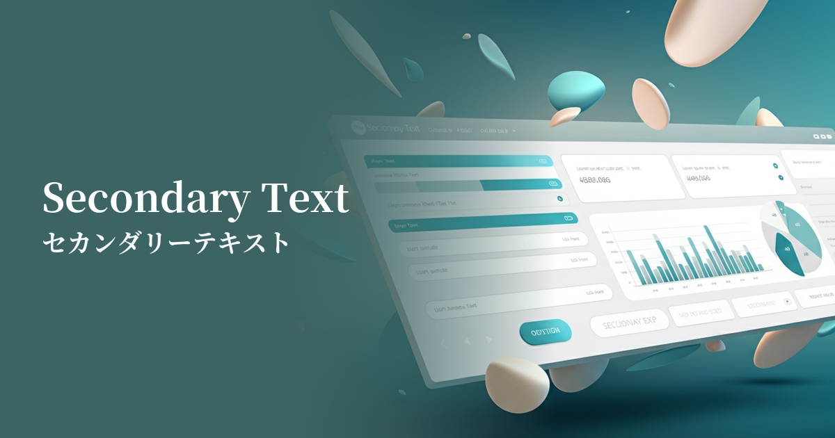
| English name | Secondary Text |
|---|---|
| Katakana | Secondary text |
| HEX | #4B5563 |
| RGB | 75, 85, 99 |
| Design Theme | UI System & Alert Colors |
Why is it a trend? (Background and reasons)
In recent years, minimalist and clean designs that prioritize the content itself have become mainstream in web design. Within this trend, the use of "supporting" colors—colors that clearly define the hierarchy of information and highlight the main content—has become increasingly important. "Secondary text" is precisely the kind of color that fulfills this role and is adopted in many design systems.
This color gives a slightly softer impression than pure black (#000000), which is expected to reduce eye strain even when users look at the screen for extended periods. Amidst growing concerns about accessibility, it's gaining attention as a well-balanced gray that is not only inconspicuous but also easy to read.
Furthermore, its versatility in easily accommodating both light and dark modes is another reason why this color is trending. Because it maintains appropriate contrast in either mode while effectively indicating supplementary information, it's extremely useful in responsive UI design.
The psychological effects of design and UX
The main impression that secondary text conveys is "subtle," "supplementary," and "supportive." By seeing this color, users unconsciously judge that "this is not the main information," reducing visual noise and allowing them to focus on the important content.
Psychologically, it has the effect of conveying calmness, stability, and trustworthiness. While not flashy, it projects an image of sincerity and reliability, making it particularly effective for business applications and information-heavy websites.
From a UI/UX perspective, this color is essential for creating a visual hierarchy. By clearly distinguishing it from main text such as headings and body text, users can efficiently scan information and quickly find what they need. This directly reduces the user's cognitive load and improves overall usability.
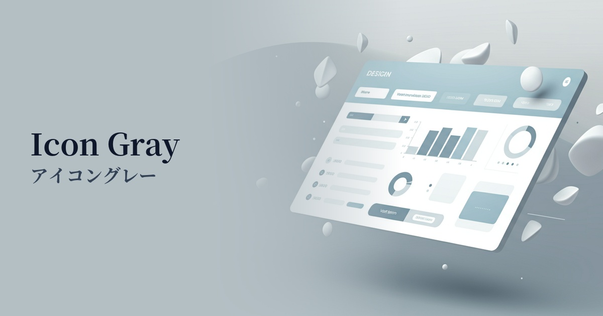
Visibility testing (UI component example)
Practical usage (best practices)
The most common use is for metadata such as the publication date, author name, and category of a blog post. It's ideal for indicating that this information is a step below the main text in importance.
In form design, it is used for placeholder text in input fields and supplementary help text such as "Please enter a password of 8 characters or more." It functions as information that can be referenced when needed without interfering with user input.
It's also suitable for supplementary information within UI components that are displayed repeatedly, such as product cards on e-commerce sites or timelines on social media. For example, using it to complement the main content, such as the number of reviews, the time elapsed since posting, or the number of "likes," creates a clean and organized impression.
In dashboards and data tables, using colors for labels and supplementary descriptions other than key figures helps users focus on the most important data. This is a good example of using color to control information priority.
Recommended color scheme suggestions
Jet (#343434)
By using dark gray as the main text color and secondary text for supplementary information, a clear hierarchy of information is created. Users can intuitively judge the importance of the information, resulting in a highly readable and comfortable UI.
Dodger Blue (#1E90FF)
Adding a vibrant blue accent to understated secondary text creates visual contrast and definition in the design. Using this blue for links and CTA buttons naturally encourages user action while maintaining a sophisticated impression.
Alice Blue (#F0F8FF)
The very light, bluish-white background enhances the cool impression of the secondary text. It creates a clean and modern feel, making it ideal for designs where trustworthiness is essential, such as SaaS dashboards and corporate websites.