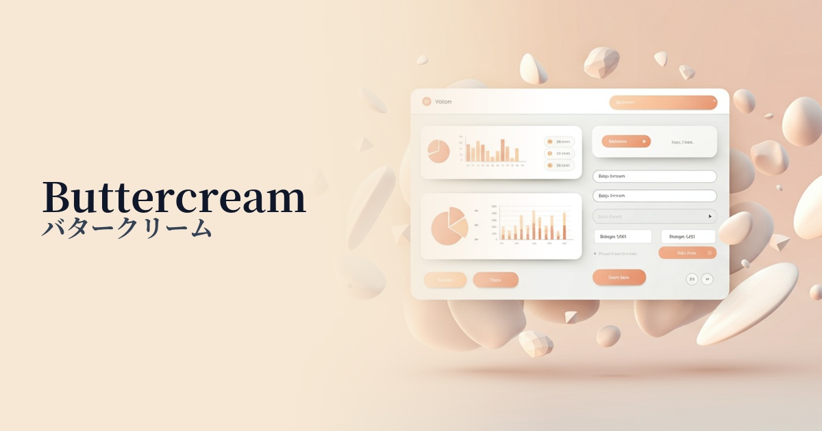
| English name | Buttercream |
|---|---|
| Katakana | butter cream |
| HEX | #FFF5CC |
| RGB | 255, 245, 204 |
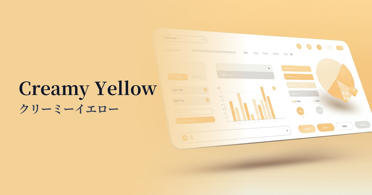
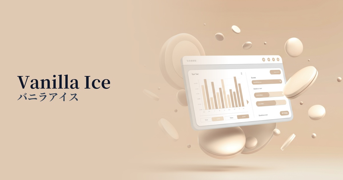
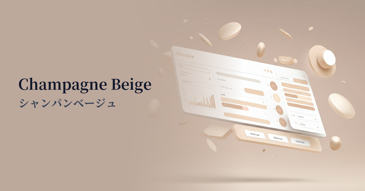
| Design Theme | Pastel & Macaron Colors |
Why is it a trend? (Background and reasons)
In recent years, web design has seen a shift away from pure white (#FFFFFF) towards warmer, off-white shades. Buttercream is a prime example of this trend, and its use in minimalist and neutral design contexts has increased.
As users spend more time interacting with digital devices, "eye-friendly designs" that reduce eye strain have become increasingly important. Soft, buttery cream-like colors make it less stressful for users even during long periods of viewing, providing a comfortable experience.
This trend is partly due to the increasing number of brands that value organic, natural, and sustainable practices. The natural and honest feel of buttercream is considered the perfect color to express the worldview of these brands.
The psychological effects of design and UX
As the name suggests, buttercream evokes images of butter and custard cream, inspiring positive emotions in users such as "warmth," "gentleness," "security," and "happiness."
From a UI/UX perspective, this color is expected to alleviate users' psychological apprehension and allow them to engage with content in a relaxed state. Because it is non-aggressive and neutral, using it as a background color naturally encourages focus on the main content and important information.
Furthermore, because it is a color that expresses sincerity and trustworthiness, it is also effective as an image color for services that aim to build long-term relationships with users, or for brands that emphasize careful communication.
Visibility testing (UI component example)
Practical usage (best practices)
The most effective use is as the background color for the entire website. This is especially true for lifestyle media and e-commerce sites related to food and interior design, where it enhances the appeal of products and photos while creating a consistent and warm atmosphere throughout the site.
It's also an excellent base color when combined with dark colors or vibrant accent colors. The buttercream background makes interactive elements like buttons and links stand out, naturally guiding users towards action.
It's also recommended for use as information cards or section dividers. By placing buttercream cards on a pure white background, information is gently grouped, making it easier to create a visual hierarchy. This makes it easier for users to understand the information structurally.
In light mode designs, using white as an alternative to pure white creates a sophisticated yet eye-friendly interface. This is particularly effective for text-heavy blogs and document sites.
Recommended color scheme suggestions
Slate Gray (#708090)
The warmth of buttercream is complemented by the calmness and intelligence of slate gray. Ideal for service websites where reliability is paramount, or sophisticated portfolio sites, it conveys a modern and honest impression.
Sage Green (#9DC183)
The natural sage green hue harmonizes with the gentle flavor of the buttercream, creating a comforting and organic feel. It's recommended for wellness-related brands and e-commerce sites that sell sustainable products.
Coral (#FF7F50)
Adding a bright and energetic coral accent creates a friendly and fun design. This is effective when you want to convey positive emotions to users, such as in children's services or creative blogs.