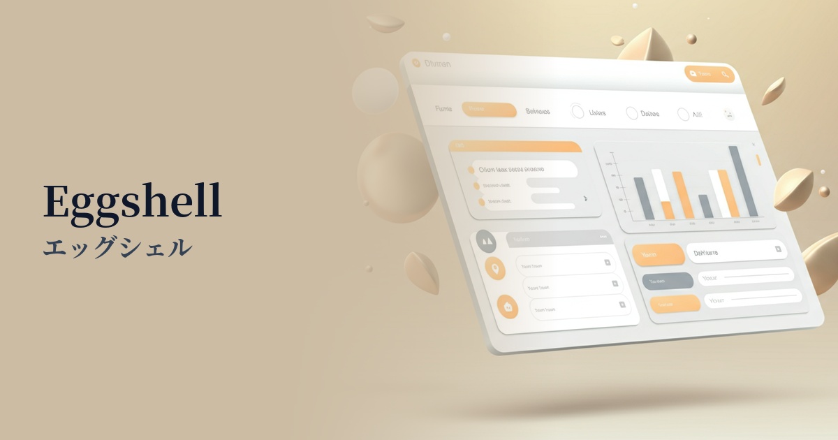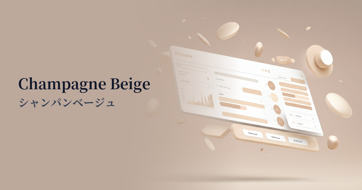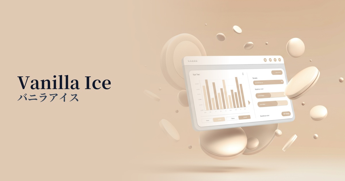
| English name | Vanilla Ice |
|---|---|
| Katakana | Vanilla ice cream |
| HEX | #FFFEEF |
| RGB | 255, 254, 239 |
| Design Theme | Pastel & Macaron Colors |
Why is it a trend? (Background and reasons)
In recent web design trends, there is a growing emphasis on minimalism, which eliminates excessive ornamentation, and on creating a natural and comfortable user experience. Off-white colors, like vanilla ice cream, are clean yet not as harsh as pure white, and they give a warm and soft feel to the space, making them a perfect fit for these trends.
As more users spend long hours in front of screens, the concept of "digital wellness," which provides a comfortable and eye-friendly digital environment, is gaining importance. Vanilla ice cream is increasingly being used as a background color because it is less visually stimulating than highly saturated colors or pure white, and is expected to reduce eye strain.
This color blends seamlessly into a wide range of design styles, from luxury brand websites and organic product e-commerce sites to personal portfolios. Its versatility—acting as a supporting color that enhances other colors while simultaneously elevating the overall quality of a site with its own elegant feel—is one of the reasons it's trending.
The psychological effects of design and UX
Vanilla ice cream, with its creamy and milky color, unconsciously evokes a sense of comfort and familiarity in users. In particular, on websites in categories such as wellness, cosmetics, and food, it visually reinforces the naturalness and trustworthiness of the products.
Unlike the sharpness of pure white, this slightly yellowish color creates a softer, more elegant, and sophisticated atmosphere. It strikes a perfect balance between luxury and approachability, making it effective when you want to enhance your brand image.
When used as a background color, it softens the overall tone of the screen while creating a moderate contrast with text and other UI elements. This makes it easier for users to focus on the content, allowing them to read long blog posts and detailed product descriptions without stress.
Visibility testing (UI component example)
Practical usage (best practices)
Using vanilla ice cream as the background color for the entire site creates a warm and minimalist atmosphere. This is especially recommended for portfolio sites that heavily utilize photos and illustrations, and e-commerce sites that emphasize the brand's worldview. The white space becomes more meaningful, and the content stands out.
Placing vanilla ice cream as the background color for card-type UI elements or specific sections against a white or light gray background subtly and visually conveys the information hierarchy. Users can intuitively recognize the grouping of information, improving the usability of the UI.
When combining with vibrant accent colors (e.g., coral pink, mint green), using vanilla ice cream as a base instead of pure white softens the color contrast, creating a more refined impression. It's ideal when you want to highlight an accent color elegantly without being overly flashy.
By setting input forms and buttons to white or light gray by default, and then changing them to vanilla ice cream when hovered over (mouse over), you can provide users with intuitive and pleasant feedback. Subtle changes lead to a high-quality user experience.
Recommended color scheme suggestions
Slate Gray (#708090)
By combining the warmth of vanilla ice cream with the intelligent and calming impression of slate gray, you can achieve both a sense of reliability and a sophisticated atmosphere. When used for the main text or headings on a business website, it creates an elegant design while maintaining readability.
Sage Green (#9DC183)
The nature-inspired sage green harmonizes beautifully with the organic feel of vanilla ice cream. Using it as an accent color on wellness-related websites or for environmentally conscious brands creates a pleasant and reassuring impression.
Rosy Brown (#BC8F8F)
Adding a slightly reddish-brown rosy brown can give the gentle tone of vanilla ice cream an elegant touch of glamour and warmth. Using it for buttons or link colors in women's services or cosmetic brands can create an elegant and sophisticated aesthetic.