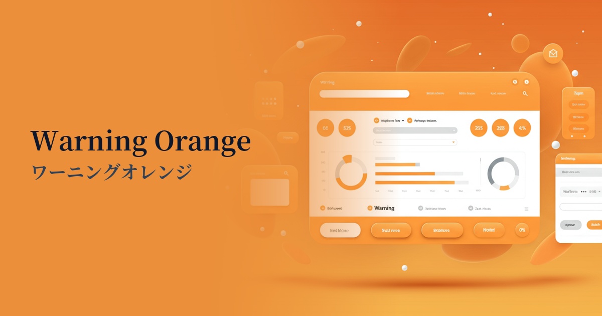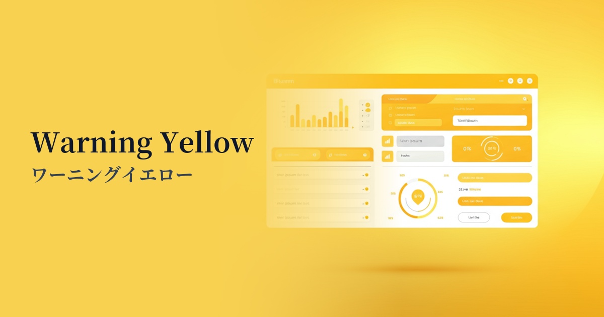
| English name | Warning Yellow |
|---|---|
| Katakana | Warning Yellow |
| HEX | #FBBF24 |
| RGB | 251, 191, 36 |
| Design Theme | UI System & Alert Colors |
Why is it a trend? (Background and reasons)
In recent years, the importance of "state colors"—colors that intuitively and accurately convey the system's status to the user—has been increasing in web design, particularly in the field of UI design. Warning yellow is one color that is attracting attention in this context.
This color is ideal for representing a "Warning" state, which is not as serious as "Red (Danger)" indicating an error, but still wants to prompt the user to check or pay attention. For example, it can gently encourage the user to take the next action, such as for minor form input errors or reminders to check account settings.
Furthermore, the positive aspects of yellow, such as its inherent "brightness" and "energy," are also behind this trend. Its exquisite balance of functioning as a warning color without causing excessive anxiety to users aligns perfectly with modern user-friendly UI design principles.
The psychological effects of design and UX
The most basic psychological effect of warning yellow is "attention-gathering." As it is used in traffic signs and construction site warning signs, it has the power to strongly attract people's attention and make them notice important information.
In UI/UX design, this attention-grabbing effect is used to highlight information that users should not overlook or items that require confirmation. Due to its high brightness, it exhibits high visibility, especially against dark backgrounds such as those in dark mode UIs.
On the other hand, this color suggests an intermediate state between "danger (red)" and "safe (green)." It also acts as a buffer, prompting the user to pause and make a decision, like a confirmation dialog asking, "This action cannot be undone, are you sure?" This allows users to use the service with greater peace of mind.
Visibility testing (UI component example)
Practical usage (best practices)
Form validation is a typical use case for the yellow warning. It's ideal for providing feedback such as "The password strength is moderate," or for alerting users when the input format is slightly different but still acceptable to the system—in other words, for warnings that aren't errors.
This is effective for displaying information at the top of a page as a notification banner, such as "Your account is about to expire" or "Your draft has been automatically saved," which do not require immediate action but should inform the user.
In SaaS dashboards and similar applications, using badges to indicate that a specific feature or plan is in a "trial period," or indicators to show that settings have been "changed from default," allows for intuitive communication of the status.
It can also be effective to use accent colors on buttons that you want to encourage users to make careful decisions, such as "Reset Settings" or "Downgrade Account." However, it is important to clearly define the design priority so that it is not confused with the main CTA (Call to Action) button.
Recommended color scheme suggestions
Charcoal (#36454F)
The dark charcoal gray background makes the brightness of the warning yellow stand out, maximizing visibility. This combination is ideal for modern, sophisticated SaaS dashboards where you want to effectively deliver warnings and notifications to users.
Navy Blue (#000080)
By combining it with intelligent and trustworthy navy blue, the intention of a warning is conveyed while maintaining a calm overall tone and a professional impression. It is effective in situations where reliability is important, such as financial services and B2B websites.
Gainsboro (#DCDCDC)
By combining it with light gray or off-white tones, you can gently yet clearly indicate warning areas within a clean and minimalist design. This soft color scheme is suitable when you want to draw attention to a user without making them feel pressured.