| English name | Biohazard Green |
|---|---|
| Katakana | Biohazard Green |
| HEX | #BFFF00 |
| RGB | 191, 255, 0 |
| Design Theme | Neon & Cyberpunk Colors |
Why is it a trend? (Background and reasons)
The rise of Biohazard Green is linked to the Y2K fashion trend and the revival of cyberpunk culture. Its strong affinity with themes like digital, virtual space, and the future makes it a popular choice for creators who want to incorporate a science fiction movie or video game aesthetic into their web designs.
Furthermore, we cannot overlook the aspect of a backlash from the minimalism that had long been dominant. As the trend shifts from quiet and clean designs to bolder and more expressive designs, colors with such a strong impact as this one have become a powerful weapon for instantly attracting the user's attention.
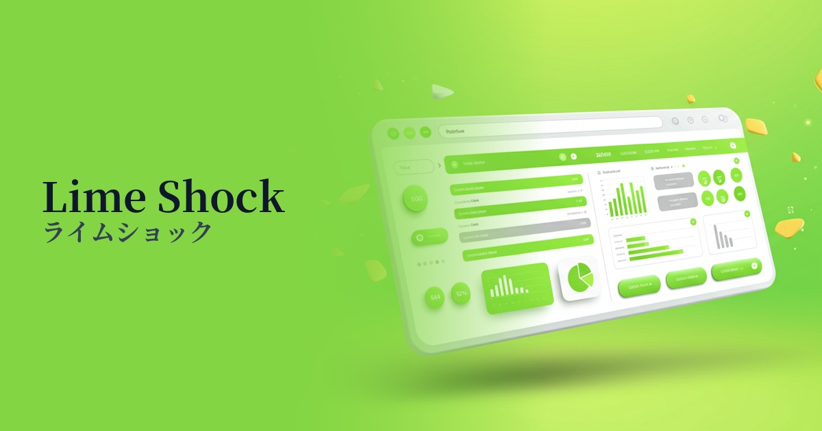
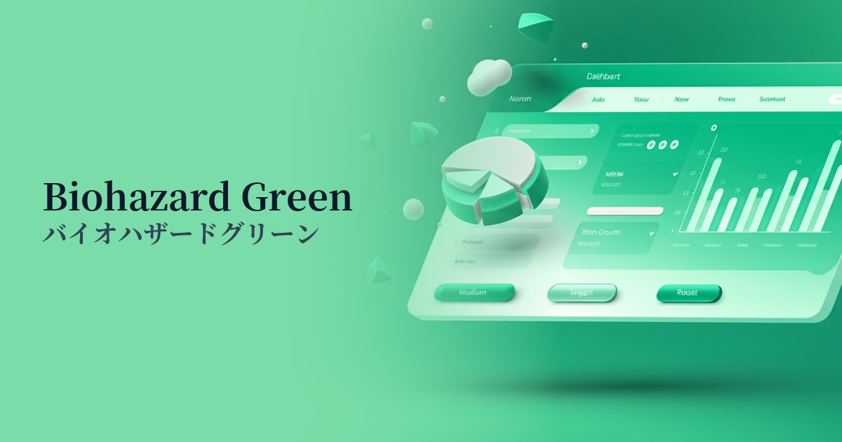
The rise of dark mode, in particular, has boosted the popularity of this color. It appears to glow brightly against a dark background, creating a striking visual contrast. It's especially effective in futuristic UI SaaS dashboards and entertainment websites.
The psychological effects of design and UX
This color possesses a dual nature: "danger/warning" and "vitality/energy." As its name suggests, it functions as a sign to draw attention, but the vibrant lime green also conveys positive impressions such as youth, vitality, and new beginnings, and this contrast creates a unique appeal.
The intense, uncommon colors evoke a strong sense of the extraordinary and cutting edge. By using them in technology startups or creative portfolio websites, you can visually communicate your brand's innovativeness and forward-thinking approach to users.
From a UI/UX perspective, its high prominence effectively draws the user's attention to specific elements. While effective for CTA buttons and important notifications, overuse can cause visual fatigue and stress. It's crucial to use it strategically, as a kind of "spice."
Visibility testing (UI component example)
Practical usage (best practices)
The most effective use is as an accent color. By limiting its use to an area of approximately 2-51 TP3T across the entire site, and applying it to the most important CTA buttons, links, and icons, you can naturally guide the user's gaze and contribute to improving conversion rates.
Using this color in the typography of the hero area on your landing page is also a good idea. By using a dark background and keeping other elements simple, you can make the tagline stand out and create a strong first impression on visitors.
It's also recommended to apply this color to micro-interactions such as hover effects and loading animations. By having this color react to user actions, you can provide a dynamic and playful user experience, increasing engagement with your site.
Using it as the entire background color should generally be avoided, as it can lead to reduced visibility and a feeling of pressure on the user. If you want to incorporate it into the background, it's wise to limit its use to part of a gradient or as a geometric pattern.
Recommended color scheme suggestions
Charcoal (#36454F)
The dark charcoal gray background maximizes the vibrancy of the Biohazard Green. This combination is perfect for expressing a cyberpunk or futuristic worldview while maintaining high visibility.
Deep Pink (#FF1493)
Adding a deep pink, a color close to its complementary shade, as an accent creates an 80s synth wave or retro-futuristic vibe. The colors intensely complement each other, resulting in a playful and bold design.
Gainsboro (#DCDCDC)
Combining it with Gainsborough, a light gray, softens the intensity of the green, creating a cleaner and more modern impression. This is effective for tech service websites and other sites where you want to maintain a cutting-edge image without compromising credibility.