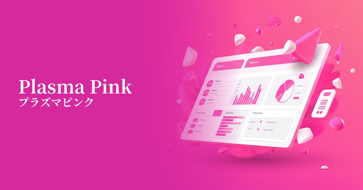
| English name | Plasma Pink |
|---|---|
| Katakana | Plasma Pink |
| HEX | #FF40B4 |
| RGB | 255, 64, 180 |
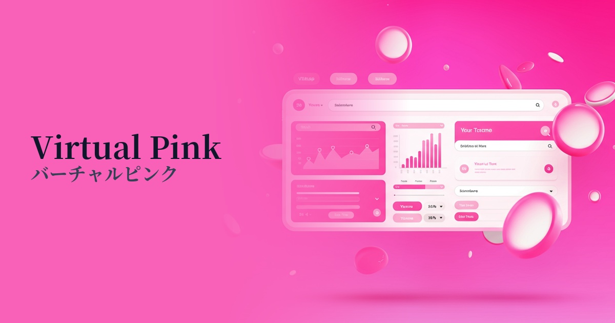
| Design Theme | Neon & Cyberpunk Colors |
Why is it a trend? (Background and reasons)
The rise of plasma pink is rooted in design trends such as "Y2K" and "retrofuturism," which reinterpret culture from the 1980s to the early 2000s. Neon colors, frequently used in science fiction films and video games of the time, have been updated with a modern sensibility and are being embraced as a fresh expression.
Furthermore, the development of virtual space technologies such as the metaverse and VR/AR is a major contributing factor. Unrealistic, luminous colors like plasma pink are highly effective in visually representing digital worlds and futuristic concepts, and are chosen by many creators.
Furthermore, on visually-oriented social media platforms like Instagram and TikTok, the ability to instantly capture users' attention—what we call "Instagrammable"—has become crucial. These vibrant colors stand out in the feed and have the power to increase the visibility of the content.
The psychological effects of design and UX
Plasma pink, with its vibrant color, conveys positive and active impressions such as "energy," "vitality," and "excitement." It has the effect of making users feel fun and youthful, and increasing their anticipation for the service or product.
The artificial, light-like hues characteristic of neon colors are strongly associated with keywords such as "future," "technology," and "advancement." They intuitively convey the brand's innovative stance and its use of cutting-edge technology.
Incorporating this color into your design sends a bold and confident message. It's highly effective when you want to build a unique brand image that defies conventional thinking. However, because it's such a striking color, while it strongly attracts user attention, you should also consider that overuse could lead to visual fatigue.
Visibility testing (UI component example)
Practical usage (best practices)
The most effective way to use it is as an accent color. By keeping the overall tone of the site dark or neutral colors and using plasma pink only on CTA buttons, important icons, and link text, you can naturally guide the user's eye and encourage them to take action.
Plasma Pink shines brightest when paired with dark background colors such as black, navy blue, or charcoal gray. The contrast is emphasized, highlighting a cyberpunk or futuristic aesthetic and creating an immersive design.
In addition to using it as a single color, we also recommend creating gradients with other neon colors such as electric blue and cyber yellow. This will result in a more dynamic and lively visual, and when used in hero areas or key visuals, it can leave a strong first impression on users.
When combining it with typography, readability must be carefully considered. Ensure sufficient contrast with the background and meet WCAG standards. In particular, avoid using it with thin fonts; combining it with a sans-serif font of a certain weight will strike a good balance between readability and design.
Recommended color scheme suggestions
Midnight Blue (#191970)
The vibrant plasma pink stands out against a deep blue background, creating a futuristic, cyberpunk, or space-themed aesthetic. Its high visibility makes it ideal for text and important accents.
Turquoise (#40E0D0)
Combining pink with turquoise, which is close to its complementary color, enhances the beauty of both colors. This creates an energetic, retro-futuristic 80s vibe.
Silver (#C0C0C0)
When combined with cool, inorganic silver, the artificial shimmer of plasma pink creates a sophisticated impression. This color scheme is recommended for minimalist and cutting-edge UI designs.