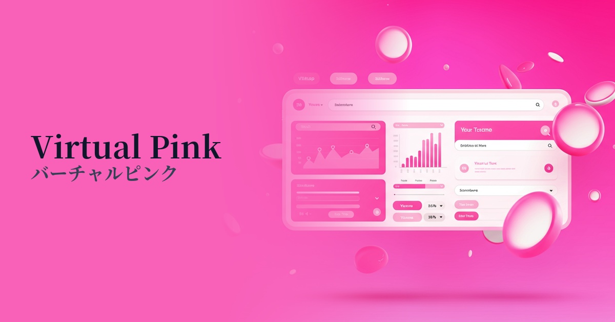
| English name | Virtual Pink |
|---|---|
| Katakana | Virtual Pink |
| HEX | #FF33A8 |
| RGB | 255, 51, 168 |
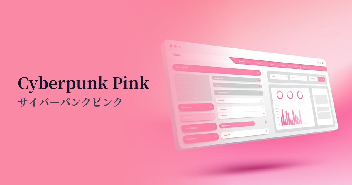
| Design Theme | Neon & Cyberpunk Colors |
Why is it a trend? (Background and reasons)
The rise of virtual pink stems from the revival of retro-futuristic culture, such as cyberpunk and synthwave, which were popular in the 80s and 90s. This style, which fuses nostalgia for the early digital age with a yearning for the future, is providing new inspiration to contemporary creators.
Furthermore, the evolution of metaverse and VR/AR technologies is a major contributing factor. As people spend more time in virtual spaces, there is a growing demand for vibrant, artificial colors that are impossible in the real world. Virtual pink can be said to be a color that symbolizes this digital and surreal worldview.
Furthermore, as social media and short video platforms become the mainstream for information gathering, they also play a role as a "hook" that instantly captures the user's attention. Highly saturated colors, which have a visual impact that makes users stop scrolling, are very effective in increasing content engagement. Virtual pink, in particular, gives a pop and energetic impression, and is therefore adopted by many brands and services.
The psychological effects of design and UX
Virtual pink conveys an impression of energy, boldness, futurism, and playfulness. It stands apart from the inherent "cuteness" and "gentleness" of pink, characterized by a stronger artificial and digital nuance.
In UI/UX design, this has a strong psychological effect of attracting the user's attention. In particular, when used in call-to-action (CTA) buttons, its vividness is expected to encourage user action and contribute to an increase in conversion rates.
On the other hand, because this color is very assertive, overuse carries the risk of causing visual fatigue in users and impairing the readability of content. The key to a superior user experience lies in using it strategically as an accent, while still conveying a sense of innovation and fun.
Visibility testing (UI component example)
Practical usage (best practices)
One of the most effective use cases is as a CTA button on a landing page or e-commerce site. Against a dark background or minimalist layout, the virtual pink button stands out, clearly communicating the intention to the user: "Please click here."
It's also recommended to use it as an accent color rather than as the main color for the entire site. For example, by limiting its use to parts of headings, icons, link hover effects, and loading animations, you can create a sophisticated, futuristic atmosphere and highlight your brand image.
Incorporating gradients or abstract graphics into the hero area of a website, which determines the first impression, is also a good idea. By combining them with other cyber colors, you can instantly draw users into the world of your service.
Using this color for important notifications or unread badges can help prevent users from overlooking important information. However, since red is commonly used for negative notifications such as errors and warnings, it is best to limit its use to positive information.
Recommended color scheme suggestions
Midnight Blue (#191970)
Placing virtual pink against a deep midnight blue background makes it stand out like a neon sign, creating a strong cyberpunk or futuristic, space-age feel. It's highly visible and ideal for creating a dramatic impression.
Gainsboro (#DCDCDC)
When combined with light gray, the intensity of virtual pink is softened, creating a modern and sophisticated impression. Using it as an accent against a clean background creates a cutting-edge yet light and approachable atmosphere.
Teal (#008080)
Combining it with teal, a color close to its complementary color, creates a dynamic and vibrant color scheme where each color appears more vivid. It's recommended when you want to express a retro-futuristic atmosphere reminiscent of 80s synthwave.