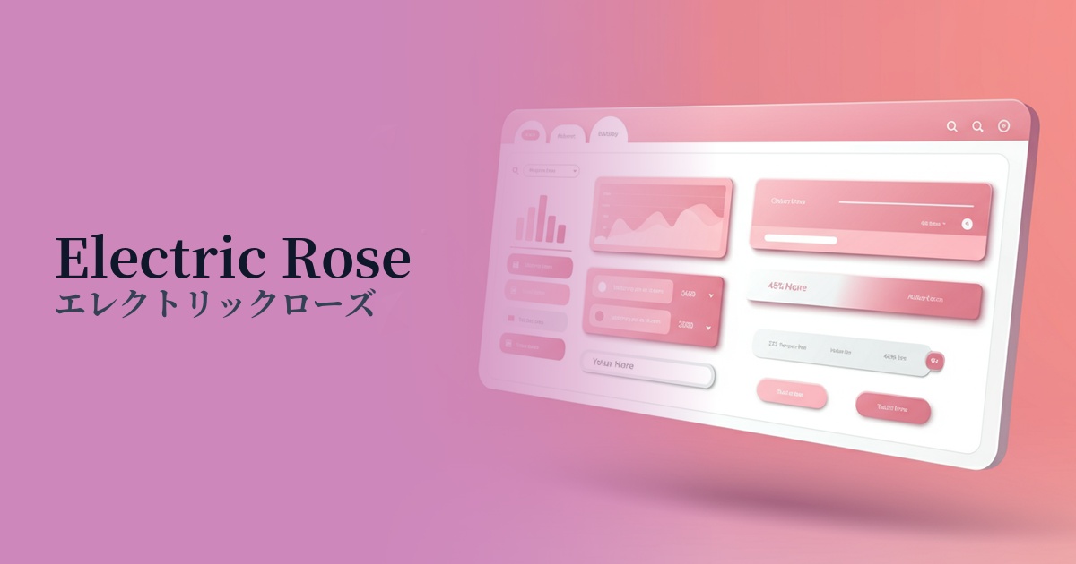
| English name | Electric Rose |
|---|---|
| Katakana | Electric Rose |
| HEX | #FC3489 |
| RGB | 252, 52, 137 |
| Design Theme | Neon & Cyberpunk Colors |
Why is it a trend? (Background and reasons)
The popularity of electric roses is deeply connected to a return to 80s and 90s retro-futuristic and cyberpunk culture. Neon colors, which were frequently used in synthwave music, science fiction movies, and video games, are being re-evaluated as a modern digital expression and are now being incorporated into web design.
This color truly shines on digital screens, where light seems to radiate from within. In today's information-saturated websites, it has the power to instantly capture the user's attention and leave a lasting, memorable impact. It's an ideal choice for building a cutting-edge, energetic brand image.
It is frequently used, in particular, on the websites of technology startups, game companies, music events, and fashion brands seeking bold expression. It plays a role in visually conveying an unconventional, futuristic, and challenging attitude.
The psychological effects of design and UX
Electric roses evoke strong emotions such as energy, excitement, and passion. They can provide users with a dynamic and enjoyable experience, and are expected to increase engagement with the site. In particular, using them in CTA buttons to encourage action may lead to an increase in click-through rates.
This color is strongly associated with concepts such as technology, the future, and innovation. Incorporating it into the UI of your website or app can give users an impression of being "cutting-edge" and "futuristic," intuitively conveying the advanced nature of your service.
Using bold colors like electric rose can be a statement of a brand's confidence and fearless attitude. However, due to its high saturation, excessive use carries the risk of making users feel uncomfortable or that the color looks cheap. Strategic use is essential to maintain a sophisticated impression.
Visibility testing (UI component example)
Practical usage (best practices)
The most effective use is in limited applications as an accent color. By using dark or neutral colors throughout the site and placing Electric Rose on CTA buttons, icons, important links, and active menu items, you can naturally guide the user's eye and improve usability.
This color works exceptionally well with dark modes and black backgrounds. It stands out vividly against a dark background, creating a beautiful, cyberpunk-esque contrast. Visibility is improved, resulting in a more immersive and dramatic user experience.
Not only can you use it as a single color, but by incorporating it into gradients with deep blue or purple tones, you can express a more profound, synthwave-like world. Additionally, adding a subtle glow effect to the element enhances the "electric," luminous texture, as the name suggests.
Due to its intense brightness, it should be avoided when used as a background color for large areas or in long body text. It places a significant strain on the user's eyes and severely impairs readability. When using it, be sure to check the contrast ratio with the background color and take care to meet accessibility standards.
Recommended color scheme suggestions
Navy Blue (#000080)
When combined with a deep navy blue, the vibrancy of electric rose stands out, vividly expressing a cyberpunk or synthwave aesthetic. The result is a futuristic, sophisticated, and immersive design.
Charcoal (#36454F)
Using charcoal gray as a background emphasizes the energy of electric rose while creating a modern and refined overall impression. It's ideal when you want to maintain readability while allowing it to function as a powerful accent.
Cyan (#00FFFF)
When paired with a vibrant cyan, it creates a retro and playful color scheme reminiscent of 1980s neon signs. It's effective for creating excitement among users on entertainment and event websites.