| English name | Dark Success |
|---|---|
| Katakana | Dark Success |
| HEX | #15803D |
| RGB | 21, 128, 61 |
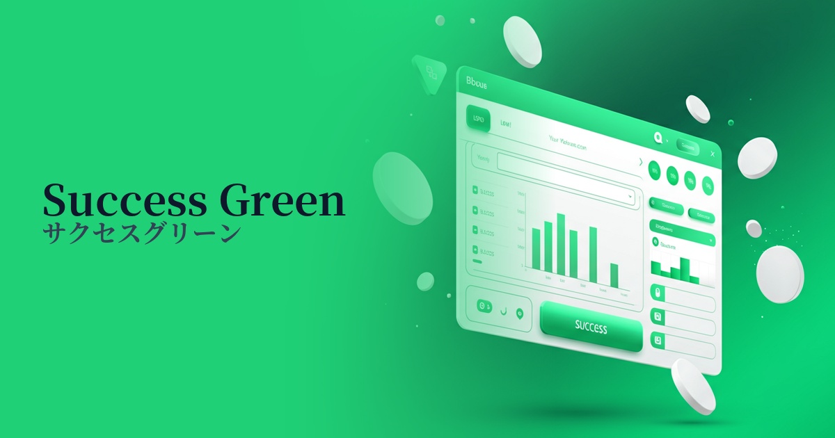
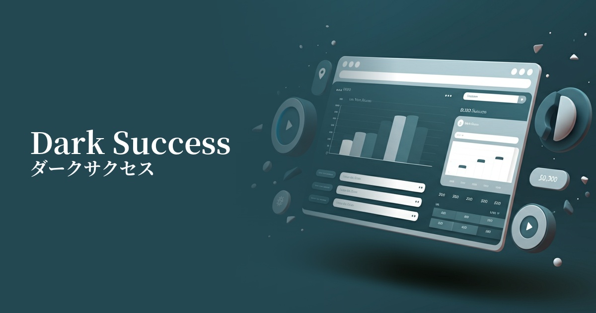
| Design Theme | UI System & Alert Colors |
Why is it a trend? (Background and reasons)
In web design, particularly in the field of UI/UX, the importance of "system colors"—colors that intuitively convey the system's status to the user—is increasing. Dark success, in particular, is gaining attention as a color that clearly communicates positive feedback such as "success," "completion," and "approval."
This trend is driven by a growing awareness of accessibility. Compared to traditional bright green (light success), deeper colors like dark success have the advantage of making it easier to ensure sufficient contrast against white or light-colored backgrounds, thus more easily meeting WCAG (Web Content Accessibility Guidelines) standards.
Another contributing factor is the shift in the overall tone of the design towards a more modern and subdued direction. Dark Success, which gives a more sophisticated impression than vibrant green, is being actively adopted, especially in the UI of financial services and B2B SaaS applications where reliability and stability are required.
The psychological effects of design and UX
Success/Completion/Approval: These serve as the most direct signs that a user's action has been processed correctly, such as successful form submission, successful payment, or saving settings. They provide users with a sense of security and accomplishment.
Trust and Stability: Deep green evokes images of nature and growth, psychologically fostering a sense of security and trust. This effect helps build user trust in services where security is critical and in platforms where long-term use is desired.
Progress and Growth: Similar to the "go" sign on a traffic light, this design provides users with positive confidence that they are performing the correct operation and are ready to proceed to the next step, promoting a smooth user experience.
Safety: In contrast to red (danger color) which indicates errors, this indicates that the system is functioning correctly and is safe. This allows users to continue using the service without hesitation.
Visibility testing (UI component example)
Practical usage (best practices)
Success messages and toast notifications: These can be used as background or icon colors for temporary notifications that indicate the completion of an operation, such as "Settings saved" or "Message sent," providing users with clear feedback.
Form validation: Applies border color and checkmark icons when input fields are correctly filled in. Provides real-time feedback to prevent input errors.
Dashboard Status Display: Used in management screens for SaaS and other applications to display statuses such as "Enabled," "Active," and "Paid." This improves visibility and allows users to quickly understand the situation.
Recommended plan in pricing lists: On pages with multiple pricing plans, using this on the button or heading of the plan you most recommend implicitly conveys the message, "Choosing this plan is the best choice for you," thereby boosting conversions.
Positive CTA buttons: These are ideal for buttons that encourage beneficial user actions, such as "Complete Registration" or "Try for Free." However, it's important to clearly define their role in relation to the site's overall primary color.
Recommended color scheme suggestions
Gainsboro (#DCDCDC)
When combined with light gray, it creates a clean and trustworthy impression. The dark success color stands out while maintaining an overall calm tone, making it ideal for SaaS UIs and corporate websites.
Charcoal (#36454F)
This combination is particularly effective in dark mode UIs. Dark Success stands out vividly against a dark background, creating a modern and professional atmosphere. Recommended for technology and creative websites.
Goldenrod (#DAA520)
Adding yellow accents, which are close to complementary colors, brings vibrancy and attention to a design. It's particularly effective for attracting user attention when used for important notifications or badges encouraging upsells.