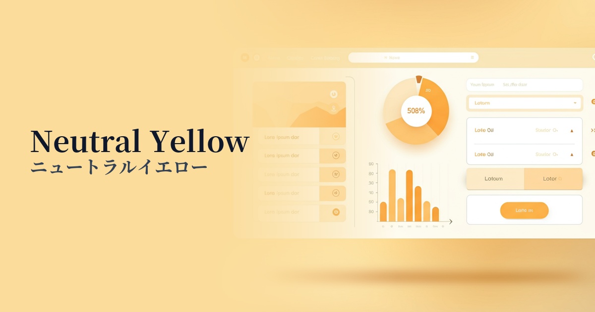
| English name | Neutral Yellow |
|---|---|
| Katakana | Neutral Yellow |
| HEX | #FEF08A |
| RGB | 254, 240, 138 |
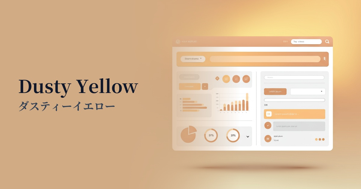
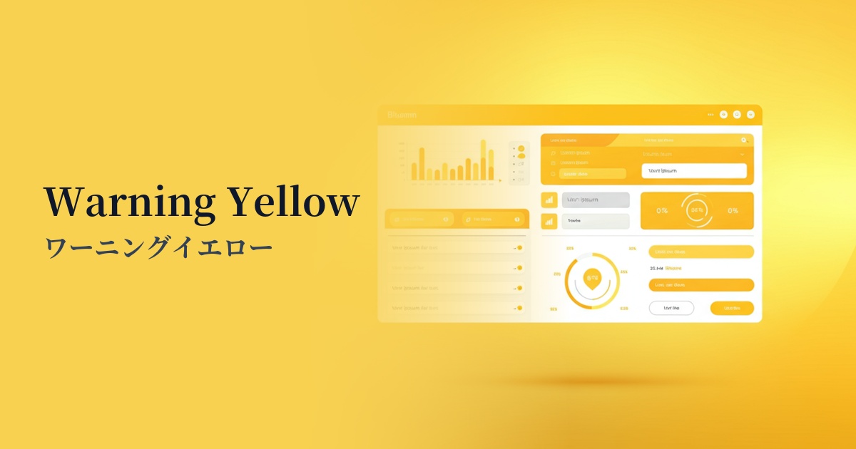
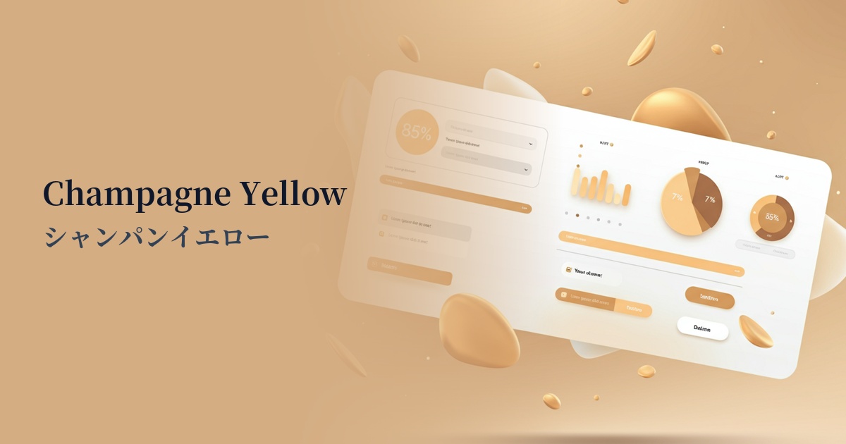
| Design Theme | UI System & Alert Colors |
Why is it a trend? (Background and reasons)
In recent years, web design has seen a trend towards favoring colors that evoke a sense of security and a positive impression in users. Neutral yellow, with its gentle tone that isn't too bright, strikes a balance between an optimistic atmosphere and ease of viewing. Because it's less likely to stress users even during extended use, it's widely adopted in many interfaces.
One of the reasons it's attracting attention is its compatibility with UI design, especially dark mode. It maintains excellent visibility against black or dark gray backgrounds without being as assertive as a warning color (red), making it ideal for intermediate status displays such as "caution" or "information." This allows for the creation of a sophisticated information hierarchy in the UI.
Furthermore, the growing interest in sustainability and wellness is also a contributing factor. This color evokes images of sunlight and the bounty of nature, and conjures up an organic and natural image. Therefore, it functions effectively as a color that expresses trustworthiness and approachability in eco-friendly brands and health-conscious services.
The psychological effects of design and UX
Yellow tones generally evoke positive emotions in users, such as happiness and joy. Neutral yellow, in particular, has a soft and gentle impression, and is expected to bring a sense of security and a positive outlook to users.
Unlike strong warning colors, it serves as a "soft alert" that gently draws the user's attention. It is ideal for conveying information that you want the user to see but isn't urgent, such as form input hints or minor system notifications.
Warm, gentle tones help to reduce the psychological distance between the user and the brand, creating a more approachable brand image. Furthermore, the reduced saturation makes it less stimulating for users with visual sensitivities, providing a more inclusive design experience.
Visibility testing (UI component example)
Practical usage (best practices)
This color is ideal for using in alert banners and tooltips to indicate statuses such as "information" or "hints." It helps in neutral communication, distinct from success (green) or danger (red).
By using it as the border color for active input fields or the background color for input guides, it intuitively indicates where the user is currently interacting, improving the usability of the form.
In minimalist designs based on monochrome or achromatic colors, using this color for CTA buttons, icons, and link text provides an effective accent, naturally guiding the user's gaze.
In dark-themed UIs, this color is highly effective for indicating important elements or active states. It stands out beautifully against black or dark blue backgrounds, maintaining a sophisticated look while ensuring high visibility.
Recommended color scheme suggestions
Slate Gray (#708090)
When combined with a calming slate gray, the brightness of neutral yellow is highlighted, creating an intelligent and sophisticated impression. It is recommended for designs that want to balance reliability and modernity, such as business websites and SaaS dashboards.
Avocado (#568203)
Combining it with a deep green like avocado creates a natural and organic atmosphere. It's ideal for wellness-related services and sustainability-themed brand websites, conveying a sense of security and healthiness.
Terracotta (#E2725B)
When combined with warm terracotta, it creates an earthy and approachable atmosphere. When used on lifestyle-oriented e-commerce sites or blogs, it achieves a balance between a handmade warmth and a trendy, stylish impression.