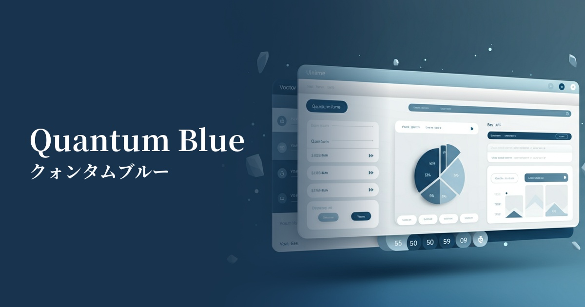
| English name | Quantum Blue |
|---|---|
| Katakana | Quantum Blue |
| HEX | #1919FF |
| RGB | 25, 25, 255 |
| Design Theme | Neon & Cyberpunk Colors |
Why is it a trend? (Background and reasons)
The rise of Quantum Blue stems from the rapid evolution of technologies such as AI and the metaverse. As these advanced technologies permeate our lives, interest in futuristic and surreal colors that symbolize digital spaces and virtual reality is growing. This color is perfectly suited to visually representing that digital future.
Another major factor is the revival of cyberpunk culture, which originated in 1980s science fiction films. The style, with its dark worldview and striking neon colors, is providing new inspiration to contemporary creators. Quantum Blue evokes the light of those iconic neon signs, giving the design a narrative quality and a strong individuality.
In recent years, design trends have been dominated by minimalism and neutral colors, but it's important to note that there's a growing demand for bolder, more emotionally resonant colors. The intense impact of quantum blue makes it a powerful tool for capturing users' attention among the many websites and highlighting a brand's uniqueness.
The psychological effects of design and UX
Quantum Blue evokes impressions of "advancement," "technology," "the future," and "intelligence." The inherent psychological effects of blue, such as "trust" and "calmness," are combined with the "energy" and "sense of the extraordinary" of neon, creating a unique psychological effect.
In UI/UX design, its high saturation and brightness have a strong effect in attracting user attention. Therefore, using it for CTA buttons, important notifications, and indicators showing active status can effectively guide user actions.
On the other hand, because it is such a powerful color, overuse can cause visual fatigue in users. Particular attention should be paid to the contrast with the background color, and it is important to always check that it meets the standards of WCAG (Web Content Accessibility Guidelines). Using it as an accent in a dark theme makes it easier to achieve both visibility and design appeal.
Visibility testing (UI component example)
Practical usage (best practices)
The most effective use of Quantum Blue is as an accent color. In UI designs based on dark mode, placing Quantum Blue on icons, selected menu items, and progress bars significantly improves visibility and creates a sophisticated, futuristic interface.
On landing pages and campaign websites, using this color for CTA (Call To Action) buttons that directly lead to conversions can naturally attract users' attention and strongly encourage clicks. The simpler the other elements are, the greater the effect.
It's also recommended to use it as the key color for the main visual in the hero area, which determines the first impression of your website. For example, incorporating it into a gradient based on quantum blue or abstract 3D graphics can instantly draw visitors into that world.
Using the color exclusively in logos or specific UI components, and consistently deploying it as a color symbolizing the brand, is also an effective approach. This helps instill a strong brand recognition in users, making them think, "Quantum Blue means this service."
Recommended color scheme suggestions
Charcoal (#36454F)
By using quantum blue against a dark charcoal gray background, the vibrancy of the colors is maximized, ensuring excellent visibility. This creates a modern and sophisticated impression, making it an ideal combination for SaaS dashboards and technology company websites.
Fuchsia (#FF00FF)
The combination of blue and magenta evokes a retro-futuristic atmosphere reminiscent of synthwave and vaporwave. It's effective when you want to create a mysterious and artistic impression, and is recommended for creative portfolio websites.
Jonquil (#F4CA16)
The combination with a vibrant yellow, which is close to its complementary color, creates a very strong contrast, symbolizing the cyberpunk aesthetic. This color scheme is perfect for energetic and playful designs, such as warnings and game UIs.