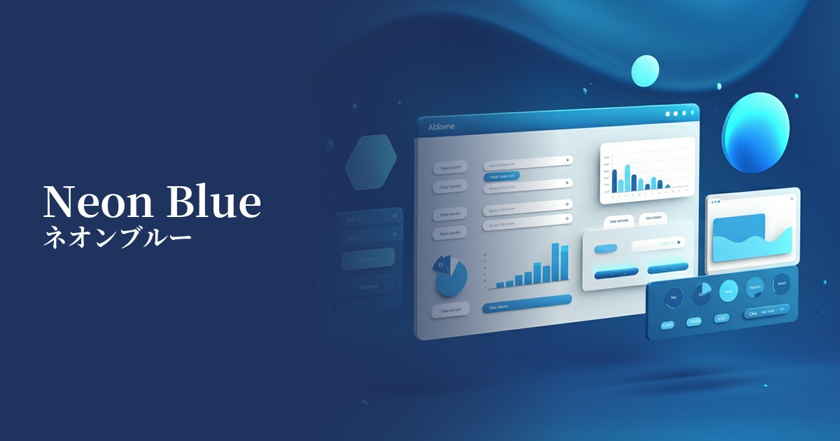
| English name | Neon Blue |
|---|---|
| Katakana | Neon Blue |
| HEX | #0000FF |
| RGB | 0, 0, 255 |
| Design Theme | Neon & Cyberpunk Colors |
Why is it a trend? (Background and reasons)
The emergence of neon blue as a web design trend stems from a return to the retro-futuristic and cyberpunk culture of the 80s and 90s. This color, frequently used in entertainment such as movies, music, and games, creates a digital, surreal world and leaves a strong impact on viewers.
The widespread adoption of dark mode has also boosted the popularity of neon blue. Because it appears to glow brightly against a dark background, it clearly defines visual hierarchy and effectively draws the user's attention to key elements. Technology startups and creative brands are actively adopting it as a color that symbolizes innovation and energy.
The psychological effects of design and UX
Neon blue evokes a dynamic impression of energy, speed, and innovation. In contrast to the static and calming traditional blue, it stirs up vitality and excitement, giving users a sense of "futuristic" and "cutting-edge."
In UI/UX design, its extremely high visibility makes it ideal for use in call-to-action (CTA) buttons, notifications, and active menu items, allowing for intuitive user guidance. However, due to its strong visual impact, it should not be overused; it's most effective to limit its use to highlighting important information.
Psychologically, it also has the effect of evoking trust in technology. Because it evokes images of digital screens and light, using it on SaaS dashboards and IT service websites helps build a functional and modern brand image.
Visibility testing (UI component example)
Practical usage (best practices)
The most effective way to use it is as an accent color. By unifying the entire site's color scheme with dark gray or off-black, and then placing neon blue on buttons, links, icons, and loading bars, you can create a sophisticated and futuristic UI.
When applying this to text, sufficient consideration must be given to accessibility. Pure neon blue (#0000FF) may lack sufficient contrast, especially against a white background. To meet WCAG standards, it is necessary to darken the background color or increase the font size and weight.
By combining it with gradients and glow effects, you can further enhance the "neon" feel of the colors. Adding a subtle glow using CSS properties like `text-shadow` and `box-shadow` can make the hero area and key visuals look even more impressive.
Not only can you use it on its own, but you can also combine it with other neon colors (such as magenta and purple) to express a richer cyberpunk world. However, if you use too many colors, the information will become scattered, so it is important to keep it to 2-3 colors to maintain balance.
Recommended color scheme suggestions
Hot Pink (#FF69B4)
The combination with neon blue is a classic color scheme from 80s synthwave and cyberpunk. The two colors intensely complement each other, creating an energetic and playful impression. It's perfect for event websites and music-related designs.
Charcoal (#36454F)
Against a dark charcoal gray background, the vibrancy of neon blue is maximized, creating an effect as if it were glowing in the dark. It gives a modern and sophisticated impression, making it suitable for UIs and portfolio websites of technology services.
Gainsboro (#DCDCDC)
Combining it with a bright light gray creates a clean, minimalist design that also feels cutting-edge. Neon blue acts as a sharp accent, creating a futuristic yet light and open atmosphere.