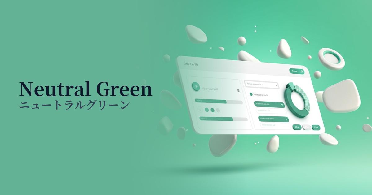
| English name | Neutral Green |
|---|---|
| Katakana | Neutral Green |
| HEX | #BBF7D0 |
| RGB | 187, 247, 208 |
| Design Theme | UI System & Alert Colors |
Why is it a trend? (Background and reasons)
In recent years, web design has emphasized "digital wellness," which aims to provide users with a sense of security and a comfortable experience. Neutral green is characterized by its gentle, muted hue that evokes nature and growth. It is easy on the eyes and does not cause fatigue even when viewed for long periods, making it a perfect match for minimalist and clean interfaces, which is why it is trending.
Particularly in the context of UI/UX, it is gaining attention as a more sophisticated alternative to the traditional, vibrant "success green." It is suitable for "silent feedback," which quietly but clearly communicates that a user's action has been successful, and can convey a positive state without compromising the tone and manner of a modern application.
The psychological effects of design and UX
Neutral green provides users with positive psychological feedback such as "success," "completion," and "safety." For example, using it for a "message sent" notification after a form submission can give users a sense of accomplishment and reassurance. Because it is not a strong color, it does not feel intrusive and supports a positive experience in a natural way.
The universal imagery associated with green—safety, harmony, and health—is also carried over to this color. In particular, websites focusing on financial services, healthcare, and sustainability can be expected to foster user trust and enhance their sense of security regarding the services they use.
In addition to providing a sense of psychological security, it brings "freshness" and "cleanliness" to the design. By incorporating it into designs based on white or light gray, it is possible to create a refreshing, airy, and modern impression.
Visibility testing (UI component example)
Practical usage (best practices)
The most effective use is success/completion notifications within the UI. Using them as background colors for toast notifications or alerts such as "Saved" or "Update Complete" allows you to communicate the status to users without causing them stress.
It's also recommended to use this color as the background color for sections that highlight specific features or benefits on landing pages or product introduction sites. It can create a rhythm throughout the page and naturally guide the user's gaze.
It's most effective when used for buttons indicating secondary actions (e.g., "Watch Later," "Add to Comparison List") rather than the main CTA button. It doesn't interfere with the primary action, but it suggests a positive alternative.
In data visualization design, this color can be used to indicate "positive growth" or "goal achievement" in graphs and charts. Because it's a light color, it has the advantage of maintaining readability even when numerical data is overlaid on top.
Recommended color scheme suggestions
Charcoal (#36454F)
Combining deep charcoal with text and key elements adds reliability and expertise to the calmness of neutral green. Its high readability and clean, sophisticated appearance make it ideal for SaaS UIs and business websites.
Antique White (#FAEBD7)
Using warm antique white for the background and negative space further enhances the gentleness of the neutral green. The overall effect is soft and inviting, making it a comfortable fit for wellness and lifestyle services.
Coral (#FF7F50)
Adding vibrant coral as an accent brings energy and a modern touch to the overall design. The contrast with the calming neutral green is effective for CTA buttons and important notifications that you want to capture the user's attention.