
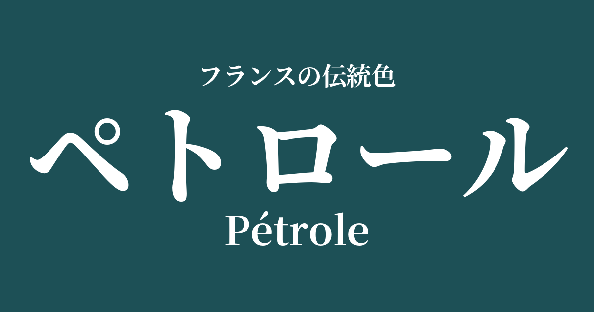
| French | Petrole |
|---|---|
| Katakana | Petrol |
| HEX | #1d5056 |
| RGB | 29, 80, 86 |
What is petrol? Origin and etymology
"Petrol" is a French word meaning "petroleum." As the name suggests, this color was named after the unique, deep, and complex hues of petroleum that change depending on the light, especially the bluish-green color.
While many color names are derived from traditional pigments and dyes, petrol is a relatively new color, with its background in the modern event of the Industrial Revolution in the late 19th century. The futuristic and powerful image of petroleum, which began to permeate society as a new energy source, was associated with this color.
Historical background of petrol
Petrol emerged as a color name and became popular during the late 19th and early 20th centuries, a period known as the "Belle Époque" (the beautiful era). During this time, industry in France developed dramatically, and a vibrant urban culture flourished, centered in Paris.
Technological innovations in chemical dyes led to the creation of a succession of vibrant and deep colors that had previously been impossible to achieve. Petrol was one such color, and as a modern and sophisticated color that stood apart from traditional royal colors, it was embraced by the bourgeoisie and artists with a new sensibility. It was truly a color that symbolized modernization.
Petrol in the world of art and fashion
The mystical and deep hues of petrol are deeply connected to the artistic styles of Art Nouveau and Art Deco. This nuance can be found in the complex color expressions that blend with natural motifs, as seen in the works of Art Nouveau glass artist Émile Gallé.
In the world of fashion, this color pairs exceptionally well with lustrous fabrics such as velvet, silk, and satin, highlighting the beauty of its interplay of light and shadow. Used in evening gowns and luxurious coats, it enhanced the wearer's intelligence and mysterious allure. Innovative designers like Paul Poiret are said to have favored this kind of deep color, often combining it with Oriental exoticism.
Color scheme preview
This is to check the readability of the text when this color is used as the background.
Petrol color scheme proposal
Jaune de Naples (#f7d98e)
The combination of deep petrol and bright, warm Jaune de Naples creates a beautiful contrast. It gives a modern yet somewhat classical, calm, and intellectual impression.
Gris de Lignan (#dcd2c8)
The sophisticated and calming petrol and the natural and soft gris de lignan create a refined color scheme for adults. It's perfect for urban and chic spaces, as well as effortless fashion coordination.
Violin (#8f4a86)
The combination of mystical petrol and noble, passionate violin creates a dramatic and distinctive impression. It evokes an artistic and luxurious atmosphere reminiscent of Art Deco.
Practical Scenes
In interior design, petrol is an extremely effective accent color that brings depth and tranquility to a space. Using it on an entire wall in a study or living room, or incorporating it into velvet sofas and cushions, can create a sophisticated, classically modern atmosphere. It also pairs exceptionally well with brass and gold metals.
In fashion, incorporating this color into coats, jackets, and suits creates an intelligent and sophisticated impression. It's especially effective in autumn and winter outfits. When worn as a silk blouse or dress, it creates an elegant style that changes its appearance depending on the light.
In web design and graphics, using it as a background color brings a sense of gravitas and trustworthiness to the content. It is suitable for luxury brands, art, and culture-related websites, and beautifully complements white or light gray text.