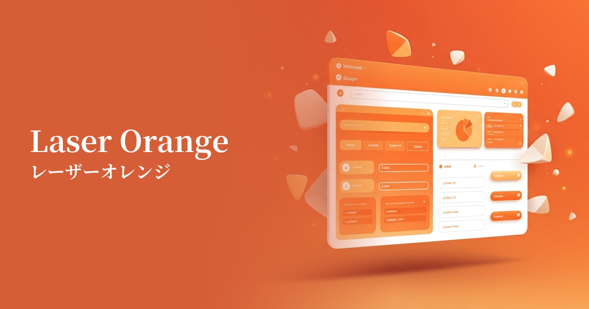
| English name | Laser Orange |
|---|---|
| Katakana | Laser Orange |
| HEX | #FF7F00 |
| RGB | 255, 127, 0 |
| Design Theme | Neon & Cyberpunk Colors |
Why is it a trend? (Background and reasons)
A major contributing factor is the recent resurgence of retro-futuristic and cyberpunk culture. Neon colors, reminiscent of 1980s science fiction movies and video games, are popular among many creators because they can express both nostalgia and a sense of the future at the same time.
In particular, with dark-mode-based UI designs becoming mainstream, highly saturated colors like laser orange are extremely effective as visual accents. They stand out vividly against dark backgrounds, attracting the user's attention and highlighting important information and actions.
Furthermore, the evolution of technology, particularly the growing interest in new digital experiences such as AI and the metaverse, is also driving the popularity of this color. Laser Orange symbolizes innovation, energy, and the limitless possibilities of the digital world, making it ideal for branding cutting-edge services and products.
The psychological effects of design and UX
Laser Orange is a color that strongly conveys energy, vitality, and creativity. It can create a positive and optimistic impression on users and is expected to have a psychological effect that encourages action. It is especially suitable for expressing new challenges and the passion of startup companies.
From a UI/UX perspective, its high visibility allows it to function as a "warning" or "attention-grabbing" sign. However, because it doesn't suggest as strong a danger as red, it can be used more effectively in situations where you want to draw the user's attention, such as for "confirmation" or "important notification," rather than for error messages.
On the other hand, overuse can make the entire screen cluttered and potentially cause mental fatigue in the user. By using it sparingly as an accent, you can maximize its energetic characteristics and maintain a sophisticated impression.
Visibility testing (UI component example)
Practical usage (best practices)
The most effective tool is a Call to Action (CTA) button that encourages conversions. In dark mode or against a neutral background, a laser orange button stands out, naturally guiding users to click.
It is effective when used in SaaS dashboards and data visualization tools for graphs, charts, and notification badges that show important metrics and alerts. This improves usability by allowing users to grasp important information at a glance.
It's also recommended to use it as an accent color for catchphrases in the hero section or for icons that showcase specific features. It instantly conveys the brand's innovative image and captures user interest.
While it can be challenging to use it extensively as a background color, incorporating it as part of a gradient or integrating it into geometric patterns can create a dynamic and futuristic aesthetic.
Recommended color scheme suggestions
Charcoal (#36454F)
When combined with deep charcoal gray or navy, the vibrancy of laser orange is maximized. This classic color scheme expresses a cyberpunk or tech-inspired aesthetic, offering high visibility and a modern, sophisticated impression.
Dodger Blue (#1E90FF)
Combining orange with its complementary color, blue, enhances the contrast between the two colors, creating a dynamic and energetic impression. A particularly vibrant blue further emphasizes a sense of the future and technology.
Ivory (#FFFFF0)
Laser Orange is recommended when you want to use it as an accent in a clean and minimalist design. By using a soft white background like ivory, the vibrant impression of orange stands out while maintaining an approachable and clean atmosphere overall.