| English name | Apricot Cream |
|---|---|
| Katakana | Apricot Cream |
| HEX | #FBE7D2 |
| RGB | 251, 231, 210 |
| Design Theme | Pastel & Macaron Colors |
Why is it a trend? (Background and reasons)
In recent years, web design has seen a growing demand for colors that are easy on the eyes and soothe the mind, in response to "digital fatigue" caused by prolonged use of digital devices. Warm, soft pastel colors like apricot cream are gaining attention as colors that provide users with a pleasant visual experience and bring about mental peace.
The growing interest in sustainability and wellness is also driving this color trend. Apricot cream, reminiscent of fruits found in nature and soft light, pairs very well with organic and natural concepts and is effective in visually communicating a brand's values.
Furthermore, the trend of "soft minimalism," which moves beyond monotonous white and gray, is also relevant. By maintaining a minimalist and clean layout while adding subtle colors like apricot cream, it's possible to give the design warmth, humanity, and a sophisticated personality.
The psychological effects of design and UX
The warm and soft tone of apricot cream instills a sense of familiarity and comfort in users. It lowers psychological barriers even on websites visited for the first time, creating an atmosphere where users can relax and immerse themselves in the content.
The bright, ripe apricot-like hue evokes feelings of happiness and optimism. Using it for lifestyle brands and wellness-related services can reinforce a positive and forward-looking brand image.
This color symbolizes "gentleness" and "care," making it ideal for designs in areas where you want to convey consideration for the user, such as baby products, cosmetics, and healthcare. It allows you to intuitively communicate the value of the thoughtfulness that your products and services offer through color.
From a UI/UX perspective, its low saturation means it's less tiring on the eyes even during prolonged viewing. However, when using it as a background color, careful attention must be paid to the contrast ratio with the text color. To meet WCAG accessibility standards, it's essential to combine it with highly readable text colors such as dark gray or dark brown.
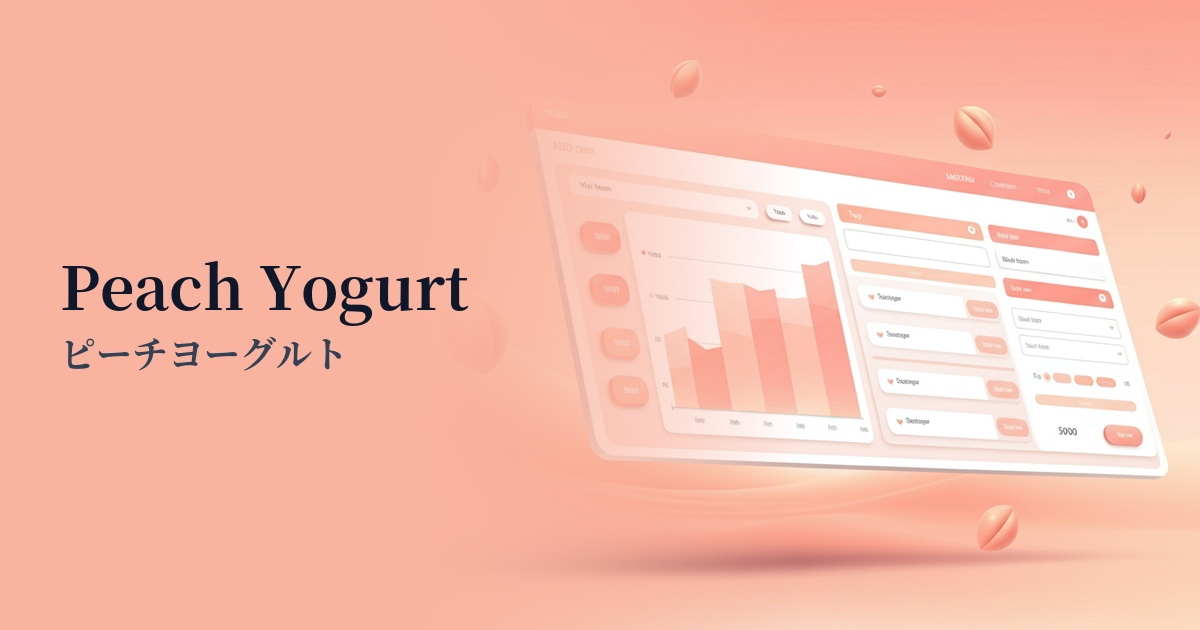
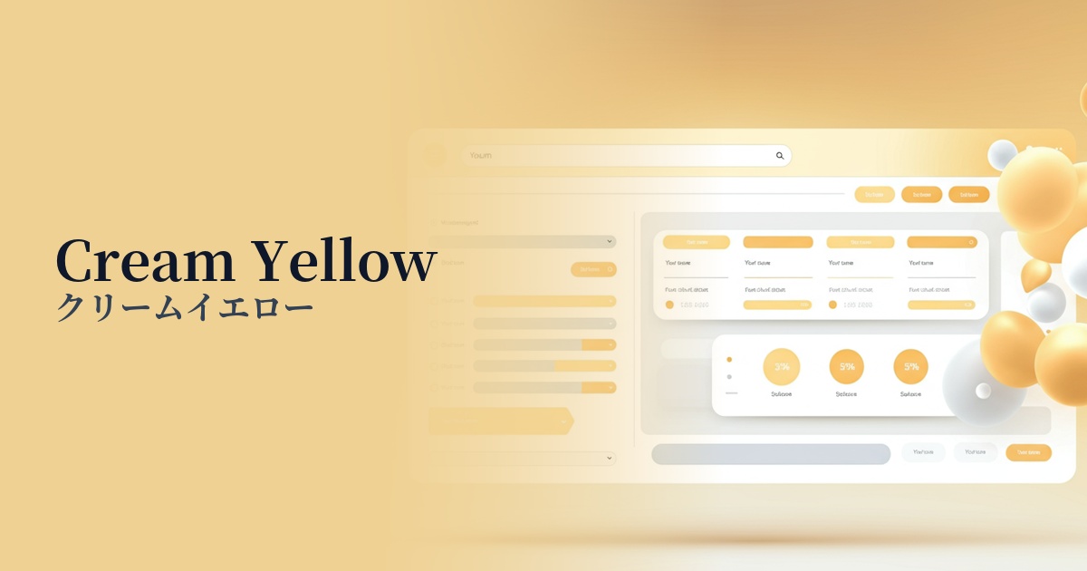
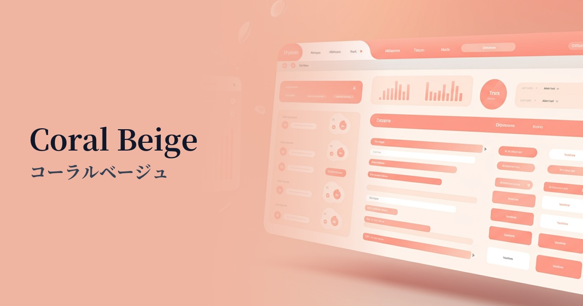
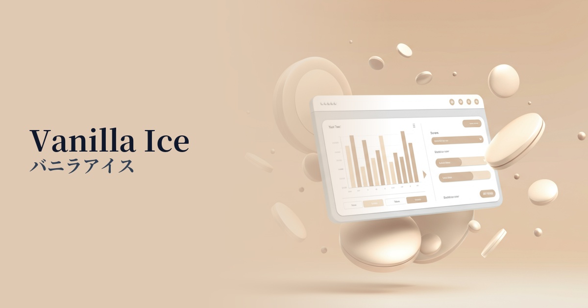
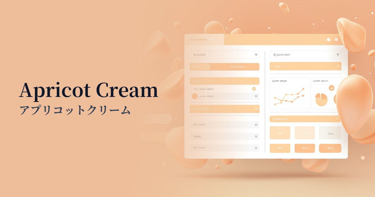
Visibility testing (UI component example)
Practical usage (best practices)
When used as the background color for an entire website, it creates a warm and soft sense of spaciousness. It gently envelops content, making it ideal for creating a comfortable digital space for users.
Setting a separate main color and using apricot cream as an accent color for buttons, icons, or the background of specific sections can also be effective. This gently attracts the user's attention and naturally guides them to important actions.
Setting this color as the background for a card-style UI that displays multiple pieces of information side-by-side softly differentiates each element, resulting in a unified and gentle interface overall. It works especially well with photo content.
When used on product pages of e-commerce sites for cosmetics, fashion, food, etc., it functions as a background that enhances the naturalness and high quality of the products. It can be expected to gently stimulate users' purchasing desire.
Recommended color scheme suggestions
Slate Gray (#708090)
The warmth of apricot cream and the intellectual, calm atmosphere of slate gray create a sophisticated, mature impression. This color scheme is recommended for corporate websites and portfolios where you want to convey both trustworthiness and approachability.
Pistachio (#93C572)
The natural and fresh impression of pistachio green harmonizes with the gentleness of apricot cream, creating an organic and healthy aesthetic. This combination is perfect for wellness and natural cosmetics brands.
Terracotta (#E2725B)
Combining terracotta colors of similar shades creates a warm gradient, resulting in a unified and sophisticated design. The earthy and comforting atmosphere makes it perfect for lifestyle media and interior design websites.