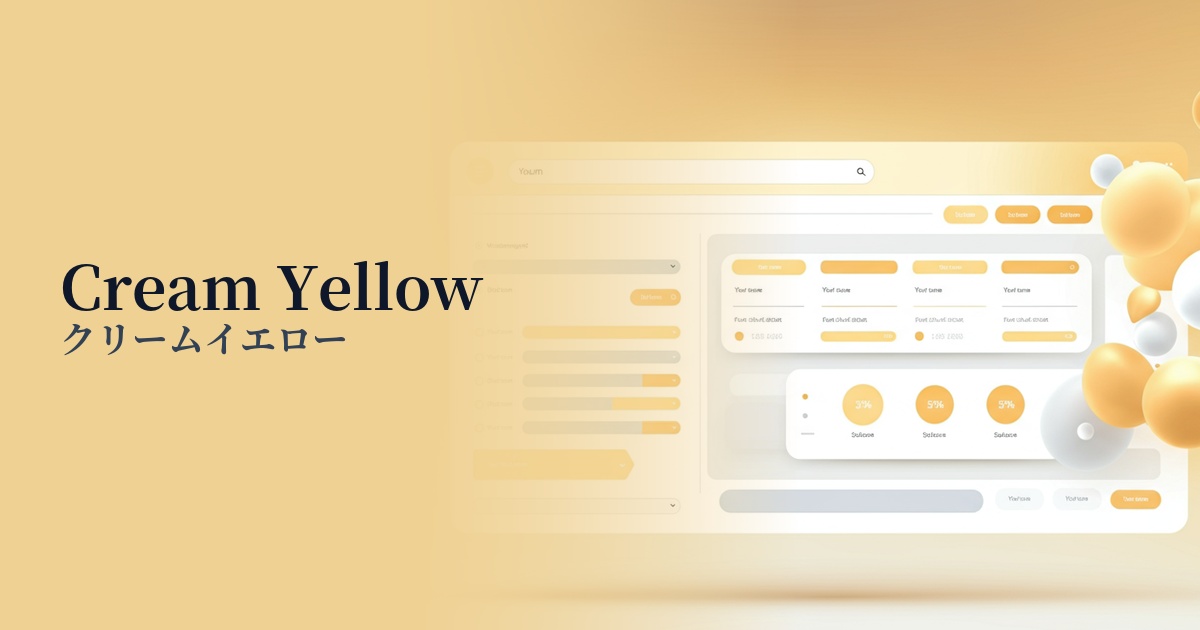
| English name | Cream Yellow |
|---|---|
| Katakana | Cream Yellow |
| HEX | #F0E6D5 |
| RGB | 240, 230, 213 |
| Design Theme | Muted colors & earth tones |
Why is it a trend? (Background and reasons)
In recent years, muted colors and earth tones have become a major trend in web design, providing users with a sense of security and comfort. Cream yellow (#F0E6D5) is one such color, attracting attention for bringing warmth and a natural atmosphere to the digital space.
This trend stems from a user desire to distance themselves from excessive information and stimulation and to spend time in peace. The understated yet bright impression of cream yellow is a perfect match for minimalist designs and organic-themed websites, and many brands are increasingly adopting it.
The psychological effects of design and UX
Cream yellow evokes positive emotions in users, such as gentleness, warmth, and a sense of security. This color, reminiscent of butter or custard cream, creates a friendly atmosphere and effectively shortens the psychological distance between the brand and the user.
From a UI/UX perspective, using this as a background color can be expected to reduce eye strain compared to pure white (#FFFFFF). This means users may experience less fatigue even after viewing content for extended periods, potentially contributing to an increase in overall site dwell time.
Furthermore, because it gives a natural and organic impression, it is an ideal color for expressing the brand's worldview on websites of food, cosmetics, lifestyle services, and companies that prioritize sustainability.
Visibility testing (UI component example)
Practical usage (best practices)
The most effective use of this color is as the background color for the entire website. Compared to a pure white background, it is easier on the eyes, maintains text readability, and brings a warm and calming atmosphere to the entire page. It is especially suitable for websites with a lot of reading content.
When the main color is a dark tone, using cream yellow as an accent color can add brightness and softness to the design. For example, using it for buttons, icons, or highlighting important headings can gently guide the user's eye.
It's also an excellent background color for card-style UIs commonly seen on e-commerce and portfolio websites. It gently envelops each piece of content, making it easy to distinguish between pieces of information while creating a unified and sophisticated impression.
On landing pages for brands that sell natural cosmetics, food, and lifestyle goods, the organic image of cream yellow perfectly matches the brand's worldview, making it easier to gain user trust and empathy.
Recommended color scheme suggestions
Sage Green (#9DC183)
This combination of earth tones evokes nature and the earth. It creates a calm and relaxed atmosphere, making it ideal for organic product and wellness-related websites. It provides users with a sense of comfort and reassurance.
Slate Blue (#6A5ACD)
The combination of warm cream yellow and intelligent, calming slate blue creates an impression of trustworthiness and sophistication. This color scheme is recommended for business websites, SaaS UIs, and other designs where you want to convey sincerity.
Saddle Brown (#8B4513)
The cream yellow and deep saddle brown are a comforting combination reminiscent of coffee and chocolate. It strikes a balance between luxury and warmth, adding depth to cafes, interior design, and fashion-related websites.